Working on Lens Studio
Information
This guide will walk you through using Lens Studio to explore and analyze your data model effectively, helping you unlock insights with ease.
With Lens Studio, you can access your Lens to examine the same data model from diverse perspectives. Studio makes it easy to analyze data across different dimensions, providing the ability to slice and dice information to uncover insights.
Key Features
- Run queries by selecting dimensions and measures to create tailored views to focus on the data that matters most.
- Explore the data model from multiple angles by using filters and sorting.
- Use segments to apply pre-defined filters.
Navigating the Lens Studio
When you first open Lens Studio, you’ll see the following interface.
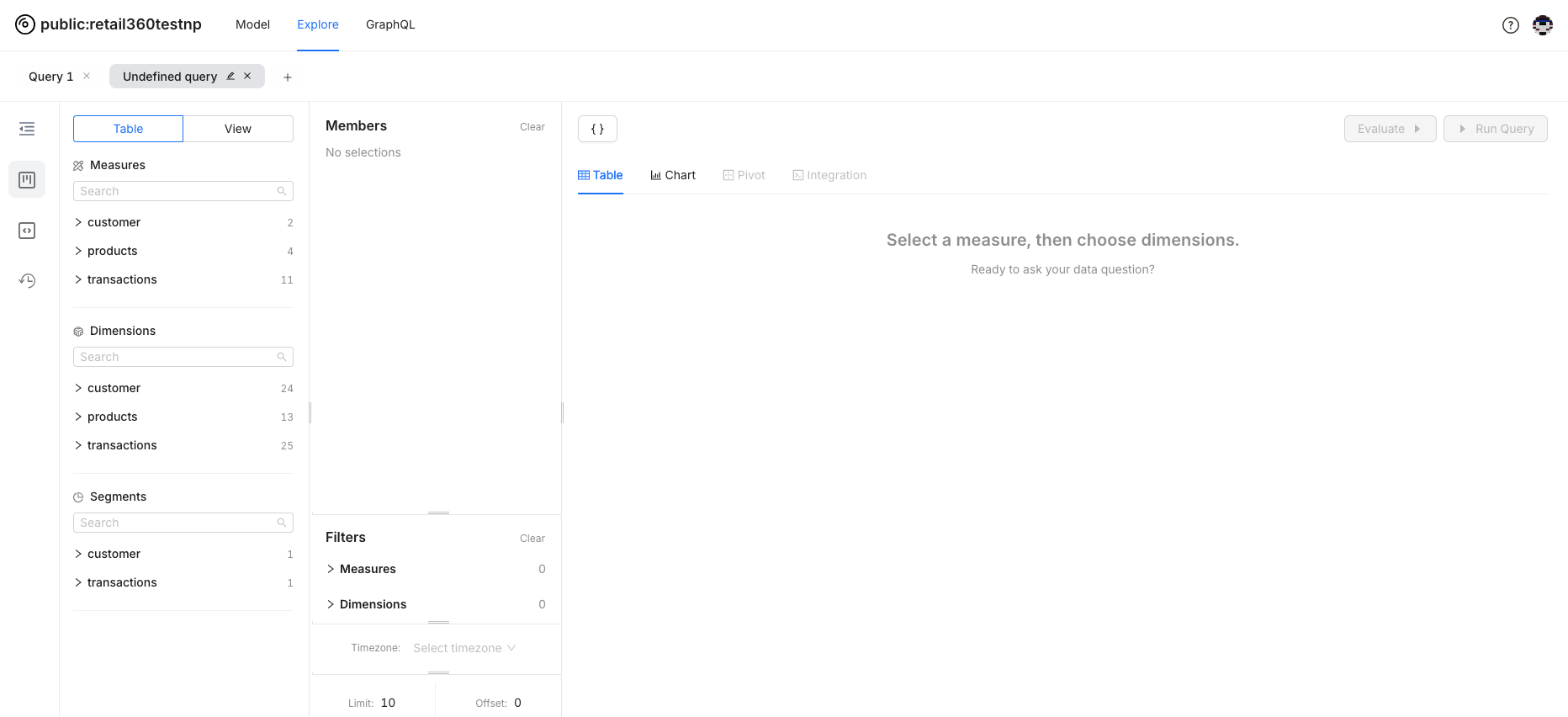
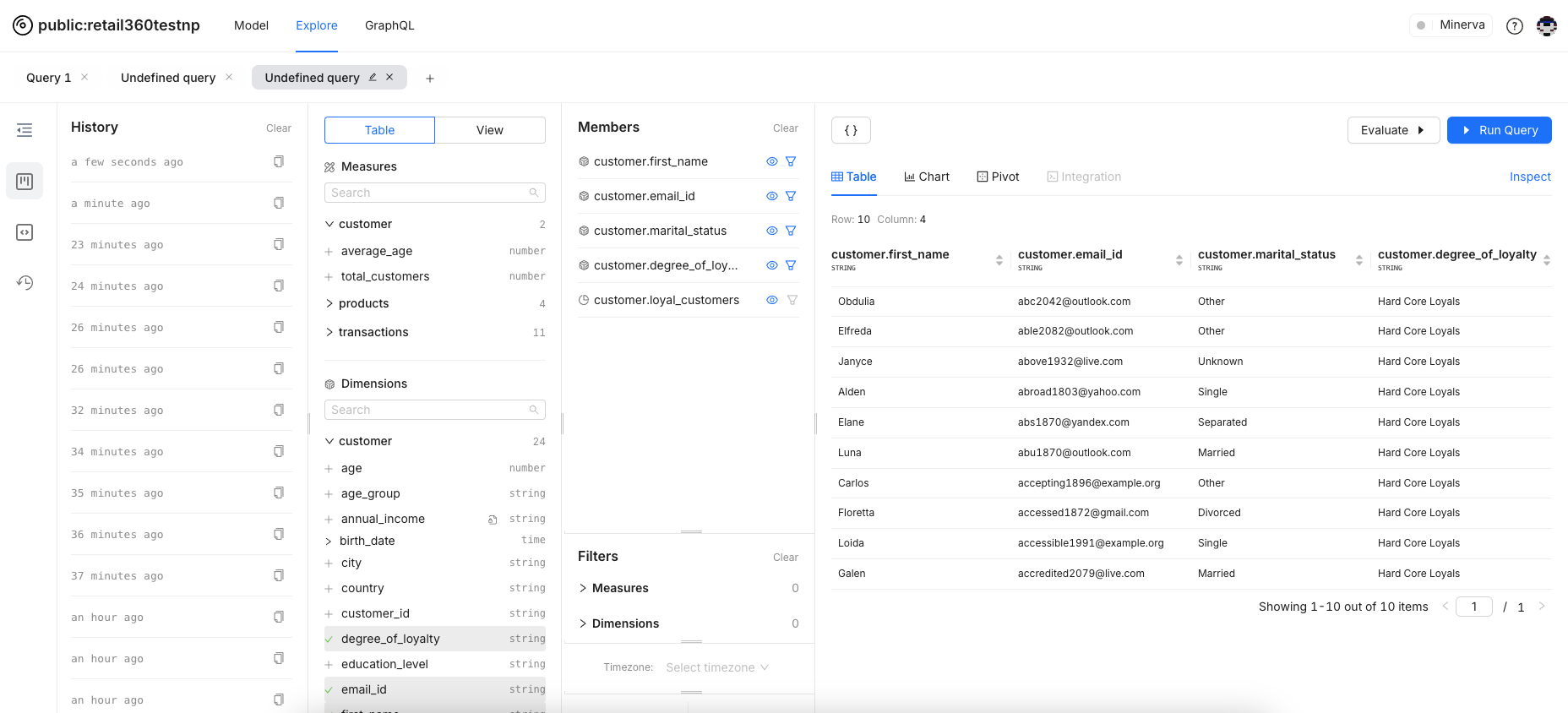
Exploring your Lens
.png)
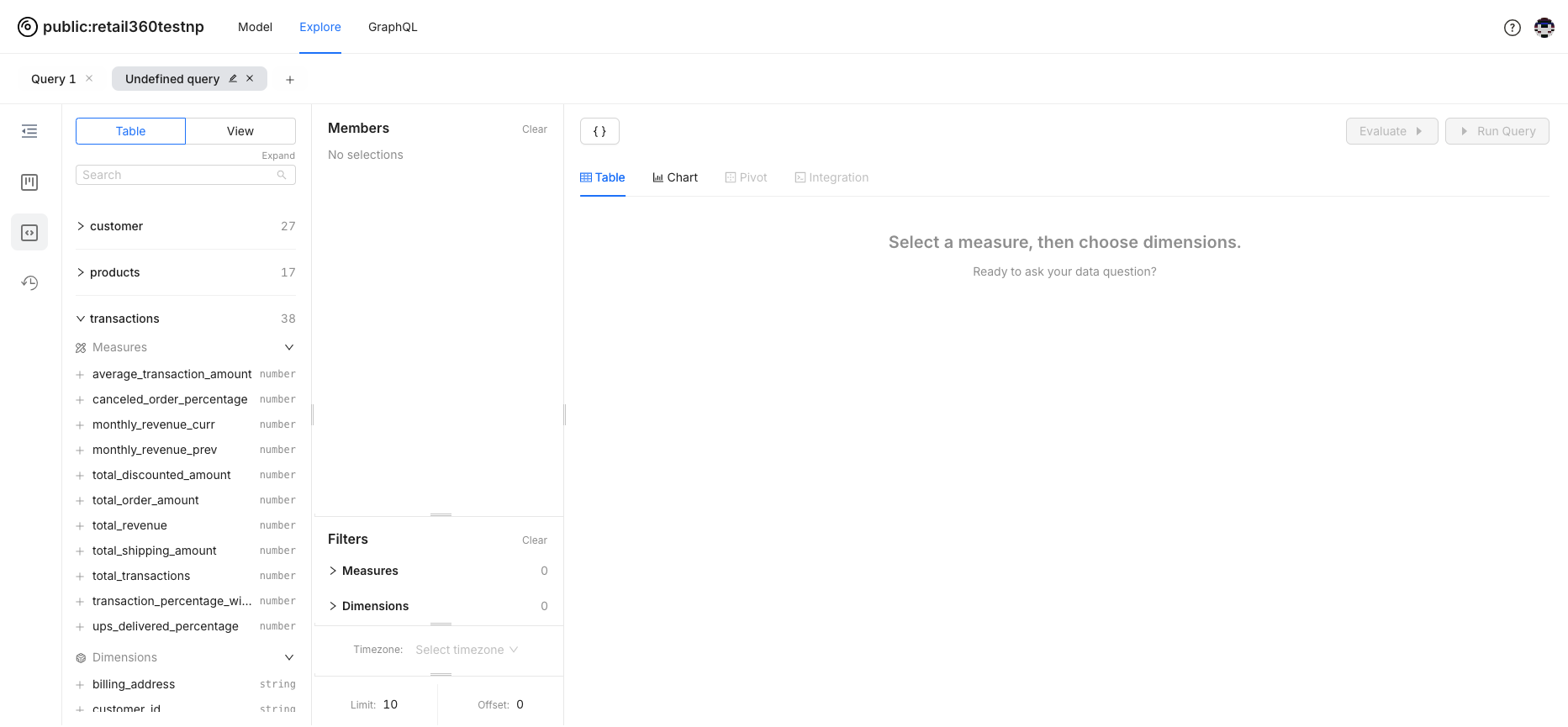
- Tables and Views: Check out the left panel to find all your logical tables and views. It’s your starting point for diving into your data.
- Selecting Dimensions and Measures: Click on any table or view to expand it and see all the dimensions and measures. Pick what you need for your analysis and start exploring!
- Building Queries: Select dimensions and measures to include in your queries. Once selected, they show up in the members list.
- Running Queries: Hit the "Run Query" button to see your results. It’s that easy!
- Applying Filters: Use filters to zero in on what really matters. They help you remove unnecessary data and spotlight specific segments.
- Visualizing Data: Switch between Table, Chart, and Pivot views to visualize your data in different formats.
-
Perspectives and History: Navigate through various options in the side menu.
-
Business Perspective: This view presents the measures and dimensions available across various tables and business views, making it easier to analyze business-specific data.
-
Developer Perspective: Gain insight into the measures and dimensions defined within logical tables and business views. This perspective provides detailed information tailored for developers working on the underlying tables and views.
-
History: Review and Reflect with the History Feature. You can keep track of your analytical journey by accessing and replaying past actions.
-
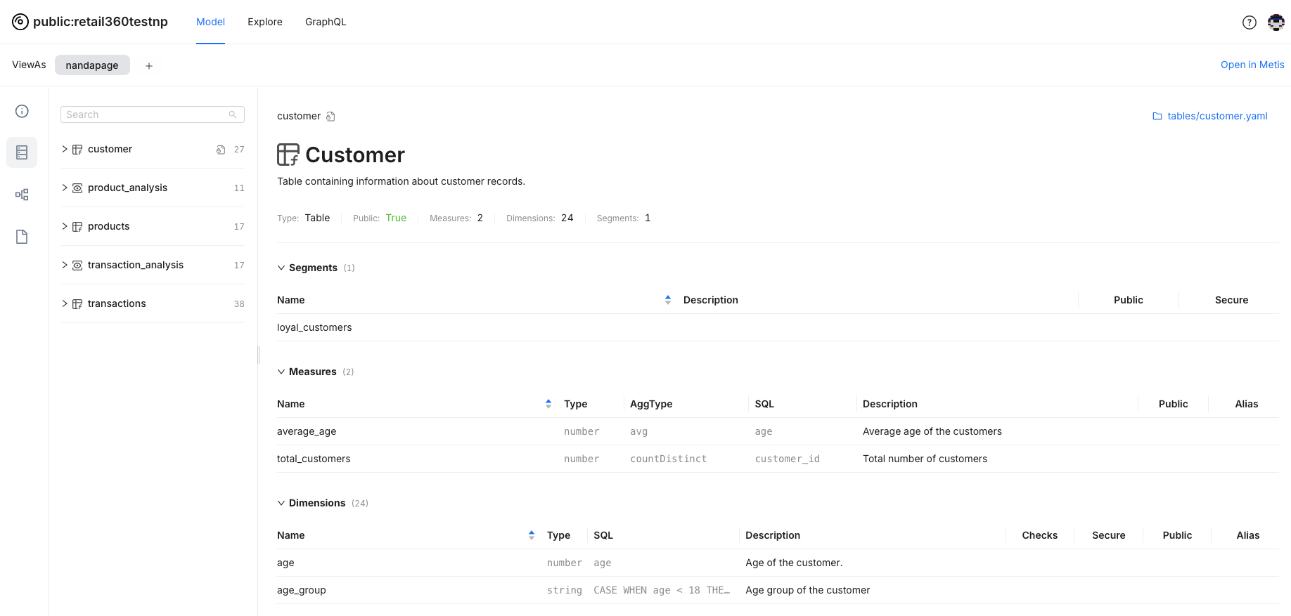
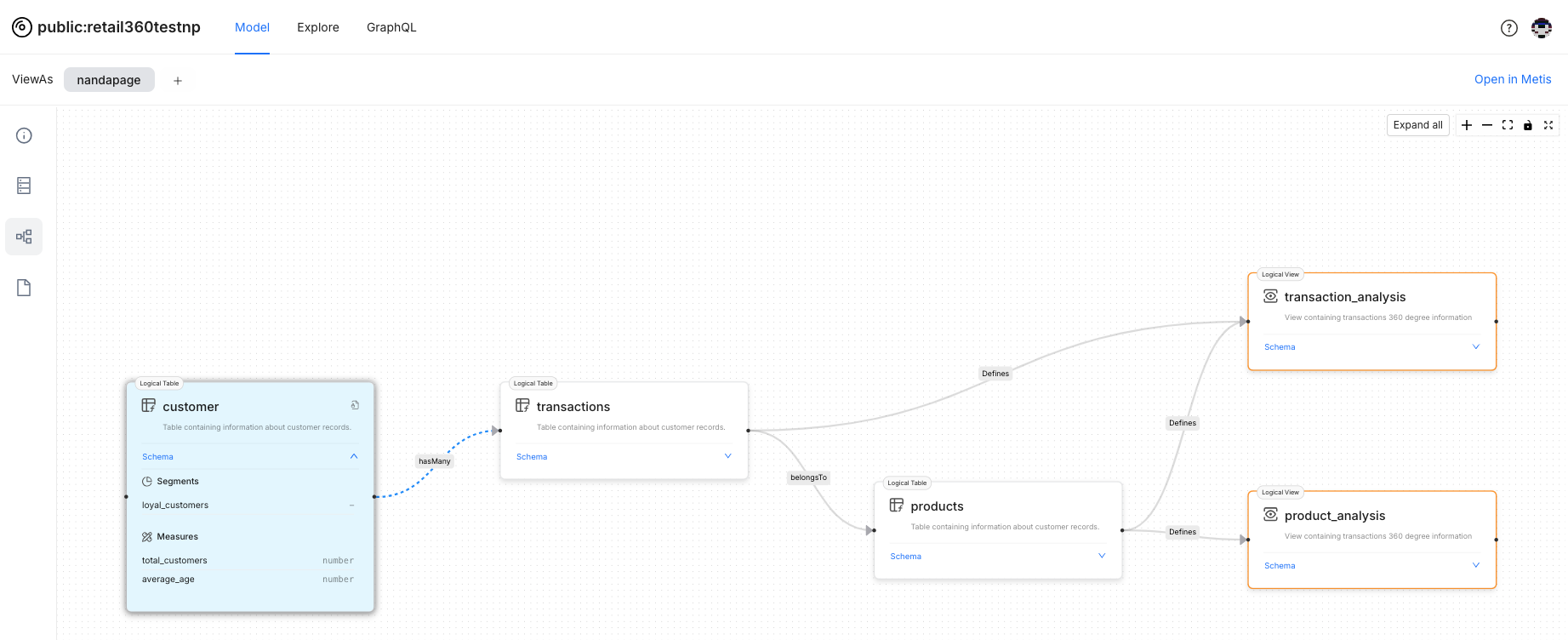
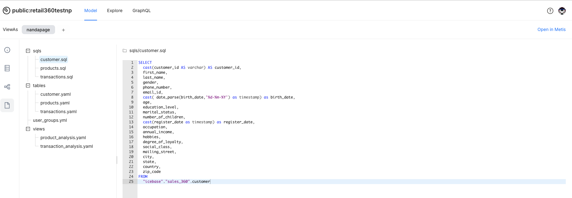
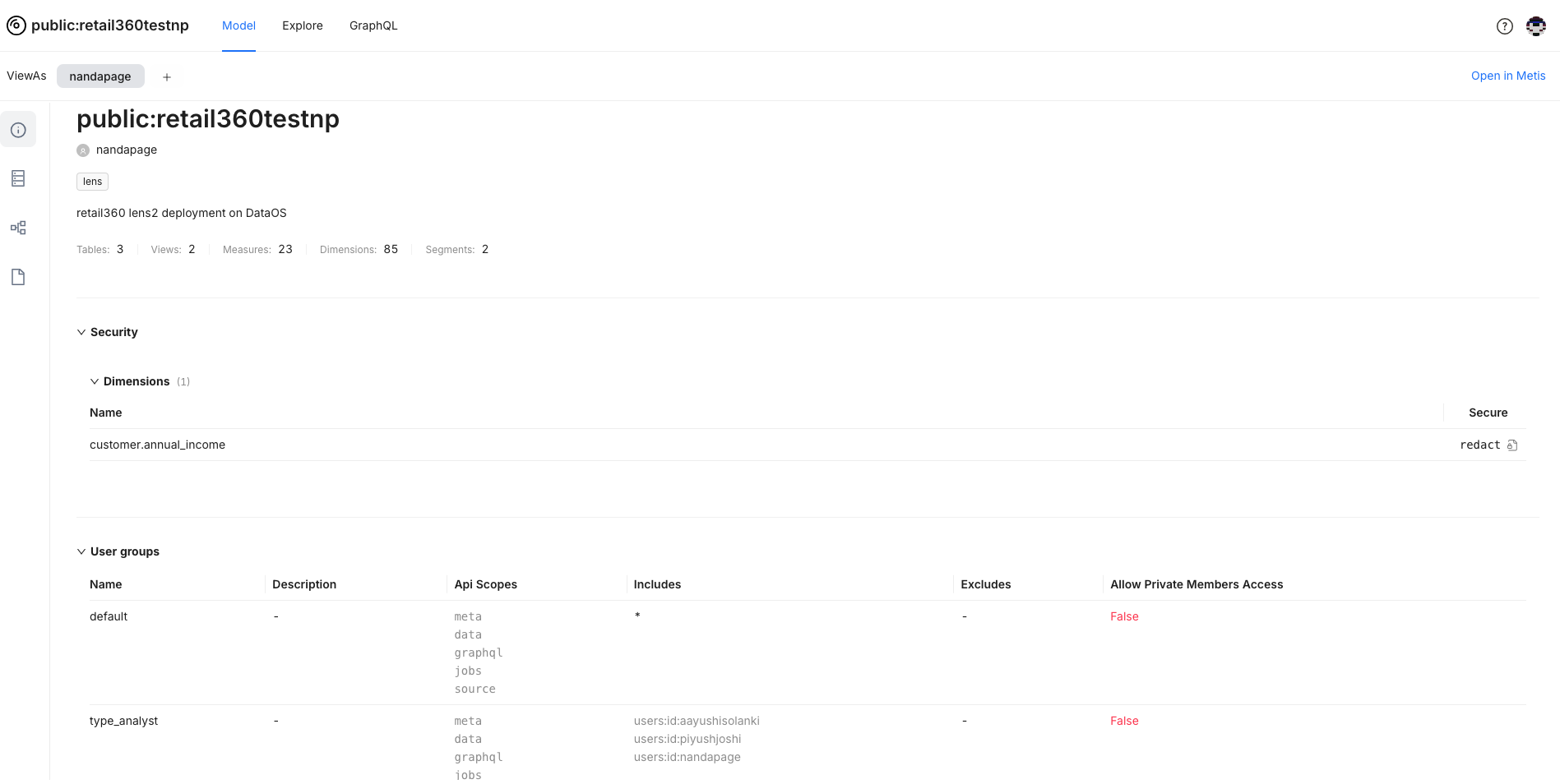
Understanding Your Data Model
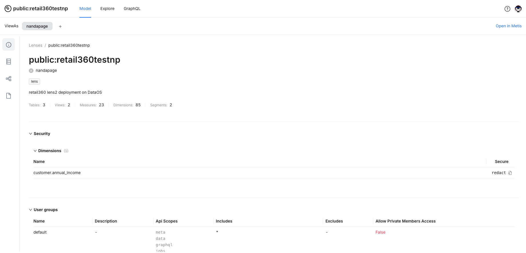
Go to the Model tab to explore the schema and fields.
-
Accessing Summary of Data Model: Get a high-level summary of your data model fields and access permissions.
-
Understanding Schema: View the details about the model schema- dimensions, measures, and segments defined in the logical table/view. You can also view the SQL snippet, which provides the logic for mapping to the physical table.
-
Examining Graph View of Data Model: View logical tables, business views, and their relationships for the data model. Click on any table or business view to see detailed information, such as the fields involved.
-
Viewing Manifest Files: Here, you will get the information on manifest files defined for logical tables and views.
Analyzing Data
Building and Running Queries
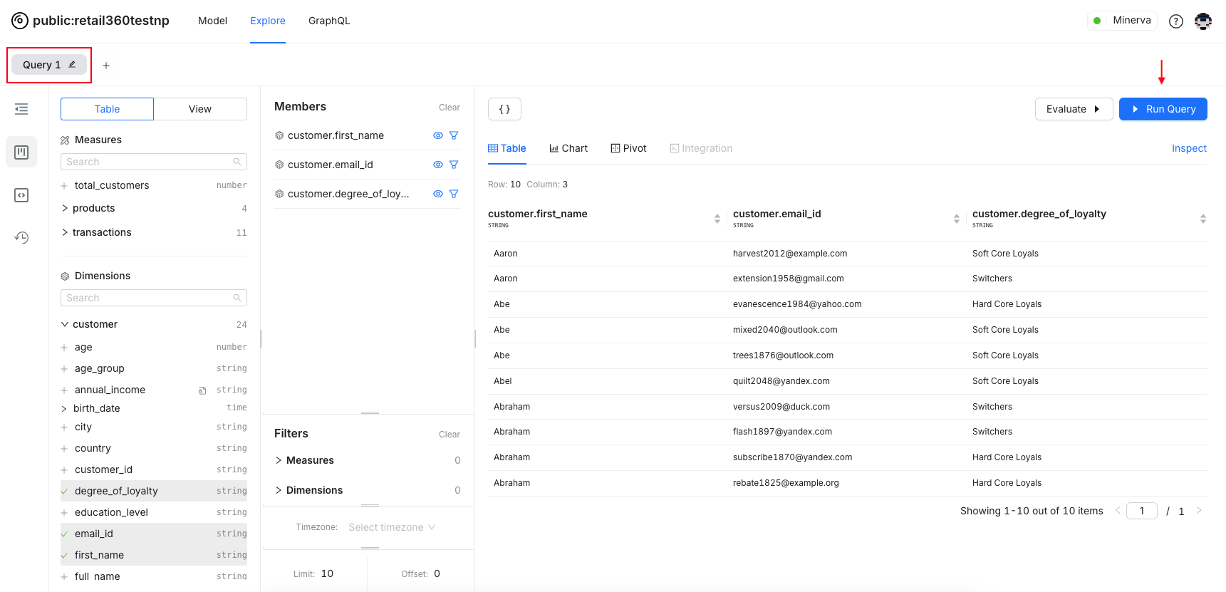
Mix and match dimensions and measures from your data model to create queries to extract meaningful insights.
-
Expand a table or view, then select the dimensions and measures needed for your analysis. Selected fields will be added to members.
-
You may use some dimensions and measures for filtering purposes but not want them to appear in the results. To hide these items from the query results, click the eye icon next to them.
-
To remove items from the member list entirely, hover over the item and click the minus (-) button.
-
Click the "Run Query" button to execute and view results.
-
You can rename this query by clicking the pencil icon. To build a new query, click the plus (+) sign.
Applying Filters
Apply filters and sorting to narrow down your data. Focus on the segments that matter and uncover those hidden insights. They help you to identify patterns and reveal relationships and insights. Example: Apply filters based on date ranges, categories, etc.
-
Here’s the query to analyze transaction revenues by product category and payment type. The relevant fields have been selected for the query.
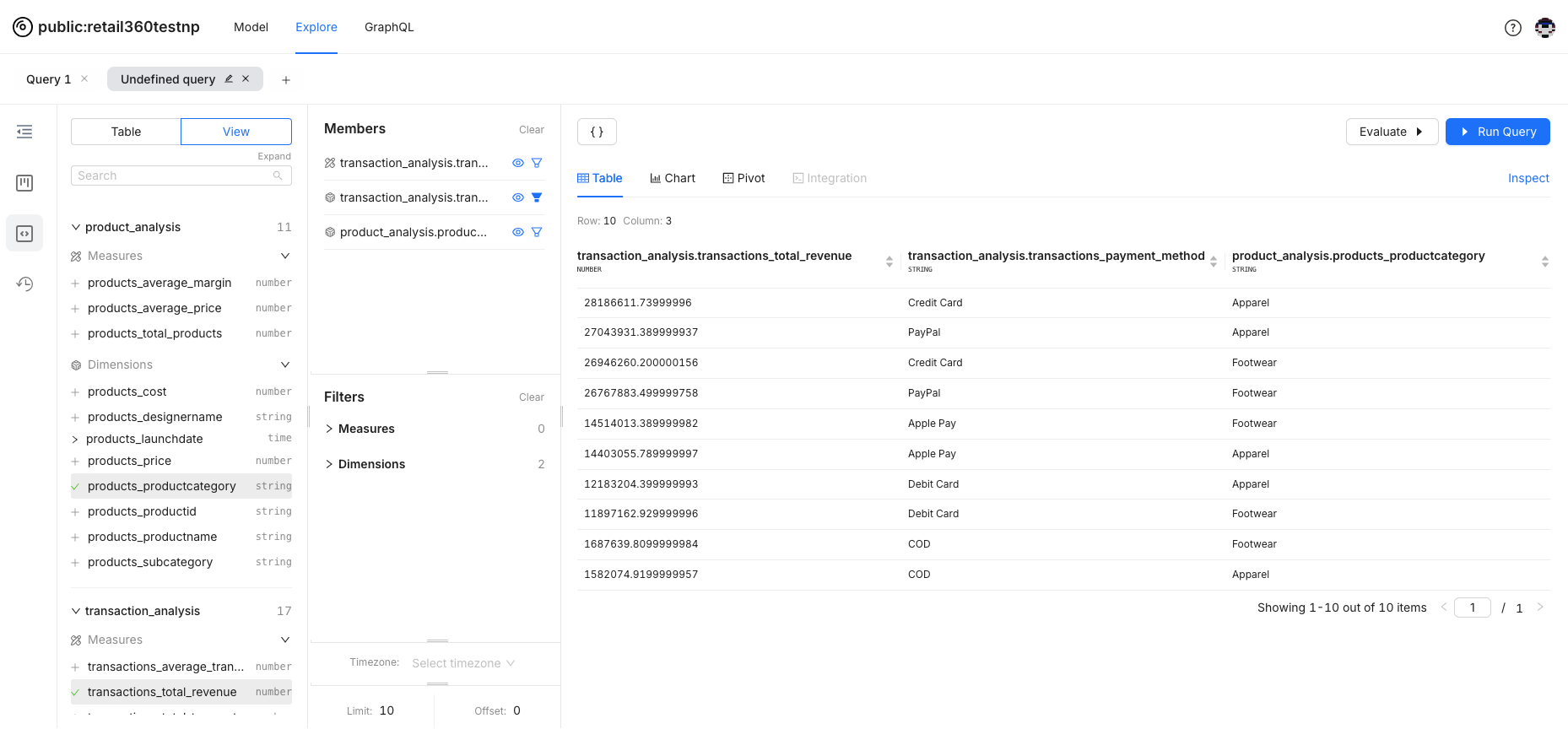
-
Suppose you want to focus on data for a specific payment method. Click the filter icon next to the relevant field to apply the filter.
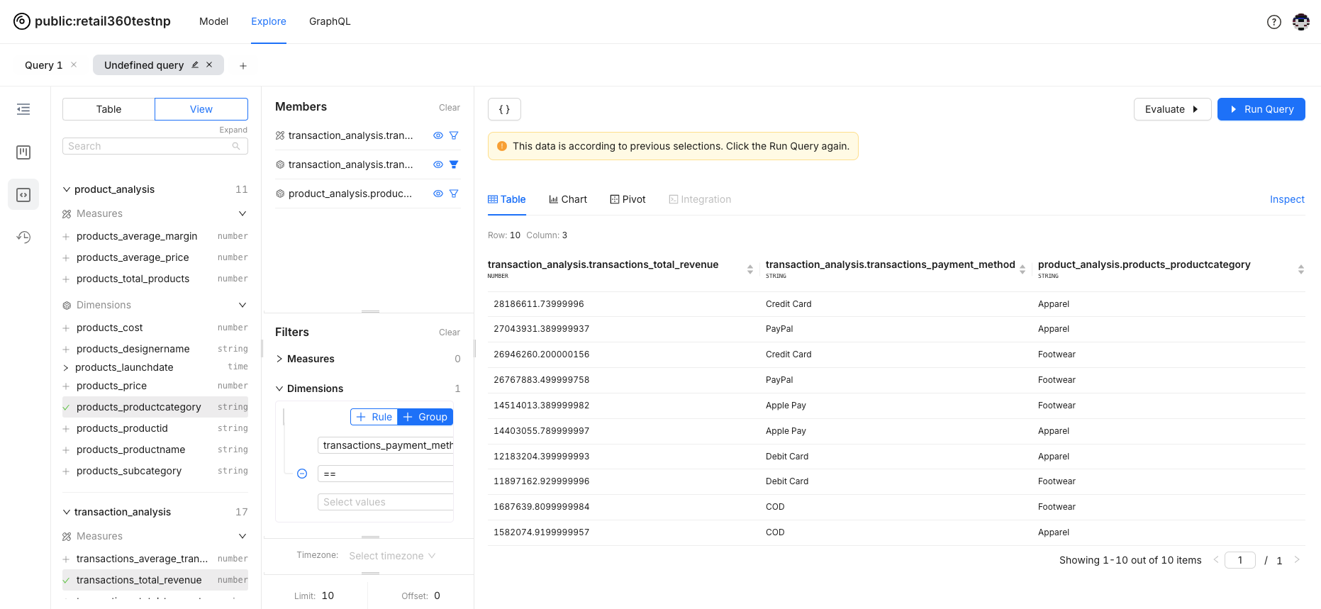
-
The field will appear in the filter panel, ready for you to apply filter criteria.

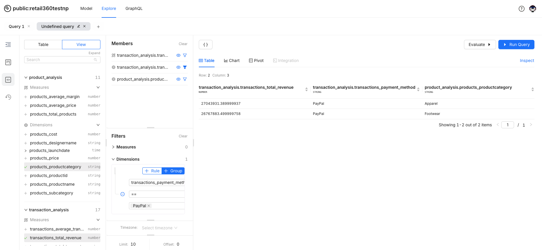
-
Set the criteria and run the query to view the filtered data in the results.
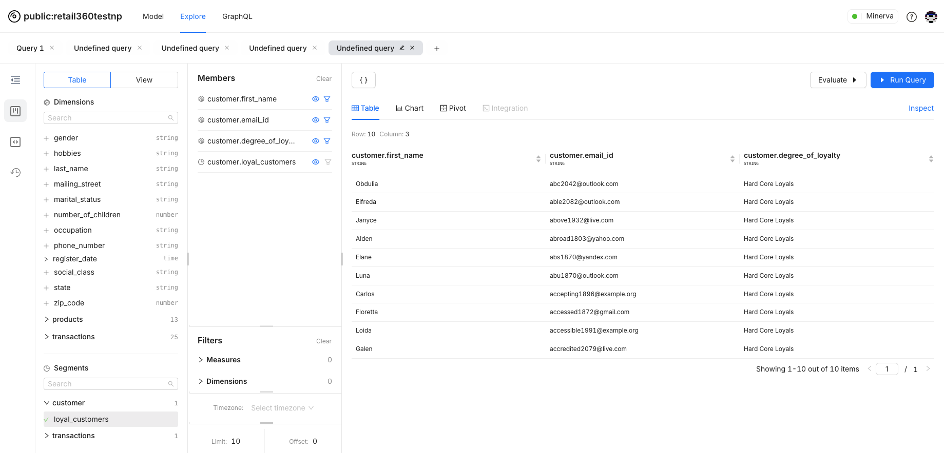
Segments for Targeted Data Analysis
Segments are like pre-set filters you create when setting up your business object’s manifest. Think of them as shortcuts to analyze by demographics, purchase behavior, and more.
-
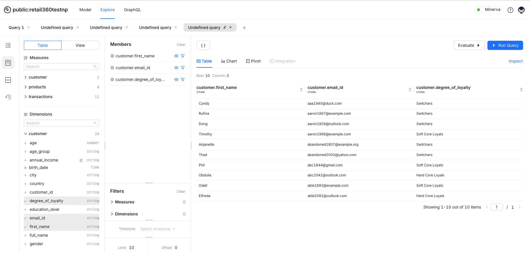
Suppose we're focusing on data for loyal customers, and we've already defined a loyal customer segment with the relevant filter criteria. You can apply this segment to filter the data. For demonstration, the query lists customers along with their loyalty status.
-
The loyal customers segment is defined in the Customer table. Drag and drop the segment to the members’ list.
-
Applying the loyal customer segment will filter the results to show only those customers. Simply Select segments to apply a predefined group filter.
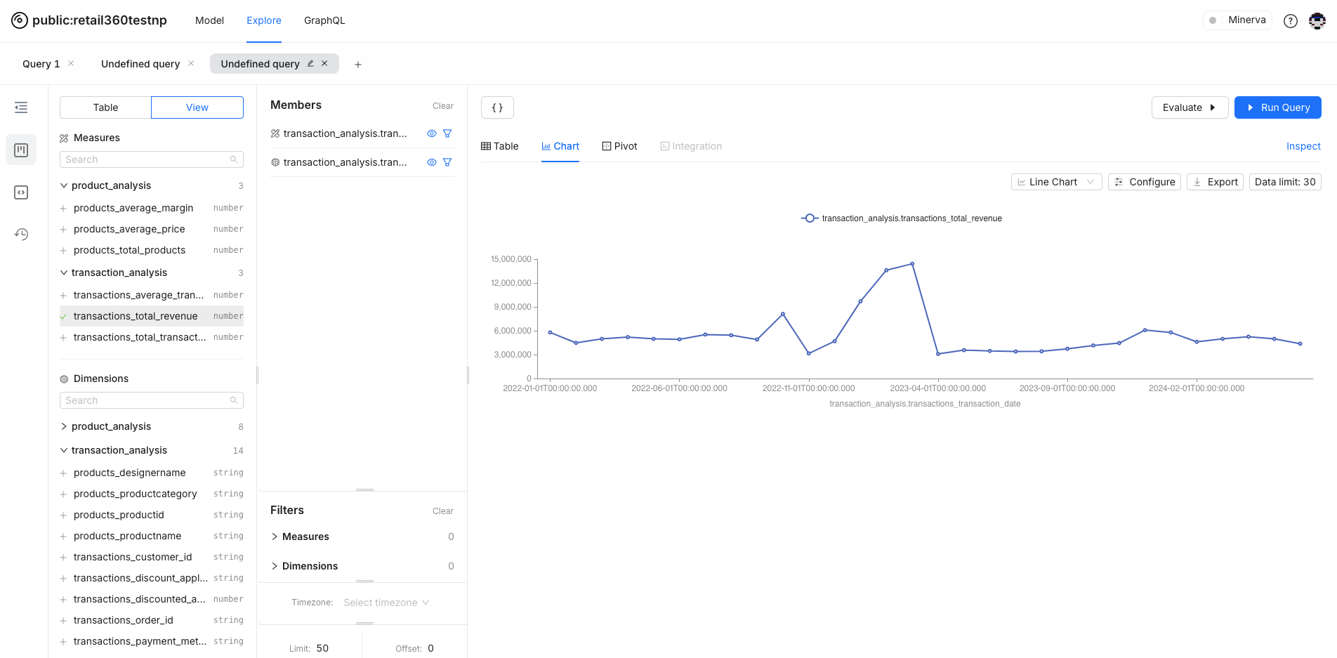
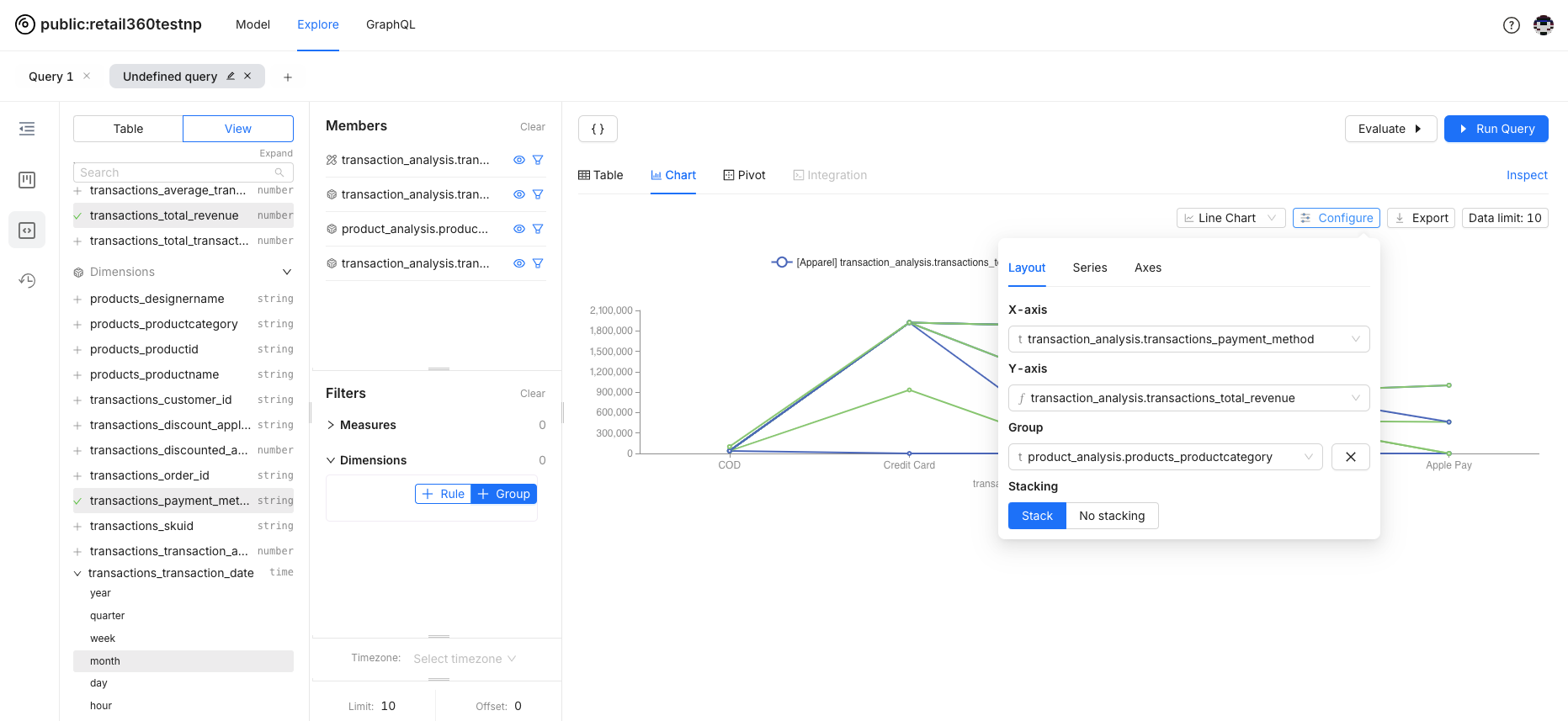
Visualizing Data
Switch between different views such as Table, Chart, and Pivot to visualize your data in the way that makes the most sense for your analysis.
- Once you run a query and select the Chart option, a default chart will be generated for your data.
-
You can select the chart type that best represents your data for analysis. For date-wise revenue analysis, a line graph is more suitable for visualizing trends over time.
-
You can configure the chart to meet your analysis requirements. In this example, additional fields are included for more granular level analysis. Data is grouped for the payment method.
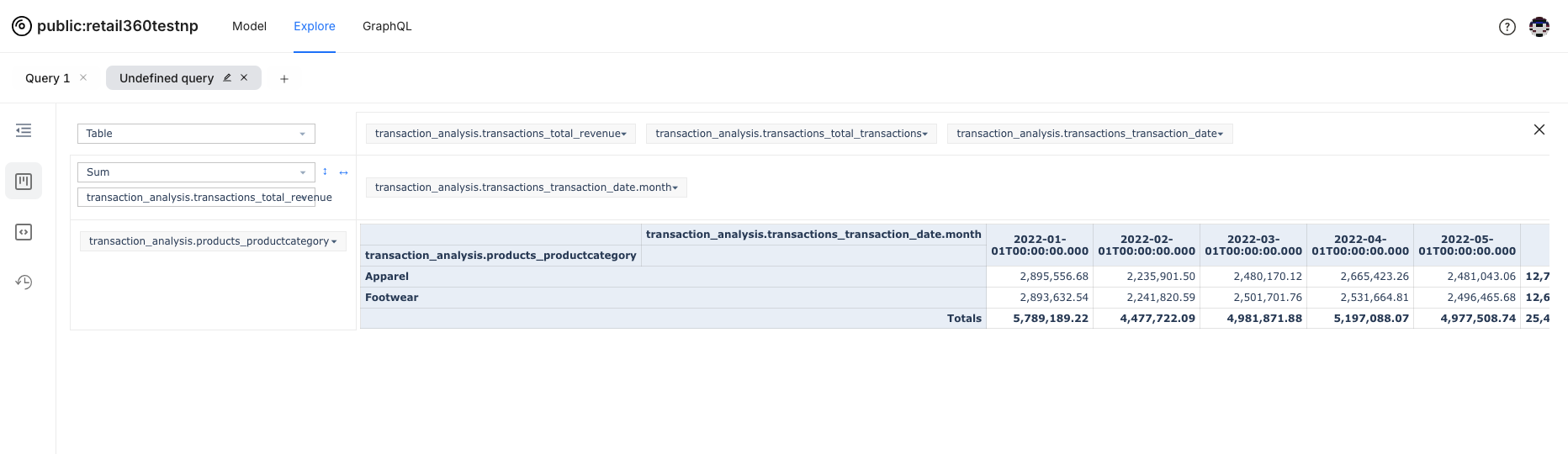
Data Aggregation and Rearrangement with Pivot Feature
The Pivot feature helps you transform and simplify your data dynamically. It turns complex datasets into clear, insightful summaries, making it easier to spot trends and patterns.
- After running a query, switch to the Pivot view from the visualization options. The data grid will adjust to allow for pivoting, where you can drag and drop different dimensions and measures.
-
Choose which dimensions and measures to display as rows and columns. For example, you might place "Product Categories" in rows and "Transaction revenue" in columns.
Accessing and Replaying Past Analyses
The History feature in Lens Studio allows you to track and revisit your past data exploration. Whether you want to review the steps you took to reach a particular insight or need to retrace your work, the History feature provides a chronological log of all your actions within the studio.
- To access History, navigate to the History tab from the side menu. The History panel will display a list of recent actions, queries, and data visualizations.
-
Click on any item in the history list to see the details of that action, including the specific filters, dimensions, and measures you used.
-
Run the query to restore your workspace to any previous state by selecting the desired entry in the history. This allows you to continue working from that point without having to manually redo your steps.
Data Protection Policies and Viewing User Groups
In the Lens model, data is safeguarded by robust policies that ensure sensitive information remains secure. These policies govern access control, determining who can view, or interact with specific data. They also define how data should be masked to prevent unauthorized access to sensitive details.
Masked Data
Data masking policies can be defined on dimensions and measures to protect sensitive information. Masked data is partially or fully hidden, depending on the policies in place:
- Masked data shows up with asterisks (like ***1234) or other placeholders, like redact, to keep sensitive information hidden.
- Only users with the appropriate permissions can view the full data.
Viewing User Groups
User groups are a way to organize users for managing access to various API scopes and easier application of data policies for different categories of users. Each user group specifies a set of users and their access controls. API scopes manage access to specific functionalities and endpoints. You can view the API scopes that user group members are permitted to access, with each scope representing particular endpoints or functionalities.
To control data visibility based on user groups, row filter policies can also be applied. When creating a Lens model, these policies are configured to regulate access to specific data.
In Lens Studio, go to Model tab. you can easily check the permissions associated with your Lens model and its data:
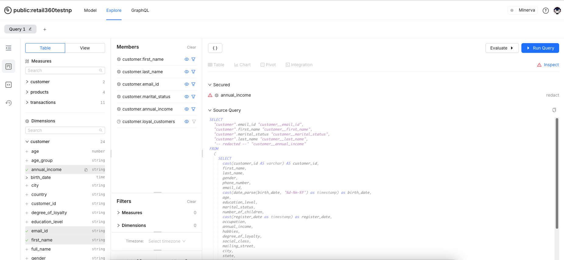
Masking Applied for the Data
With a masking policy applied to fields like income, the corresponding data in the query results will be redacted. You can notice the red triangle to denote that the masking policy applied.
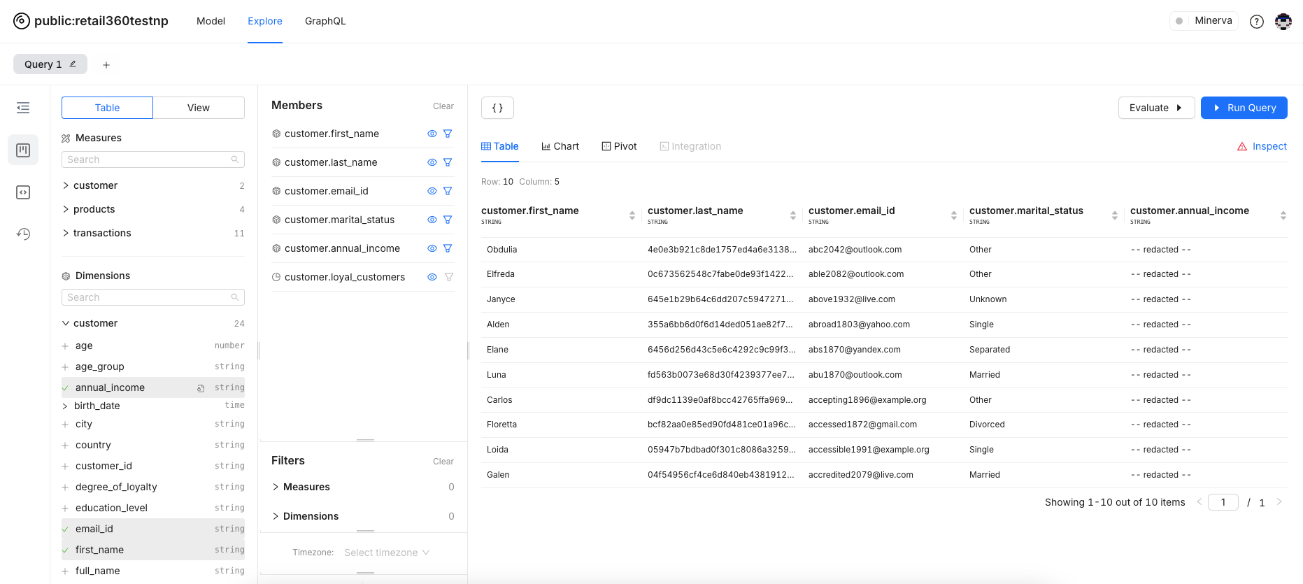
Click on the Inspect button. This is what the query looks like: