Arranging and Transforming Data with Pivot
Information
This guide introduces the Pivot feature in DataOS Workbench, a powerful tool designed to simplify data rearrangement and transformation tasks. Users can analyze datasets from different perspectives without the need for manual SQL statements, enhancing their data analysis capabilities.
The Pivot feature in DataOS Workbench is a powerful tool for rearranging and transforming data. It allows users to analyze datasets from different perspectives easily, and this intuitive interface eliminates the need for manual SQL statements for pivoting operations.
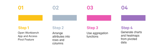
Key Steps
Here are the essential steps to use the Pivot feature:
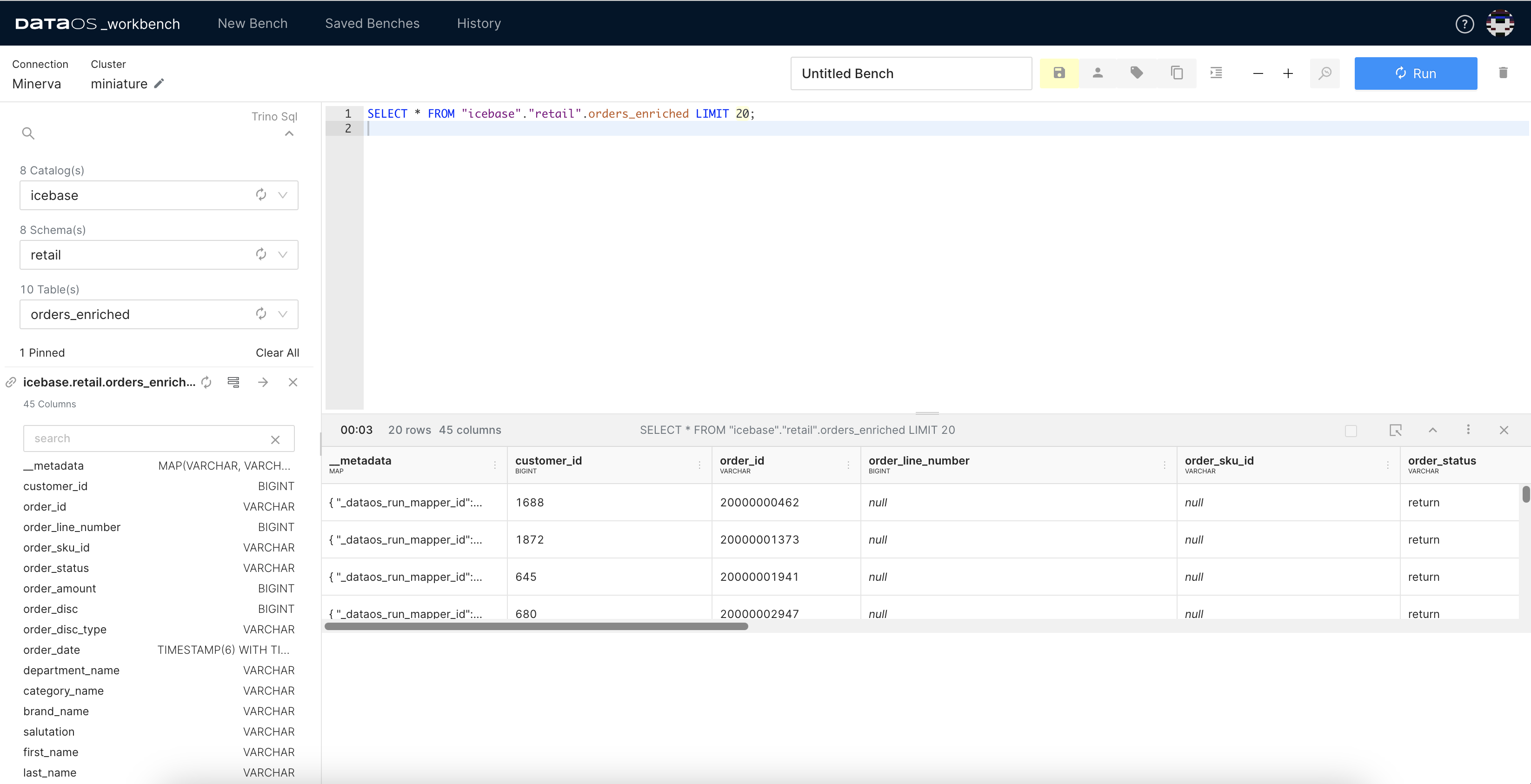
Step 1: Open Workbench App and Access Pivot Feature
-
Start Workbench App from DataOS Home and select the catalog, schema, and desired table.
-
Write your query. Let us run a query to analyze customer preferences for a retail store.
-
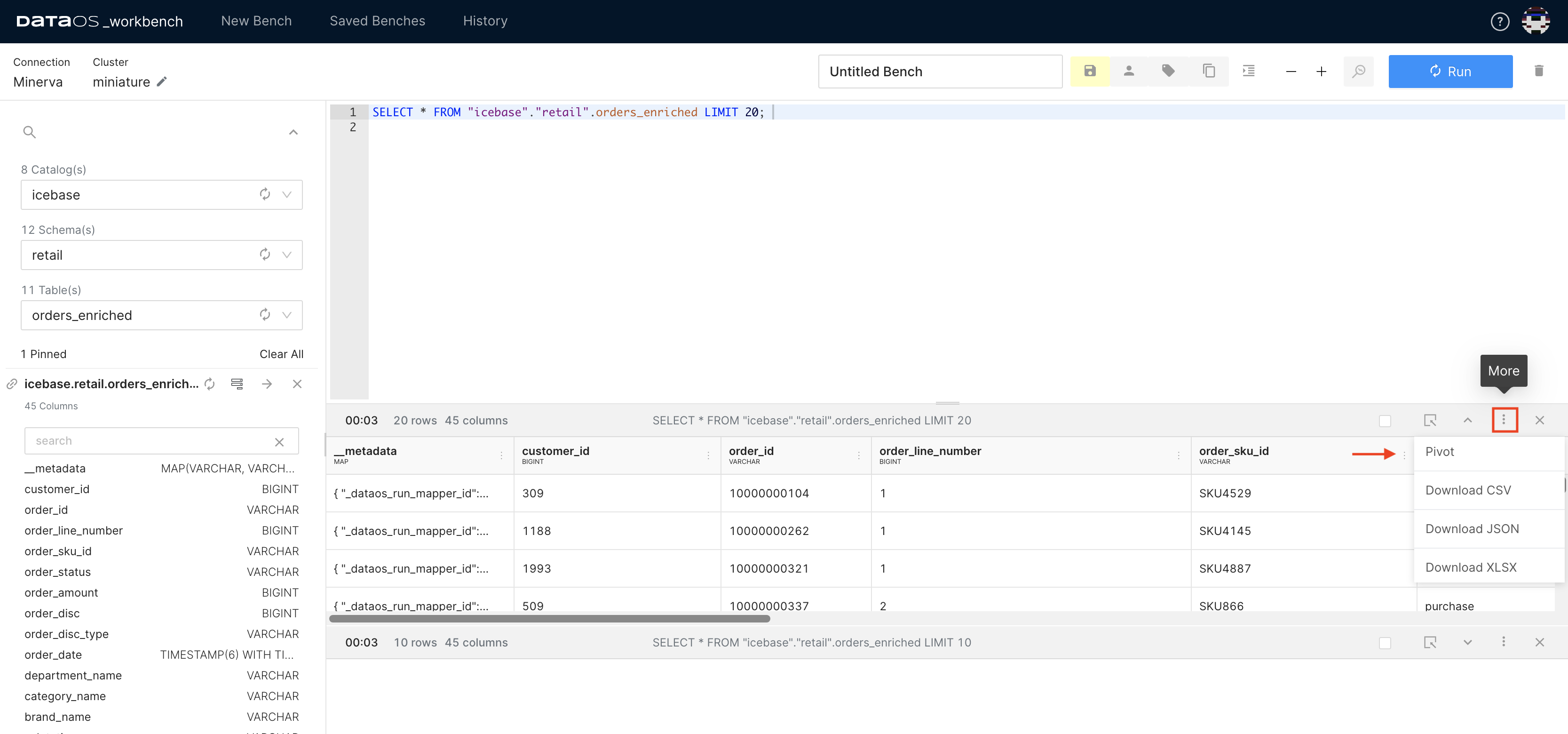
In the query result window, click on the three dots for "More" options.
-
Select "Pivot" from the dropdown menu. A new pop-up window will appear. This window displays all available columns where at least one row does not contain null values.
Step 2: Arrange Attributes into Rows and Columns
-
Pick and drag attributes from the list.
-
Drop them into the empty space to define row and column values for a new table or dataset.
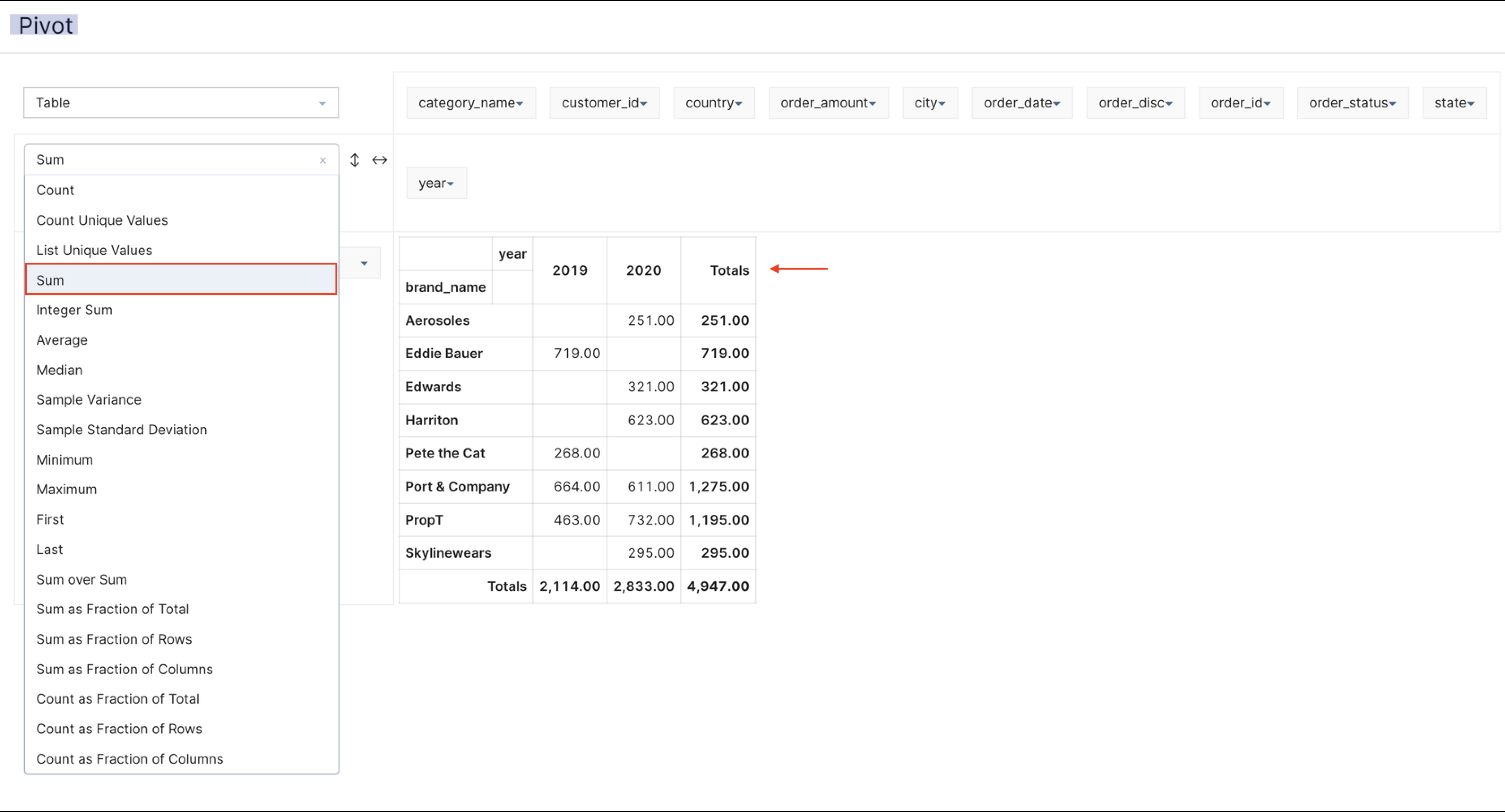
Example Scenario: To illustrate the above steps, we will compare year-over-year brand performance. In this case, you can simply:
- Drag the "brandname" attribute to the rows section.
- Drag the "year" attribute to the columns section.
Each unique brand name will populate its row, while each year will form a separate column.
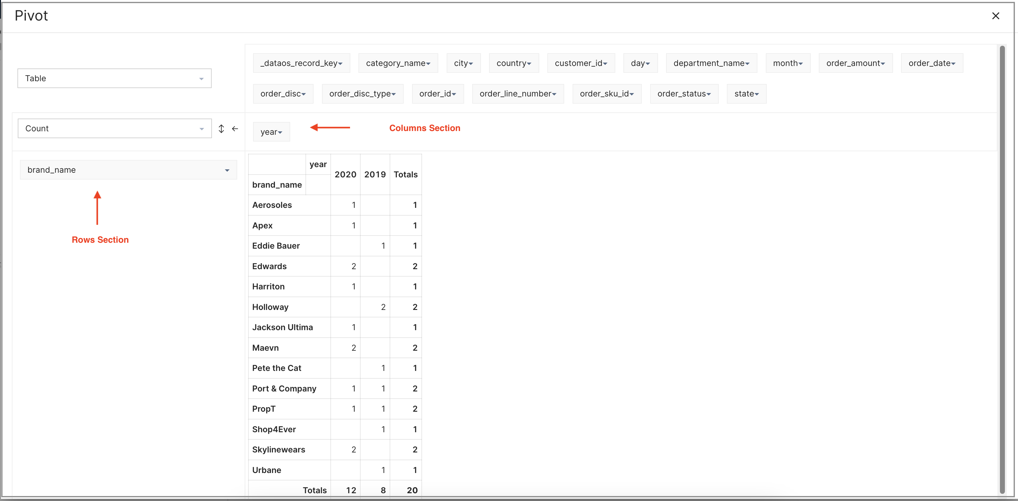
Step 3: Use Aggregation Functions
You can perform aggregations and other advanced operations within the Pivot interface to analyze and interpret data effectively.
For the above example, apply the SUM function for aggregation.
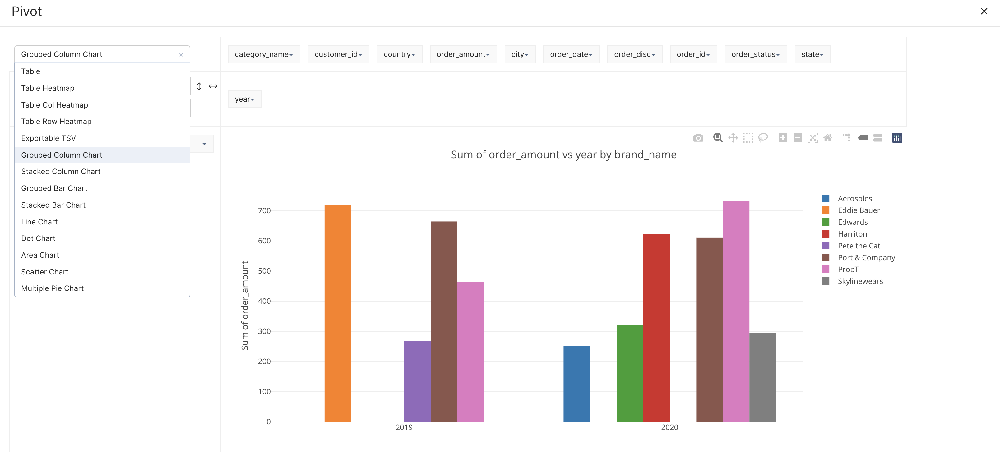
Step 4: Generate Charts and Heatmaps from Pivoted Data
The Pivot feature offers the ability to create charts and heatmaps directly from the pivoted dataset, providing users with visual representations of their data. Select the chart from the drop-down menu that appropriately present the insights visually.
By offering a user-friendly interface with drag-and-drop functionality and advanced features such as chart creation and aggregations, Pivot enhances the data analysis capabilities of DataOS Workbench users.