Creating a Dashboard with LQL (Lens 1.0)
Information
This guide will teach you how to create charts and dashboards in the Navigator using datasets generated through Lens Query Language. It provides a step-by-step process to help you turn your lens findings into impactful visual insights.
Let's visualize our data. We're all set to kickstart this endeavor using the Navigator application within DataOS. It is our primary tool for exploring insights and is built on Apache Superset.
Navigator operates on "Datasets". This means we'll need to create a Dataset powered by the LQL (Lens Query Language) that we will copy from the Lens View (created while exploring our data and finding answers to the analytical questions). This dataset will serve as the foundation for our visualization. We will create the required visualization/chart from this dataset and add it to a dashboard, named- Sales Performance Dashboard. This dashboard is crafted to empower decision-makers by offering a clear and interactive view of sales performance for a sports retail store utilizing multiple tabs.
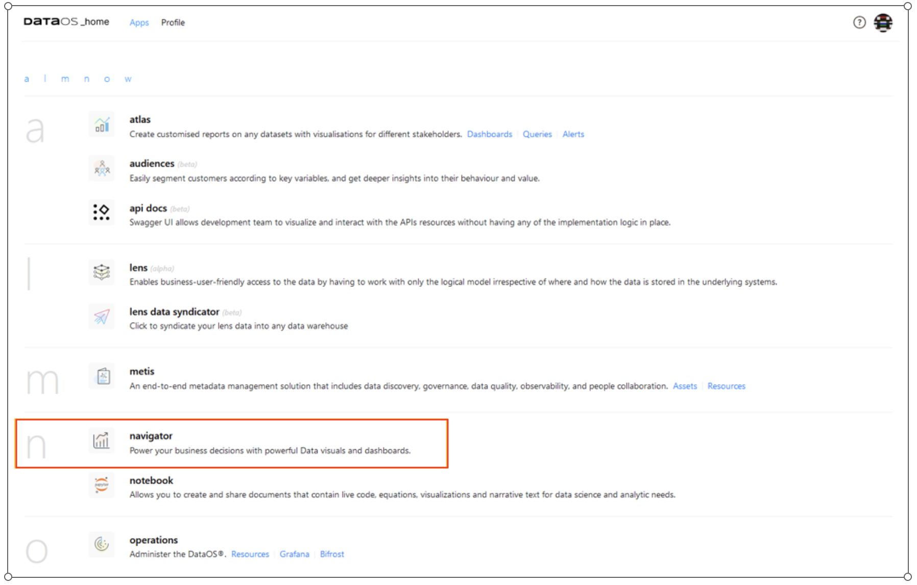
Launching Navigator App
To get started, head over to the Navigator application directly from the DataOS home page.
Creating Dashboards
Before we can dive into our visualization, there are a couple of steps we need to follow.
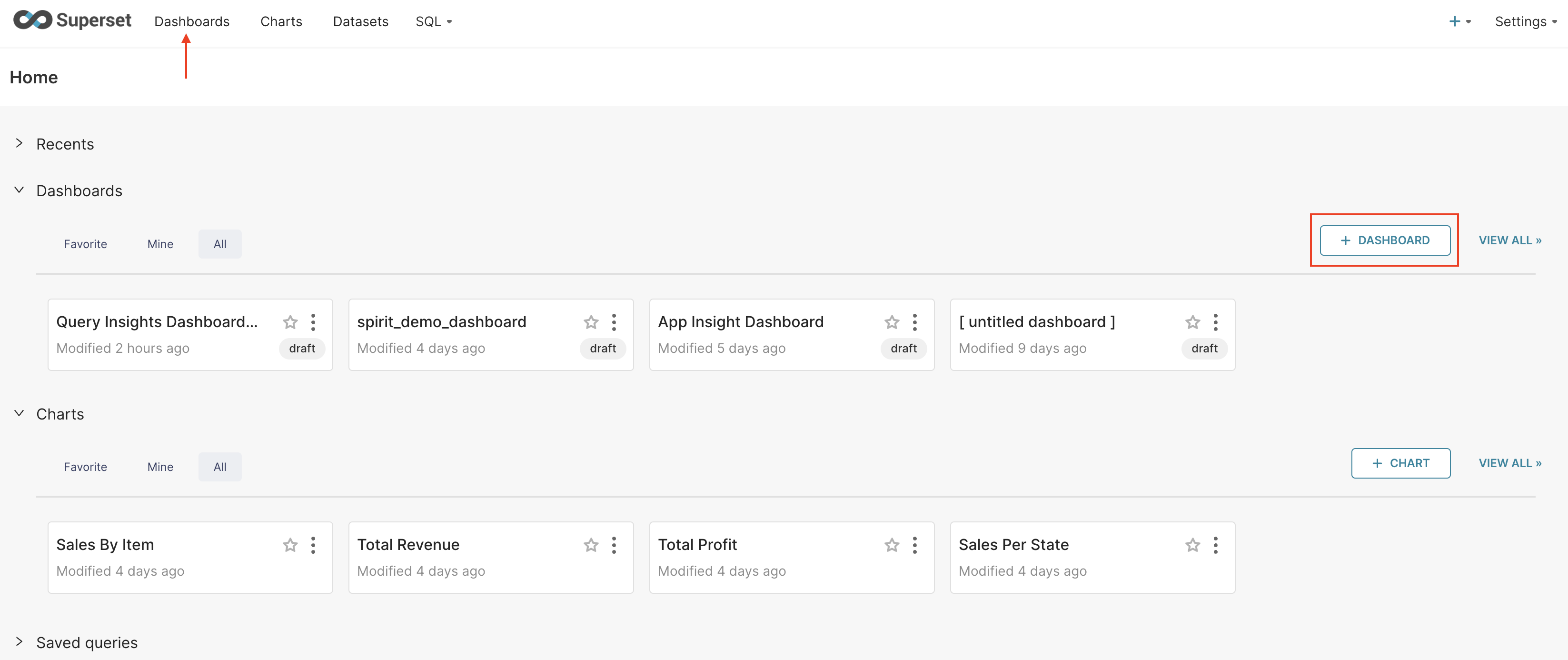
Let's create a blank Dashboard before we start.
-
Navigate to the "Dashboards" tab. Click the "+Dashboard" button.
-
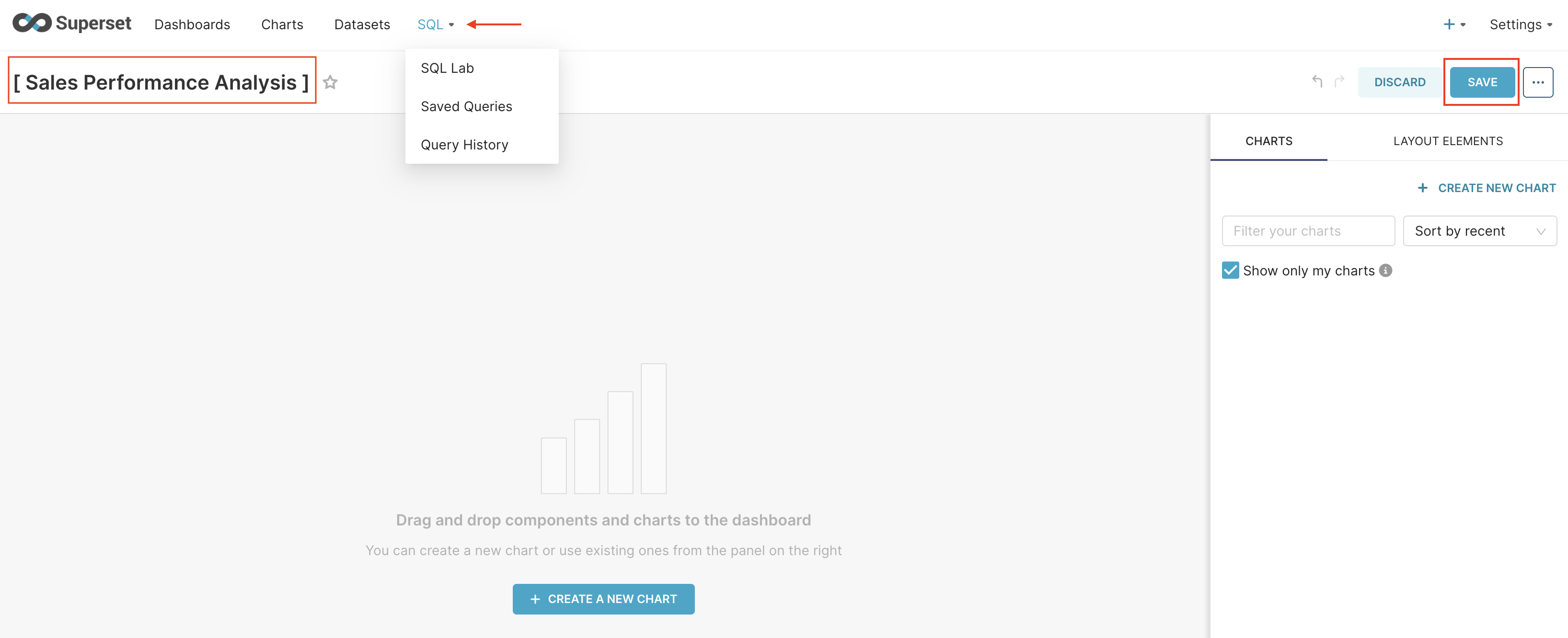
You'll now have a new dashboard with the title [untitled dashboard]. Let's rename it to "Sales Performance Analysis”. Don't forget to click on the "Save" button to ensure your changes are preserved.
Navigating to SQL Lab
Selecting the SQL tab at the navigation bar and choosing the SQL Lab in Superset will redirect you to the query interface. Here, you can write your queries and explore your data with efficiency.
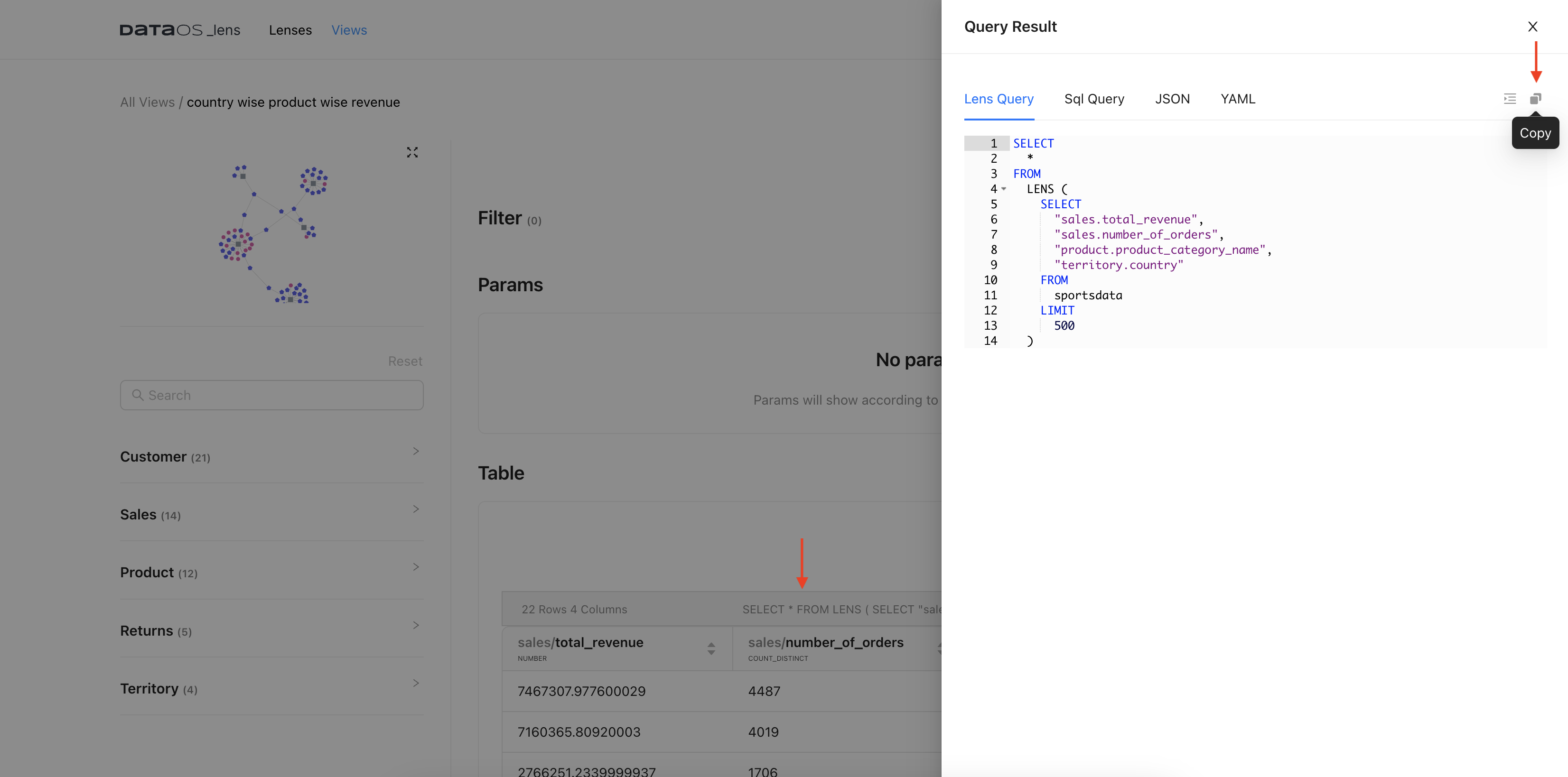
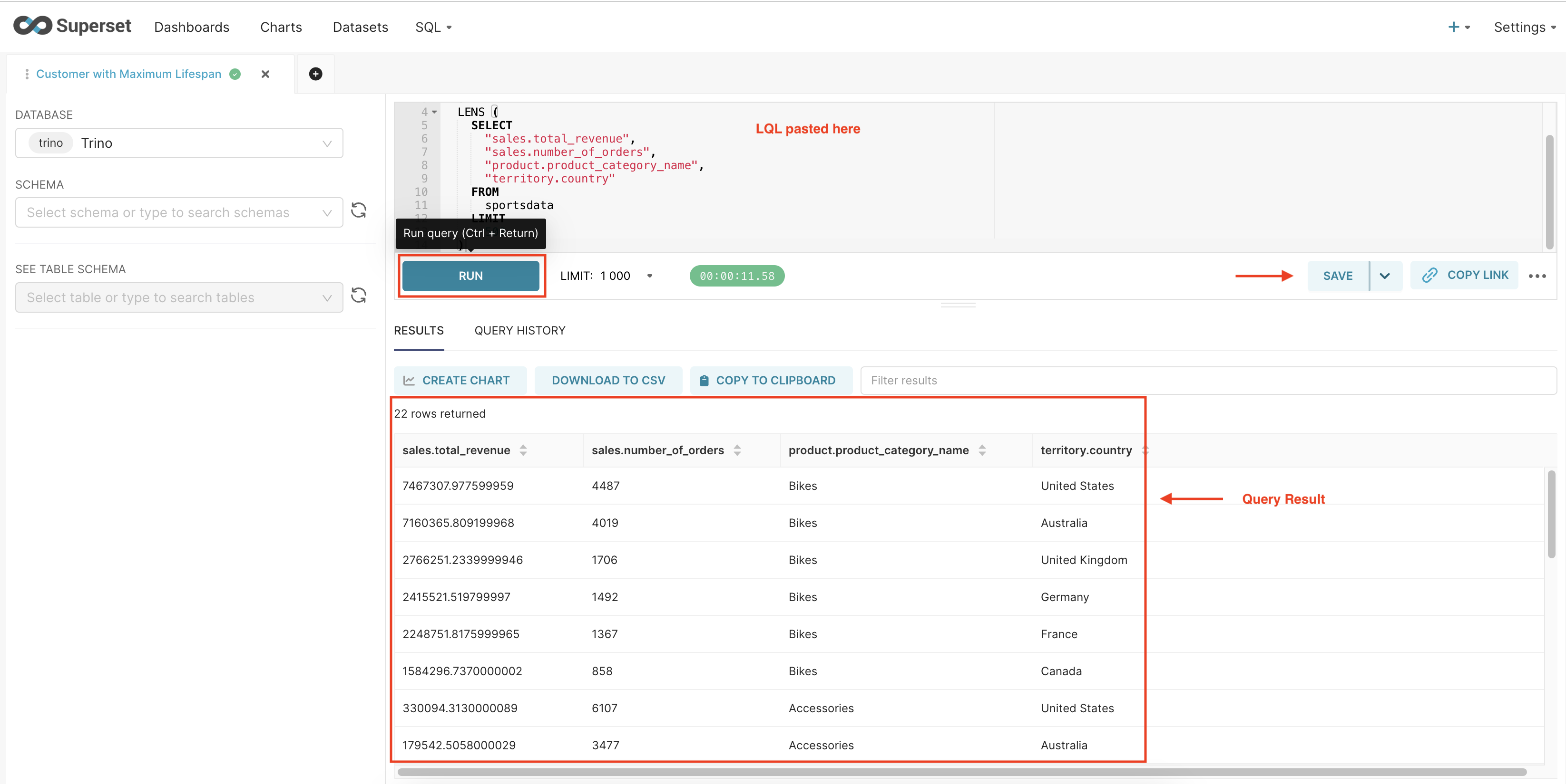
Let's go back to the Lens View that we saved and copy the LQL as shown below.
- Click the query statement above your table.
-
Click on the Copy button at the top right of the LQL.
-
To Create our Dataset, let's paste our LQL into SQL Lab.
-
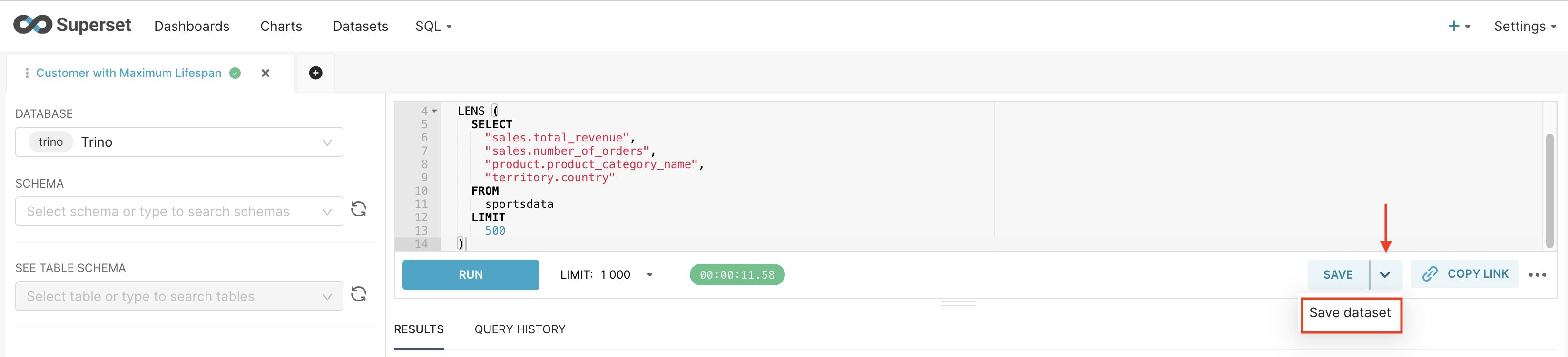
Click Run. This action will execute the query, and you should see the query results returned promptly. ****
-
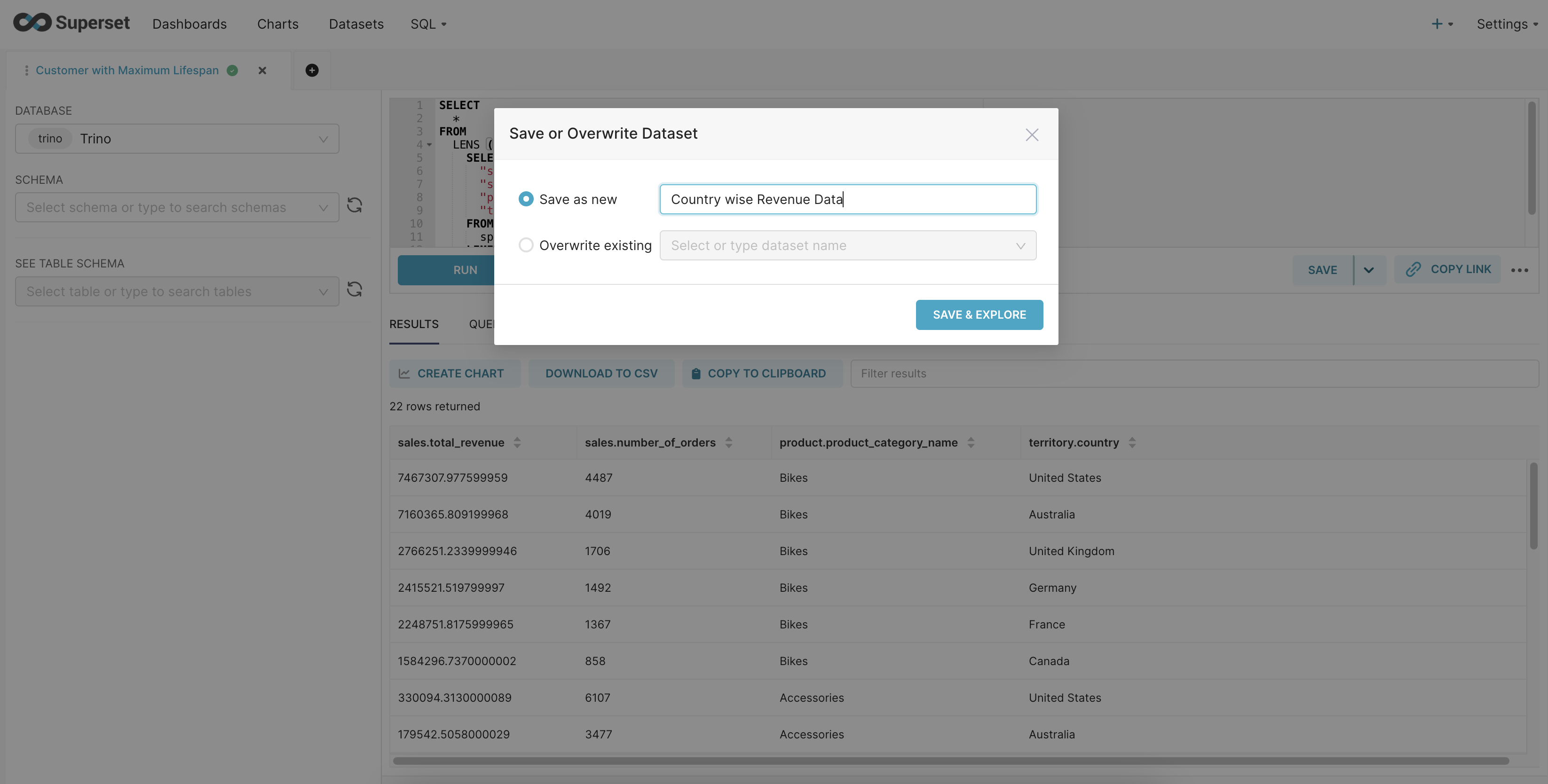
Now click on Save dataset.
-
We will save it as new and give it a name. Let’s call this "Country wise Revenue Data”
-
Then click on "Save & Explore".
Select and aggregate metrics
- Drag the variables that we want to aggregate into the "Metrics" Pane
- Select your aggregation function.
- Click on the pencil to rename metrics names to make them clearer to the end user.
Save and Add
Let's save this chart and add it to our dashboard.
- Edit the name.
- Click Save.
- Select the dashboard you wish to add it to from the drop-down.
- Select "Save" in the "Save Chart" Pop-up.
Repeat the process for the rest of the LQL for the analysis.
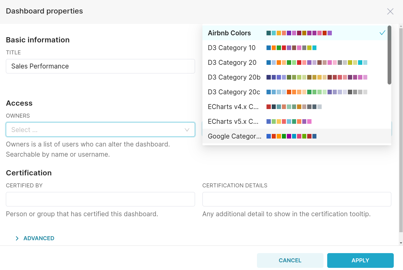
Customizing the Dashboard
-
Change the default color scheme to the "Airbnb color scheme" for a visually appealing theme.
-
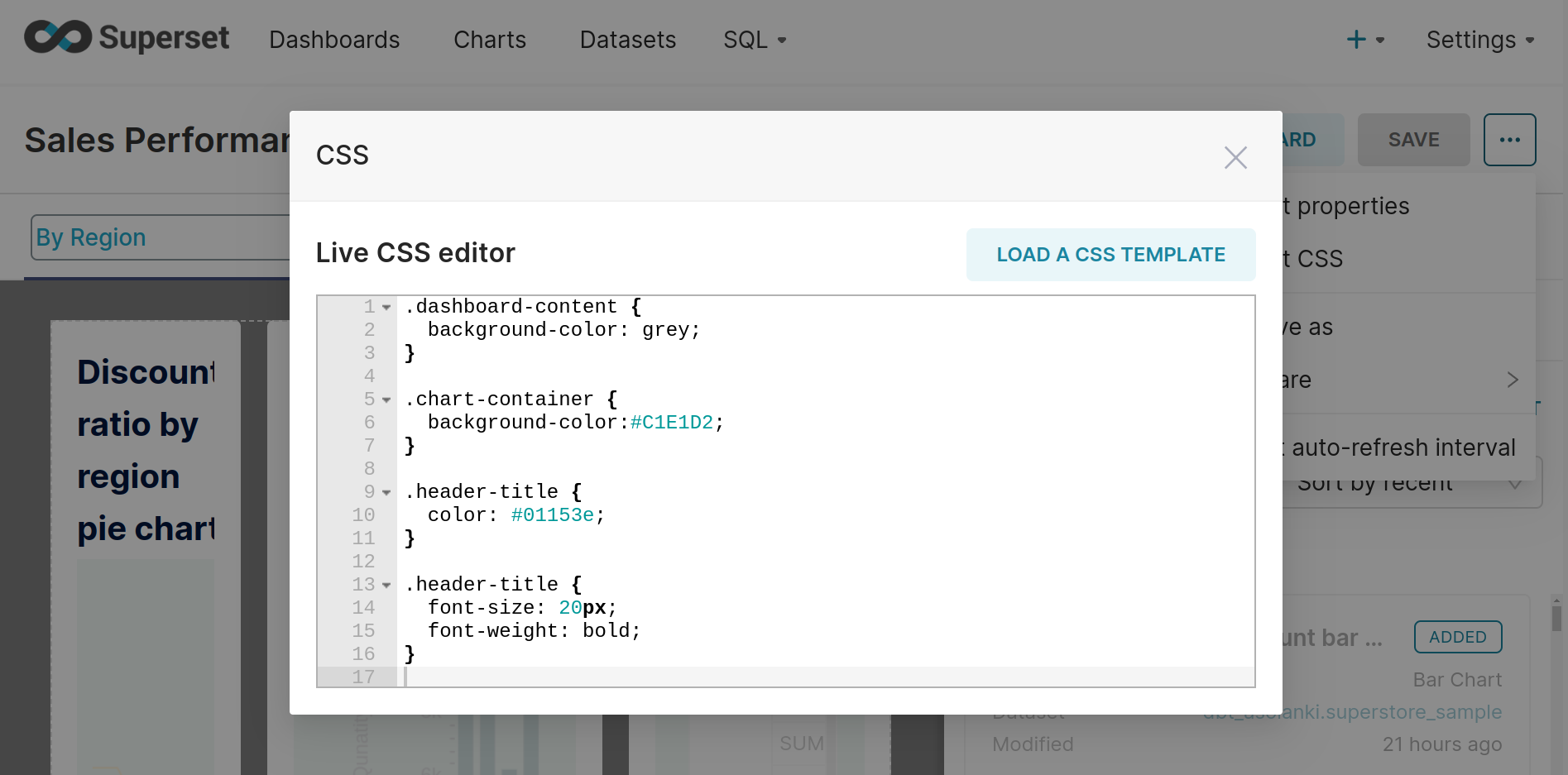
Use the CSS editor to customize the dashboard:
- Change the background color of the entire dashboard.
- Adjust the background color of each chart individually.
- Modify the color and size of each chart's title.
Add tabs and create few more charts and add them to dashboards.