Exploration of Semantic Model
Overview
Learn how to explore and understand a Data Product’s semantic model in DataOS using Studio. This helps you connect data structure with business goals.
📘 Scenario
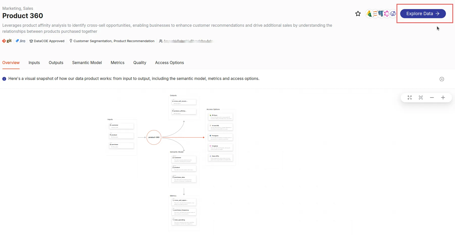
Imagine you’re a data analyst and want to analyze data product 'Product Affinity', aiming to leverage data insights for performance tracking and customer behavior analysis. By exploring its semantic model on Data Product Hub, you plan to access and analyze cross-sell and upsell opportunities, which involves examining dimensions, measures, and metrics like customer_segments, product affinity scores,and total spending.
Quick concepts
'Lens' is a key DataOS Resource in creating and implementing semantic models. Here’s what makes them powerful:
-
Physical data sources
Semantic models connect to a variety of physical data sources, such as Postgres, BigQuery, and Redshift. Knowing the origin helps you understand how the semantic model organizes it into logical structures. -
Lakehouse (Optional)
For large datasets, you may unify data from multiple sources, making it easier to manage and query data. Consider storing the aggregated data to Lakehouse, a managed storage architecture that blends the strengths of both data lakes and data warehouses. -
Logical tables
A semantic model maps physical data (from data sources or Lakehouse) to logical tables establishing relationships between data entities—making your work faster and clearer. -
Table properties
When creating logical tables, SQL and key properties like schema, data types, and constraints are specified. -
Data quality and transformation
Semantic models incorporate tools for ensuring high data quality and transforming raw data into user-friendly formats. By maintaining accuracy, consistency, and reliability, semantic models ensure that the data is ready for exploration. -
Metrics
Semantic models define meaningful metrics to track performance or key business indicators. -
Consumption ports
Semantic models enable versatile data consumption options, such as BI tools and APIs for seamless integration with GraphQL and Studio for advanced analytics.
Uncover insights from Semantic Model
Exploring semantic models allows you to understand the data flow, relationships within the data, and the transformations that drive insights.
Navigate to the ‘Explore’ option
-
On the Data Product details pageand click 'Explore' to navigate to the Studio in the Data Product Hub.
-
You'll land in the Explore view with tabs: Studio, Model, and GraphQL.
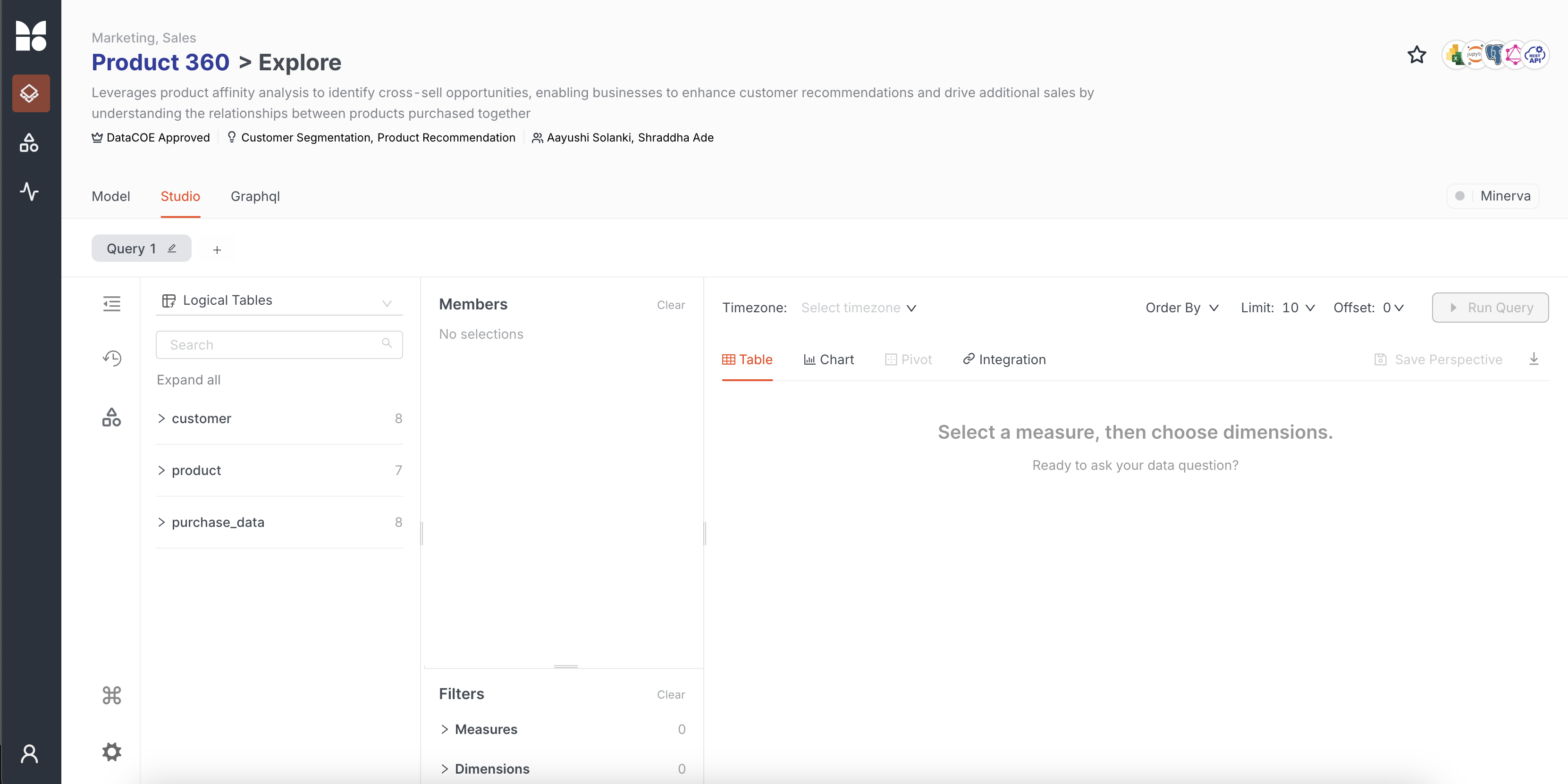
Before exploring data via the semantic model in Studio, let us understand the model fully.
Access model to unpack data structure
You first decide to explore the Model. As you open the Model tab, you start exploring the structure of the Data Product, gaining insights into the connections and dependencies across datasets.
Visualize connections in Graph view
The Graph view offers a visual representation of the 'Product Affinity' semantic model, showcasing how logical tables and entities are interconnected, with key metrics highlighting their relationships.
Explore entities like Customer, Product, and Purchase Data along with key metrics like cross_sell_opportunity, total_spending, and purchase_frequency. Metrics marked with a wave icon are derived from logical tables, showing their role in performance tracking. For example, cross_sell_opportunity_score is created using members from the purchase and product tables, while purchase_history and total_spending are built using dimensions and measures from these logical tables.
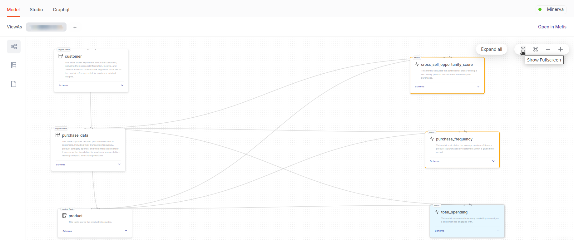
Click 'Show Fullscreen' to explore the model easily. Then, use 'Expand All' to view all measures, dimensions, entities, and metrics for detailed insights.
To examine the members of a single metric, say total_spending. You hover over it and get the names of the dimensions and measures taken from purchase_data and the product table represented by the blue dashed line. The blue dashed lines highlight which dimensions and measures from the tables are utilized to calculate the metric. This referencing adopts a naming convention where each measure or dimension is prefixed with its table name, like purchase_total_spend. This convention and visual representation make it easy to understand the relationships and dependencies within the data model.
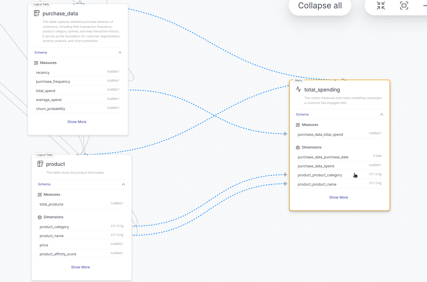
You click on a metric, say cross_sell_oppurtunity_score, which opens a side panel detailing all measures, segments, and dimensions within it. You can see each attribute's data type (numeric, string, date).
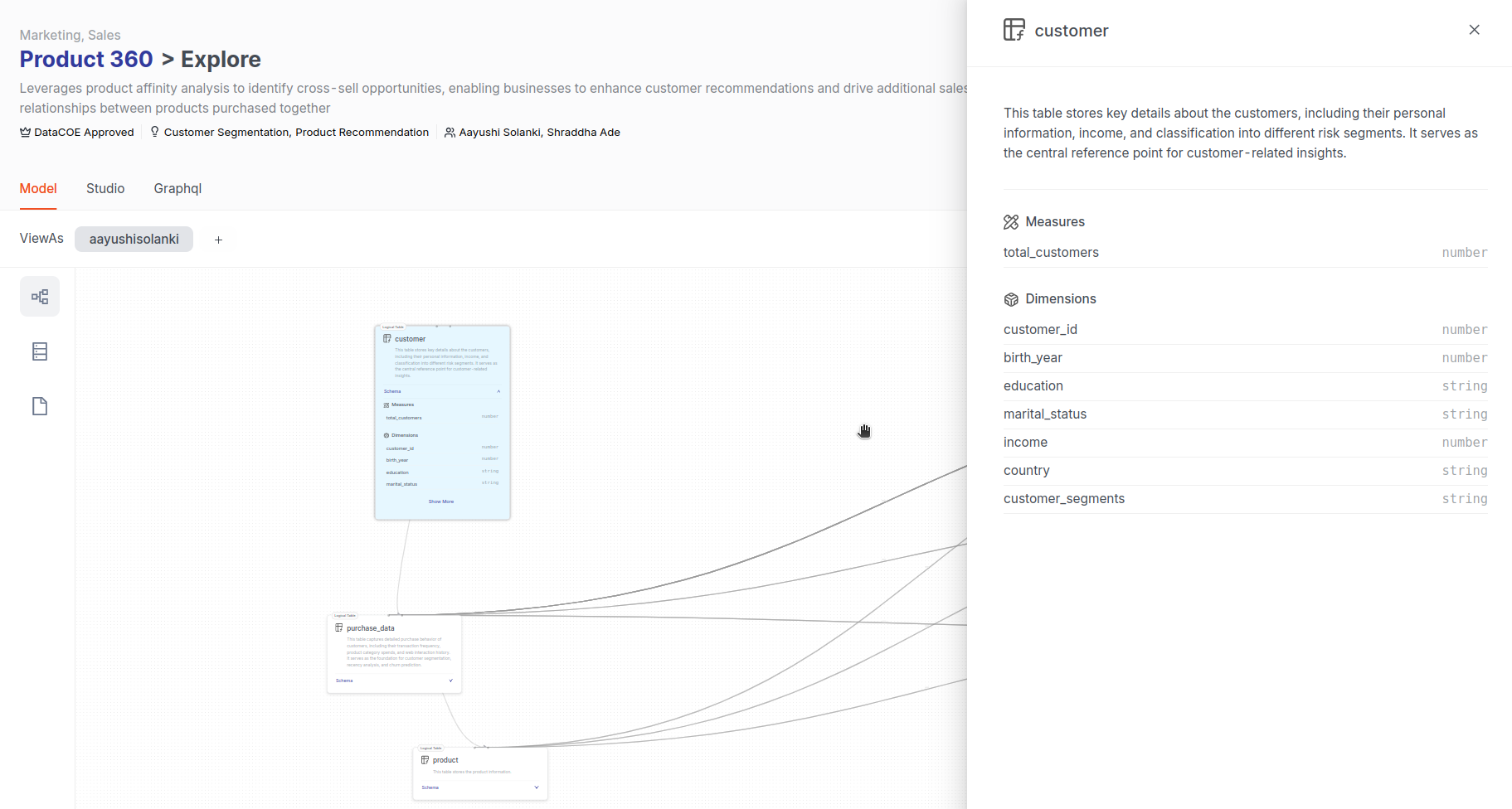
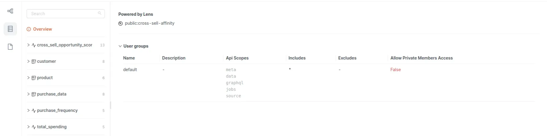
Explore details in Schema section
Under 'Schema', gain insight into the table structure, column names, data types, and primary keys. This detailed breakdown ensures that you have a thorough understanding of data hierarchies and access control.
The 'Overview' section gives you additional details, such as the Lens model’s name and user groups (default), and the API scopes give the info on the level of access given to the users included in the group and the redacted fields for data security. Here, the group includes *, which means everyone provides access to all other members.
You select a table customer to get more details on the table.
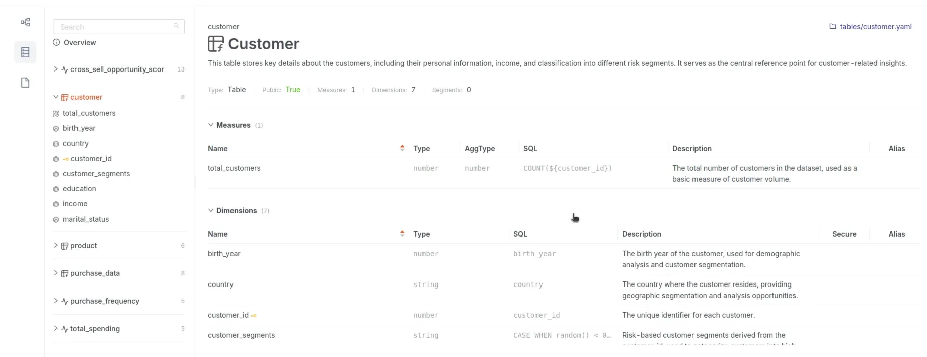
The schema section shares the following details:
Quick schema insights
- Name & Type: E.g.,
Customertable. - Measures: Like
total_customerswith count logic. - Dimensions: Fields like
customer_id(primary key),country,segments. - Segments: Optional pre-defined filters for granular analysis.
- Additional Info: Displays redacted fields and user access as you set them in the Lens user groups and data policy manifest file.
Explore configuration in Files section
View all relevant SQL files, tables, views, and YAML files essential for defining the Lens. This resource helps you explore the actual implementation and configuration of the model. You can click the 'Open in Metis' button in the top right corner to access the semantic model artifact in Metis.
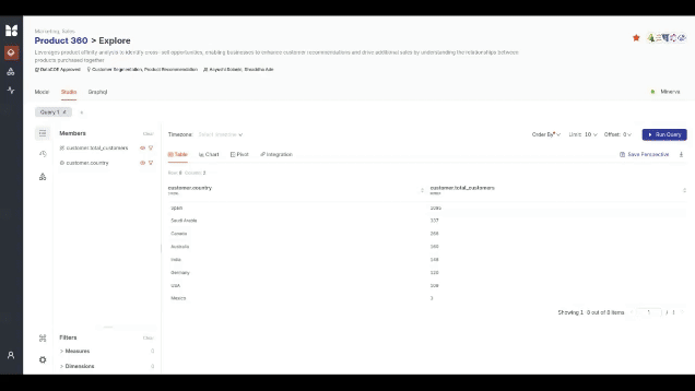
Analyze data with Studio
Start in the 'Studio' tab—an interactive, no-code workspace to query and visualize data as tables, charts, and pivots.
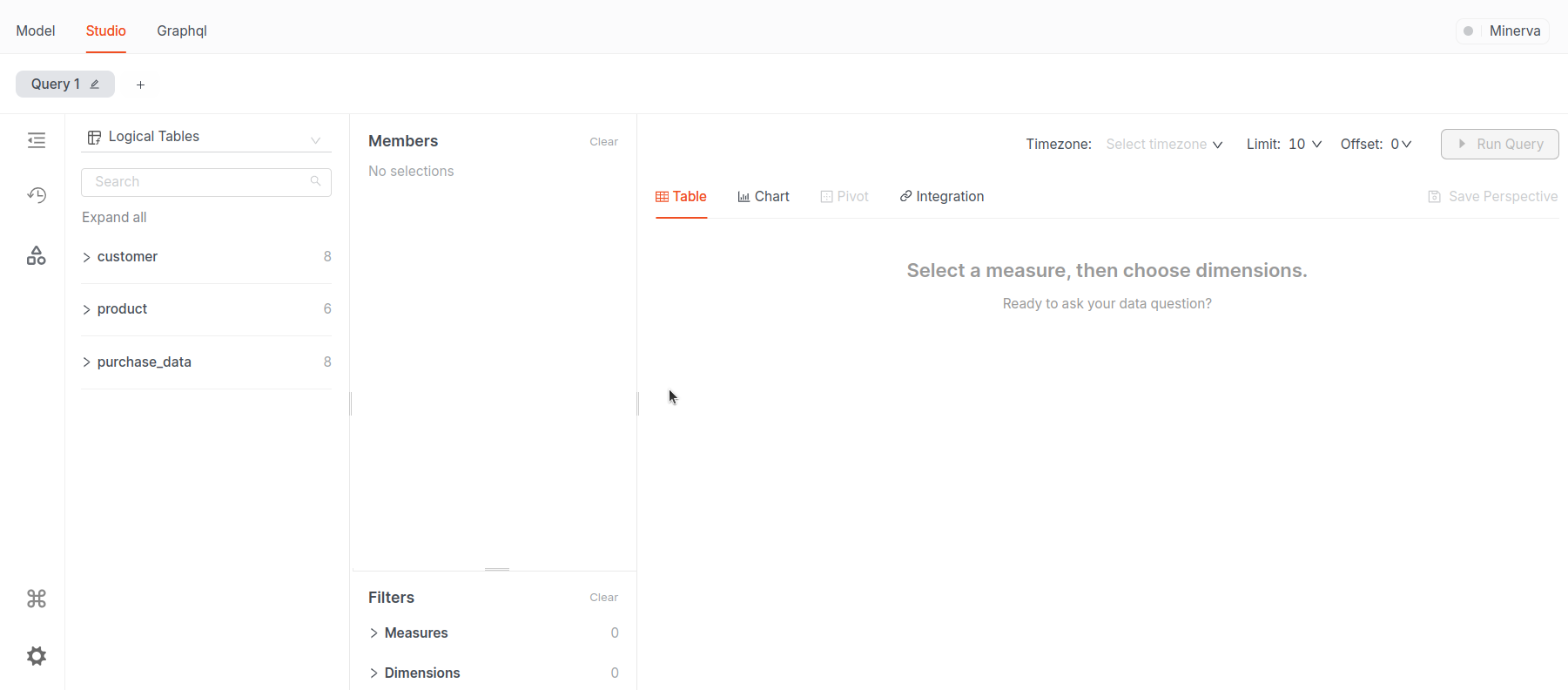
Checking Cluster health
-
Hover over the cluster name, like Minerva, to view its details.
-
Toggle the Watch button to monitor cluster health. Close the window and you see a green dot indicating good health. The Cluster is ready and you can proceed with further exploration, assured that any queries you run will perform smoothly.
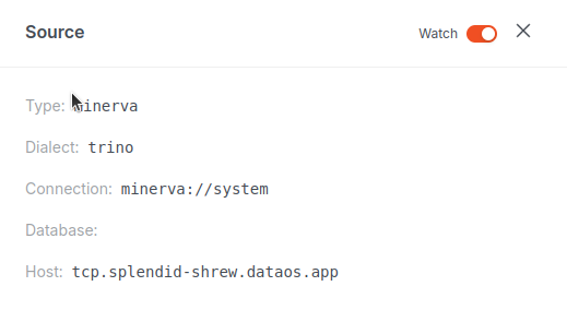
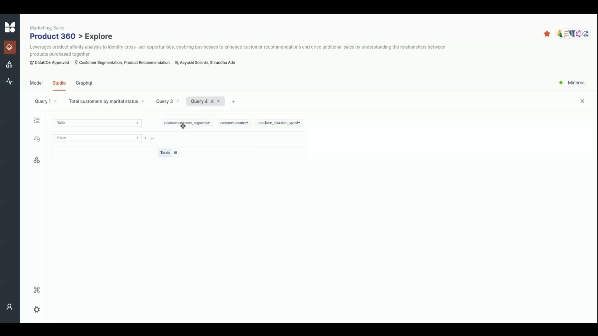
Creating a query
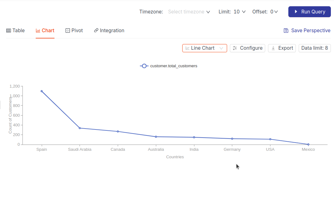
Let's analyze the total number of customers per country:
-
Select the
countrydimension and thetotal_customersmeasure.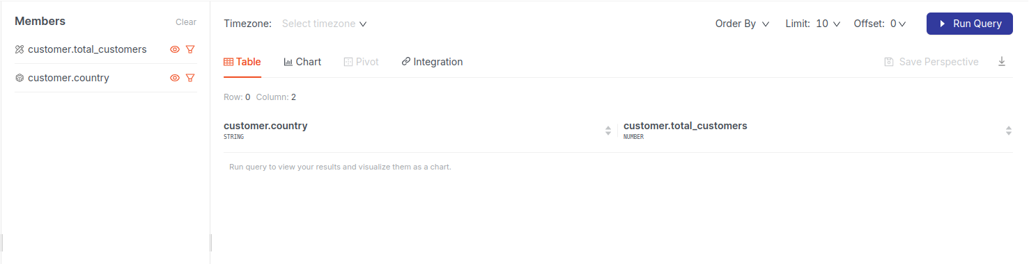
-
Hit Run Query to generate the query result as table which you can change later in Chart.
-
Sort your data to see the top 5 countries by total customers. Use Order By with
total_customersin descending order and limit the results to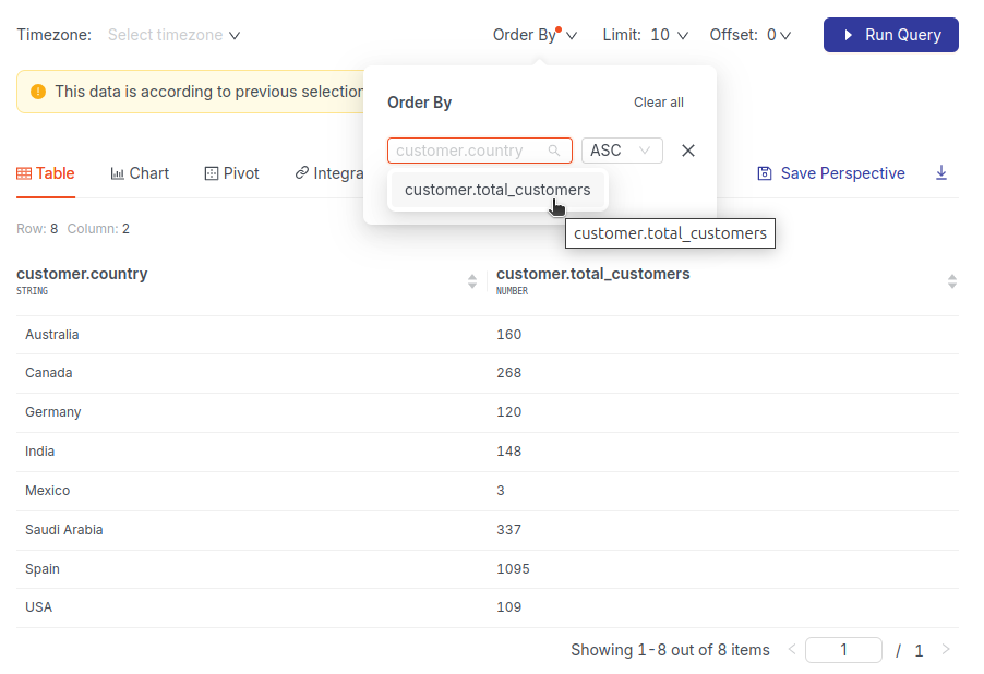
Saving analysis as a Perspective
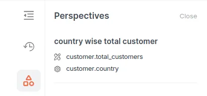
Save your query result for later by clicking 'Save Perspective'. Give it a meaningful name, like 'Country-wise Total Customers,' and save it.
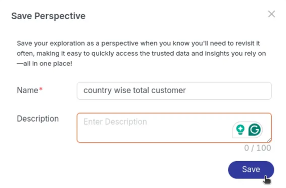
Once you save any Perspective, it will be accessible to everyone and can be accessed in the Perspective section of Explore Studio.
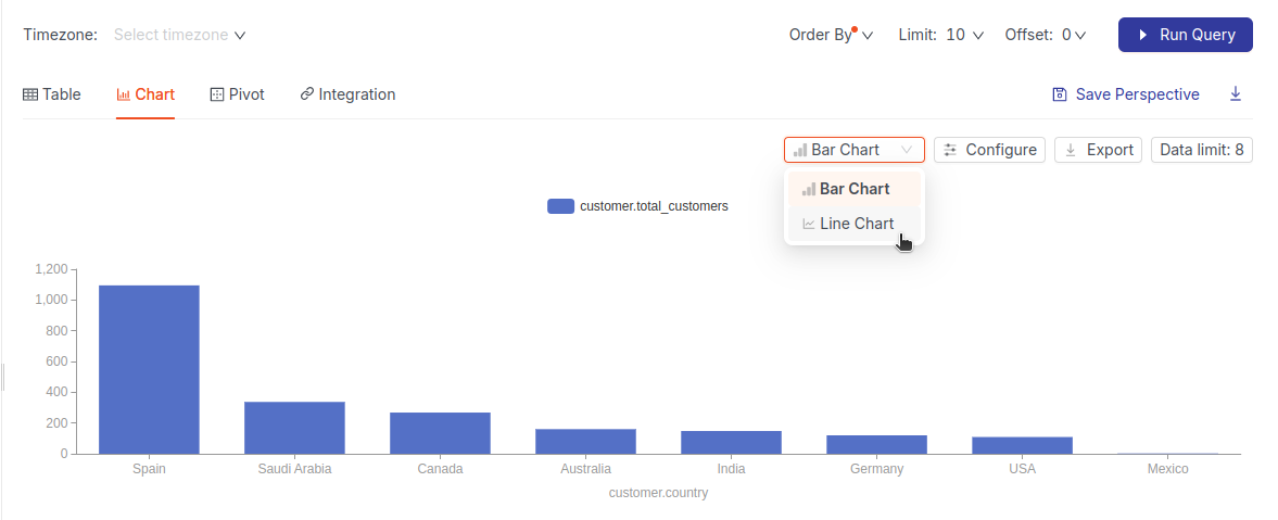
Visualizing data with charts
Transform your table into a visual story:
-
Switch to the Chart tab and select the chart type, Line, or Bar Chart.
-
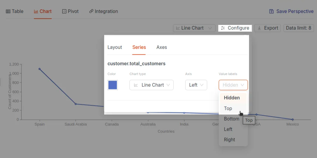
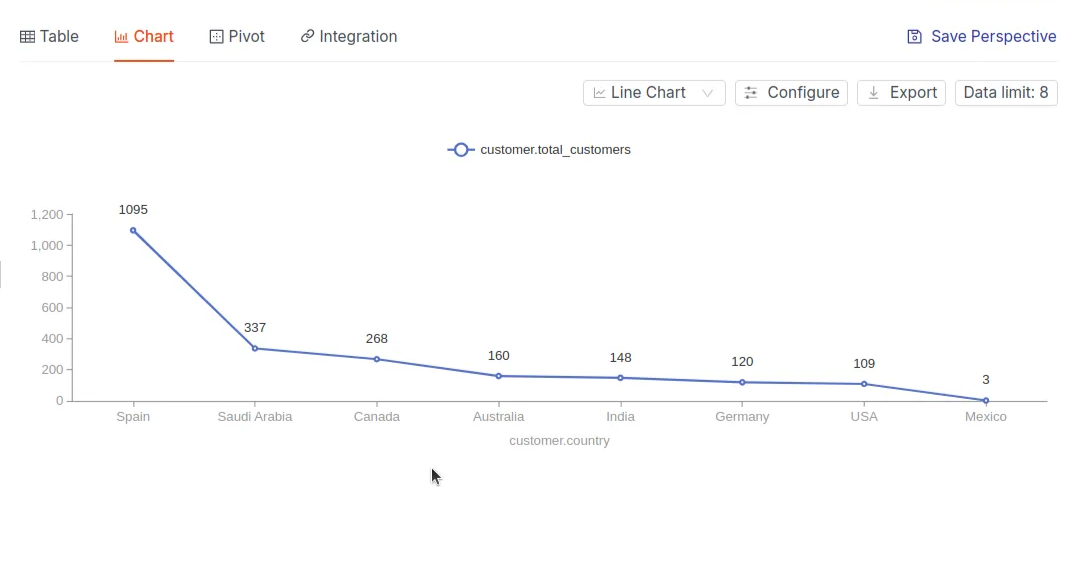
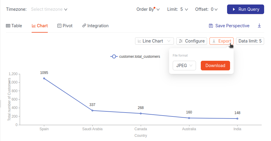
When you select the 'Line Chart' option, the chart will change from a bar chart to a line chart. Configure the chart by toggling value labels for a clearer view.
-
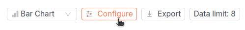
But here, you are not able to see the actual values of each country, so to be able to display the value labels on top of each country, you click the 'Configure' button as shown below:
A pop window appears as you click on the Configure button; here, you click on the Value labels toggle to change the label from Hidden to Top.
As you click on the Top button, the value labels are visible on top of the bars, as shown in the below image, giving you the exact count.
-
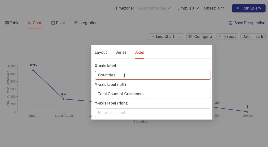
Now, you want to name both axes to make it more readable. For it, you click the Configure section and choose the Axes section in it.
Now, you label both the axes as given in the following image:
-
Now, your graph is ready! After the chart is prepared, you will send this insight to one of your stakeholders. To do this, you click on the 'Export' button, save it in JPEG format, and click the 'Download' button.
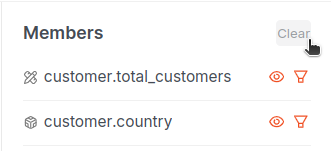
You can 'hide specific fields' by clicking the 'eye icon' next to the field name. This is useful for focusing on only the most relevant data points in your analysis.
-
When you're ready to start a new analysis, quickly reset all selected dimensions and measures by clicking the 'Clear' button. This action will instantly deselect your previous choices, as shown in the image below:
Filtering data
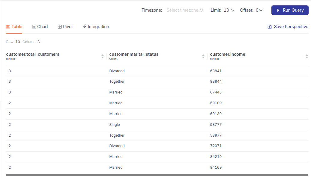
After clearing all members, you move to analyze some data with filters on and want to get insight on the following scenario:
Example: Distribution of customer marital status for income above $50,000.
For this analysis, you choose the following members:
- Measures: total_customers
- Dimensions: marital_status, income
- Filter condition(on Dimension): Income > 50,000
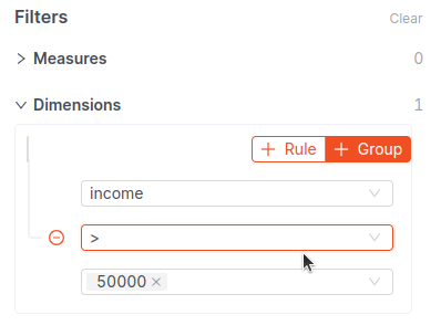
Here is the query result.
Using History for Quick Access
If you want to revisit a query you ran an hour ago but didn't save as a Perspective, simply click on the 'History' icon and select the relevant timestamp to return to that query.
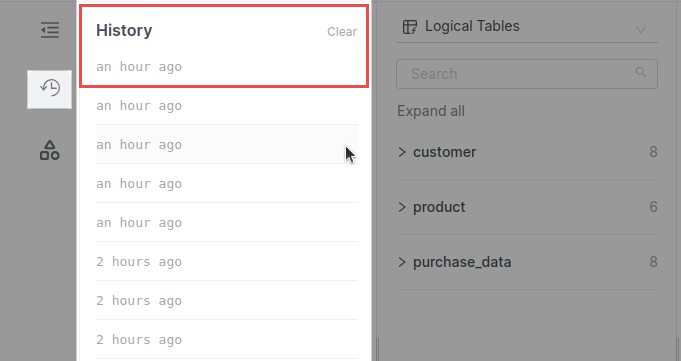
To save a query from two days ago for future reference, click on the query, give it a name, and save it. You can easily access it whenever needed, as demonstrated here.
Creating a Pivot Table
Example: Analyze the relationship between customer segments, countries, and total spending:
- Select:
- Dimensions:
customer_segments,country - Measure:
total_spend
- Dimensions:
-
Click Run Query.
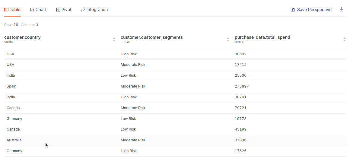
-
To make this more understandable, switch to the Pivot tab. Drag and drop your fields to rows and columns area.
The Pivot option is available only after running the query.
This matrix will help you identify:
- High-risk customers by segment and country.
- Which countries have the highest total spend.
- Potential focus areas for cross-selling or customer retention efforts based on risk levels and regional data.
To learn more about creating Pivot tables for query results, refer to the Quick start guide on the topic.
Integration with API
👉 Developers: Click here to learn more about API Integration →
Self-check quiz
1. What does the Studio tab in DataOS allow you to do?
A. View data lineage
B. Write Python scripts
C. Run drag-and-drop queries and visualize results
D. Edit data pipelines
2. What does the ‘Save Perspective’ option help with?
A. Archives old datasets
B. Schedules automated reports
C. Saves your query view for future reuse
D. Deletes previous charts
3. A stakeholder requests a downloadable chart of total customers by country. What's the best approach?
A. Write a SQL query in Metis
B. Use the Studio tab → Chart view → Configure labels → Download
C. Use the GraphQL tab
D. Explore it in the Files section
4. While performing analysis, you wrote a query yesterday in Studio but forgot to save. How can you retrieve it?
A. It’s lost unless exported
B. Use the Graph View
C. Go to Studio → History tab → Locate by timestamp
D. Check in API logs
5. You want to filter high-income customers for a marketing campaign analysis. Which steps should you follow?
A. Select only total_customers and click Run
B. Apply filter income > 50000 in Studio
C. Use Pivot before filtering
D. Create a new semantic model
6. While analyzing total spending by segment and country, you need a visual summary. What tool should you use?
A. Pivot tab in Studio
B. Files tab in Model
C. Postgres terminal
D. Explore via GraphQL
Next step
Now that you understand your data model, move on to learning how DataOS enforces Data Product Quality.