Explore a Data Product
The Explorer page in Data Product Hub allows users to explore the data model (Lens) associated with the selected Data Product. It provides an interface for business users and data analysts to interact with the data model's pre-defined dimensions, measures, and segments. It enables them to visualize, filter, and analyze the data without writing queries, offering insights through an easy-to-use exploratory environment.
Clicking the Explore button opens the Explore Page, with the Studio tab displayed by default. Other available tabs include Model and GraphQL.
%20(1).png)
Below is the list of components of the Explore Page:
- Data Product overview
- Favorite button and BI Sync
- Source details
- Data Exploration tabs
- Left panel
- Drop-down Menu (Logical Table, Entities, Metrics)
- Members and filters
- Saving queries
- Result display and visualization panel
Data Product overview
The top of the page displays key information about the Data Product being explored, providing context and clarity for users.
- Data Product title: The title of the Data Product is always visible at the top of the page. For example, "Sales-360-data-product-v12". Above the title, the associated business unit or function for which the Data Product was created is displayed, offering context regarding its origin. In this example, the business unit is "Sales".
- Description: Below the title, a description gives an overview of the Data Product's purpose. In this case, it’s described as a "customer 360 view of the world."
- Tier | Use-case |Team information: The header contains essential information, including the Data Product's tier (e.g., Aggregated, Source aligned), its primary use case (e.g., Demand Forecast, Performance monitoring), and the list of contributors or collaborators involved in creating and maintaining the product (e.g., Aakansha Jain, Darpan Vyas). It provides users with a clear understanding of the product's purpose and the key stakeholders behind it, ensuring transparency and context.
Favorite button and BI sync
The Star like button (⭐) allows users to mark the Data Product as favorite. The BI Sync option opens the BI Sync functionality, enabling synchronization of the Data Product with tools such as PowerBI, Tableau Cloud, Tableau Desktop, and Apache Superset.
Source details
Clicking on the Source section displays details of the source on which the Lens model is built, along with an option to check the source's health. Upon selection, the following information is shown, as illustrated in the image.
%20(1).png)
The explanations for each are provided below:
- Type: Indicates the type of Cluster source is linked to. In this case, the type is Minerva. It can either be Themis or Flash.
- Dialect: The query language or SQL dialect used for interacting with the data. For this product, the dialect is Trino.
- Connection: The connection string or URL links the Data Product to its source. This example defines the connection as
minerva://miniature, indicating the internal connection point to the miniature Cluster. - Database: The database name is not explicitly shown in the given details, but this field would typically indicate the database within the system where the Data Product is stored.
- Host: Provides the host or context details where the data source is hosted. In this example,
tcp.liberal-donkey.dataos.appis the context where the Data Product exists. - Watch: To watch the health of the source Cluster, Click on the Watch button.
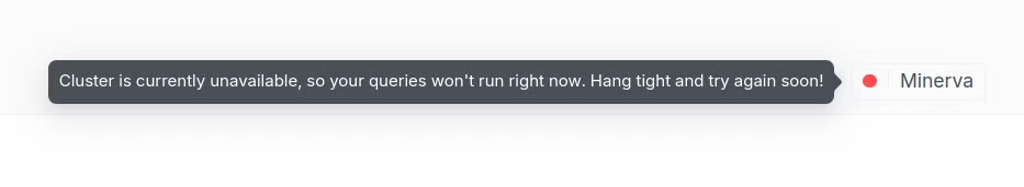
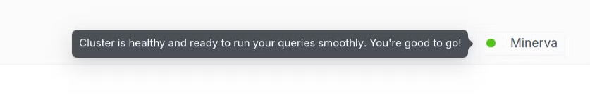
Clicking the Watch button allows users to return to the source and view the source health status by selecting the cross button. Hovering over the Cluster name, such as Minerva, will display the health status. A green dot indicates good health, and that queries will run smoothly, while a red dot indicates that the Cluster is unavailable.
Data Exploration tabs
Further, the data exploration tab contains three tabs for exploring the Data Product in detail.
- Model Tab
- Studio Tab
- GraphQL Tab
Let’s first understand the default studio tab
Studio tab
When the Explore page is first opened, the Studio tab appears by default. This tab provides an interactive workspace for designing queries and viewing tables, pivot tables, charts, and other visualizations. It serves as the primary tool for exploring and analyzing data without requiring technical coding skills.
This page is divided into five primary sections, each serving a specific purpose in the exploration and querying of Data Products:
Left panel
Here are the key components in the sidebar navigation
-
Expand/Collapse all: An option to show or hide all the logical table Panel. Selecting "Expand" will increase the screen size to display the logical table side panel.
-
History: It logs queries executed on a data model using timestamp format. This allows users to revisit previous queries and review their selected dimensions, measures, filters, and results. It's beneficial for auditing, troubleshooting, or repeating previous analyses.
.png)
History
For instance, a query might have been executed 32 minutes ago, using the city dimension and total accounts measure to analyze the total accounts across various cities.
- Perspective: In the Data Product Exploration interface, a user's query can be saved as a Perspective. A Perspective captures the current state of the query, including all selected dimensions, measures, metrics, filters, and any applied settings (e.g., time zones or limits). Once saved, Perspectives can be accessed at any time from the Perspective tab, allowing users to revisit or share their specific analyses without recreating the queries. By saving a Perspective, users can efficiently store and retrieve their specific analyses for continuous use or collaboration with team members.
.png)
How to Save and Use Perspectives?
-
Running a Query: After selecting dimensions, measures, and running a query, it can be saved to avoid reconfiguring it later. For example, to find the total count of accounts in each city, select the
citydimension and the account's count measure from theAccountstable. Then, click the Run Query button..png)
Run query -
Saving a Perspective: Once the query is complete, click the Save Perspective button (typically near the "Run Query" button).
.png)
Save Perspectives -
Accessing saved Perspectives: After saving, the query will be available under the Perspective tab for the particular Data Product (e.g., Sales 360).
-
Users can click the Perspective tab and view all saved Perspectives, allowing them to reload the exact configuration of any previously saved query.
.png)
Accessing and reusing saved Perspective -
Re-running a Perspective: Select it from the list to re-run a saved Perspective. This reloads the query and all settings and filters, making regenerating the results or applying new changes quickly.
Drop-down Menu: Logical table, Entities, Metrics
The drop-down menu lets users switch between Logical tables, Entities, or Metrics.
.png)
Logical table
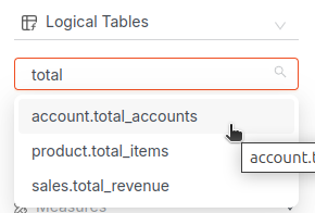
This is the default view in the sidebar. It shows a list of logical tables, which are structured datasets containing dimensions and measures. Logical tables are often used for performing queries, such as analyzing account data, product information, or sales figures.
For example, the above image contains three logical tables: account, product, and sales.
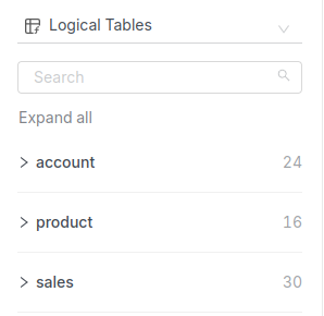
As a particular table is expanded, the list of all its dimensions and measures is displayed. In this case, the table named account is visible with various components such as Measures (e.g., total_accounts, avg_rev_subquery) and Dimensions (e.g., city, address).
Search Bar: Just below the logical table title, the search bar allows users to filter and quickly find specific tables, dimensions, or measures by typing keywords.
Besides Logical tables, the model also contains views. In the Lens model, users can create two types of views, each serving a different purpose and approach in accessing and presenting data. Here's a differentiation between the two types of views:
Entities: serve as a layer atop the data graph of tables, presenting an abstraction of the entire data model for consumers to interact with. They serve as a layer for defining metrics, providing a simplified interface for end-users to interact with key metrics instead of the entire data model. In an entity-first approach, views are built around entities in the data model. Views are built as denormalized tables, bringing measures and dimensions from multiple logical tables. They don’t have measures, dimensions, or segments of their own.
.png)
Metrics: are presented as a drop-down list option, allowing users to select from predefined key performance indicators (KPIs). These Metrics provide quantifiable measures crucial for assessing the performance of specific data points within the Data Product. For example, selecting the metric aggregated_qtr_revenue_metric.sales_sales_aggregate_qtr_revenue_2024 would allow users to analyze quarterly revenue for different product brands. To know more about how to create the metrics, refer this link
How to explore Metrics in the Explorer:
- Step 1: Click on the Metrics from the drop-down list in the left sidebar
- Step 2: Select the relevant metric based on analytical needs. For example,
aggregated_qtr_revenue_metric.sales_sales_aggregate_qtr_revenue_2024may be selected to track sales.
.png)
-
Step 3: The selected metric will be added to the query. When combined with dimensions (like sales source or product brand), it will give a complete performance view.
-
Step 4: Run the query to get the results and review how the selected metric performs over time, across categories, or compared to benchmarks.
In this case, the metric aggregated_qtr_revenue_metric.sales_sales_aggregate_qtr_revenue_2024 is used along with two dimensions:
- Sales Source: Indicates whether the sales are from proof (alcoholic) or nonproof (non-alcoholic) products.
- Product Brand: Identifies the brand of the product sold.
After running the query using this metric and dimensions, the result shows the revenue generated by each brand based on the sales source (proof/nonproof).
Members and Filters
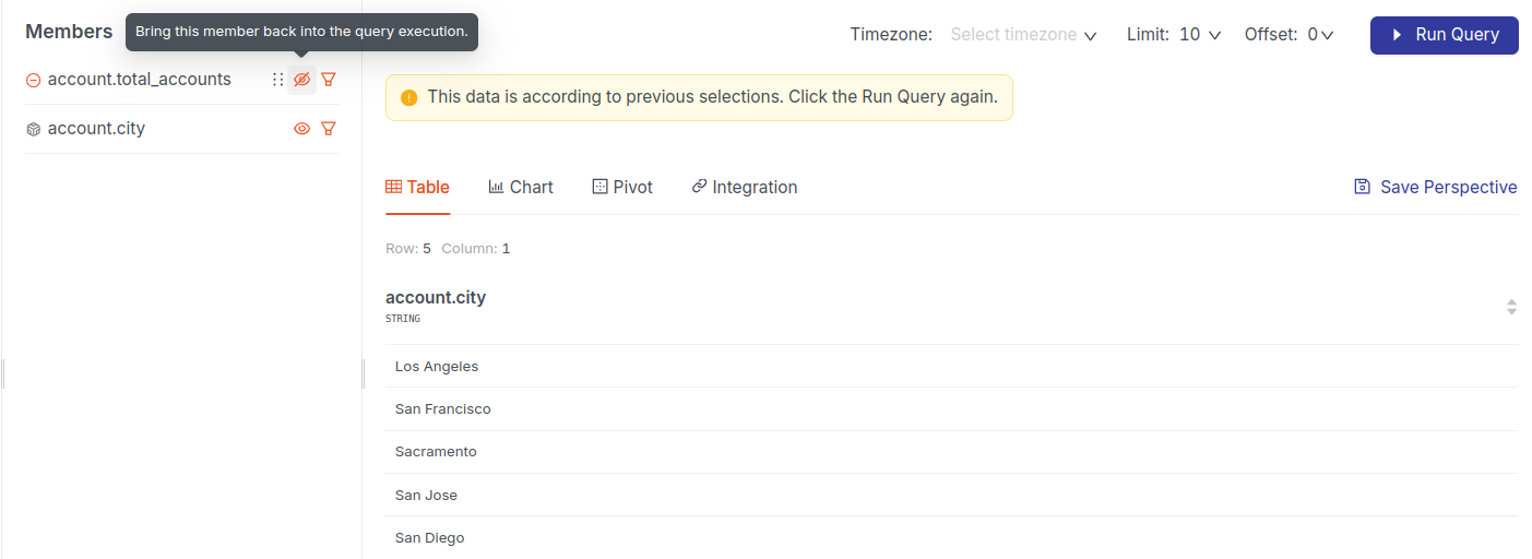
the Members Tab dynamically displays the dimensions and measures selected by the user from the list of available entities (such as "sales" or "account"). This tab allows users to track and manage the dimensions and measures used in a query. One can unselect selected members using the minus (-) icon. It lets users modify these selections with visibility and filter controls. The Clear button at the top of the Members Tab removes all selected dimensions and measures, resetting the query.
Example:
Selecting the dimensions account, city, and the measure account total_accounts will immediately add them to the Members tab, indicating their activation in the query. Similarly, clicking the (-) sign will remove the selected member from the query.
.png)
-
Visibility Control: The "eye" icon next to each member allows the visibility of selected dimensions or measures to be toggled in the query results.
Example: Hiding the visibility of total_accounts using the "eye" icon will display only the city names in the query results, while the total accounts count will be hidden. This feature is useful for focusing on specific data points without removing the measure entirely from the query.
-
Filtering Option: A "filter" icon allows users to apply filters to the selected dimension or measure directly from the Members Tab. Users can supply multiple values using the IN operator for clearer intent, alongside standard equality logic.
Example: Clicking the filter icon on the
citydimension and applying the filter "city is not equal to Sacramento" will display data for all cities except Sacramento. After applying the filter, click Run Query to view the filtered results..png)
Saving queries
Query data and save it with a suitable name so users can view it later.
Result and visualization panel
The Result and Visualization Panel is where users can choose how to view the outcomes of their queries. Once dimensions and measures are selected in the Members Tab and the query is executed, this panel offers multiple options for displaying the results. The panel provides flexible visual formats, allowing users to explore data in ways that best suit their analysis needs. Additionally, controls for Timezone, Limit, and Offset enable users to further customize how the data is presented, ensuring a comprehensive and user-friendly data exploration experience.
The following are the options for displaying the results:
Table
The table tab displays the query results in a tabular format. It’s ideal for users who prefer to see data in rows and columns for easy comparison and detailed analysis.
.png)
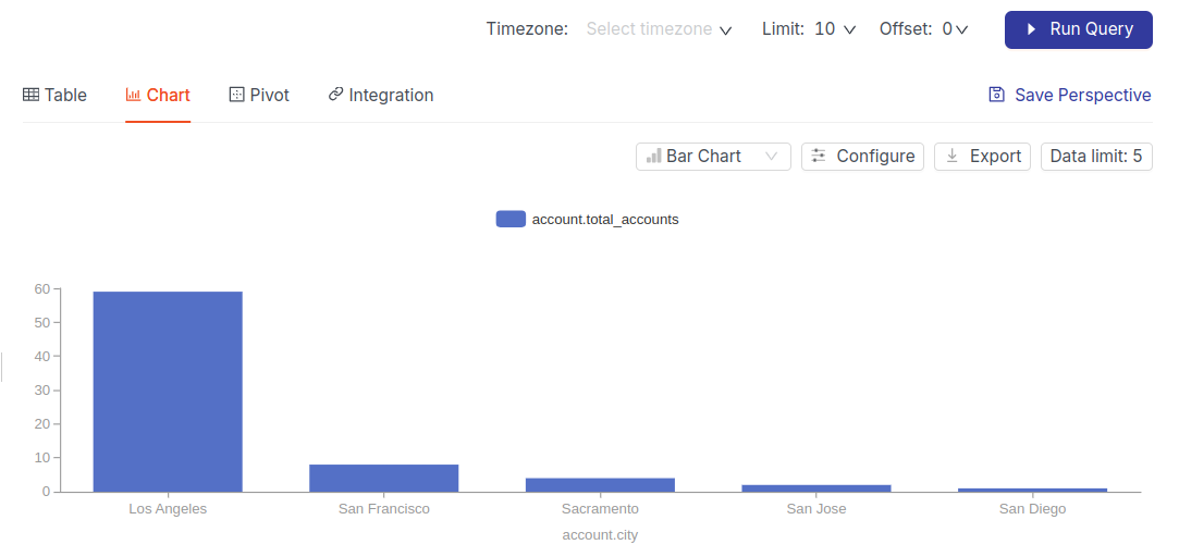
Chart
The Chart tab allows users to visualize the query results in a graphical format. Various charts (e.g., bar, line, pie) can be used to display trends, comparisons, and distributions visually.
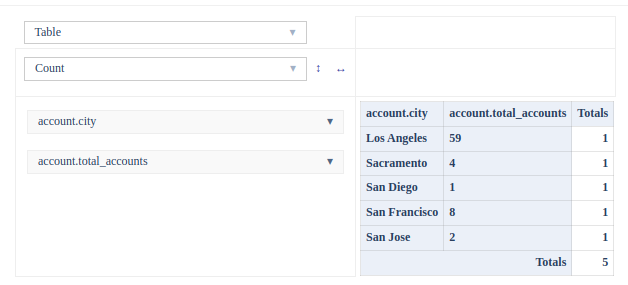
Pivot
The Pivot tab allows for interactive analysis. Users can group, summarize, and manipulate the data to create custom views and insights. Pivot tables are useful for dynamic data exploration.
Integration
The Integration tab enables users to integrate the query results with other tools or services. This is particularly useful for exporting or connecting the data to external platforms for further processing or visualization. This gives data app developers the functionality to fetch real-time data and display it visually in the dashboard or create an application on top of it.
The data model can be integrated through the following methods:
- CURL
- GraphQL
- Postgres
- Source SQL
.png)
CURL
For instance, to retrieve the total number of accounts grouped by city using an API, verify the output using a curl command, and then automate the process using Python. Here’s a practical example that demonstrates how to utilize the given curl command step-by-step and integrate it into a Python application workflow.
Steps to Follow:
Step 1: Select Desired Measures and Dimensions First, select the total_account measure and the city dimension from the side pane. As selections are made, the curl command for the query is automatically generated. Here's the generated command:
curl --location 'https://lucky-eagle.dataos.app/lens2/api/public:purchasebehavior360/v2/load' \
--header 'Content-Type: application/json' \
--header 'Authorization: Bearer <api key here>' \
--data '{ "query": {
 "measures": [
 "account.total_accounts"
 ],
 "dimensions": [
 "account.city"
 ],
 "segments": [],
 "filters": [],
 "timeDimensions": [],
 "limit": 10,
 "offset": 0
} }'
Step 2: Execute the Command in the Terminal
-
Copy the entire command and replace DATAOS_API_KEY with the actual API key.
-
Open the terminal (Command Prompt on Windows or Terminal on macOS/Linux/Windows), paste the modified command into the terminal, and press Enter.
-
The provided curl command retrieves data about the total accounts per city in json format. The response will appear as follows:
{"query":{"measures":["account.total_accounts"],"dimensions":["account.city"],"segments":[],"filters":[],"timeDimensions":[],"limit":15,"offset":0,"timezone":"UTC","meta":{"secured":{"segments":[],"dimensions":[]}},"rowLimit":15},"data":[{"account.city":"Los Angeles","account.total_accounts":59},{"account.city":"Chicago","account.total_accounts":12},{"account.city":"Kansas City","account.total_accounts":11},{"account.city":"San Francisco","account.total_accounts":8},{"account.city":"New York","account.total_accounts":6},{"account.city":"Greenville","account.total_accounts":5},{"account.city":"Miami","account.total_accounts":5},{"account.city":"Philadelphia","account.total_accounts":5},{"account.city":"Houston","account.total_accounts":5},{"account.city":"Sacramento","account.total_accounts":4},{"account.city":"Omaha","account.total_accounts":4},{"account.city":"Cincinnati","account.total_accounts":3},{"account.city":"Jacksonville","account.total_accounts":2},{"account.city":"San Jose","account.total_accounts":2},{"account.city":"Spokane","account.total_accounts":2}],"lastRefreshTime":"2024-10-09T07:32:55.554Z","refreshKeyValues":[[{"refresh_key":"14503825"}]]
- Check to ensure the output is correct and contains the expected data.
Step 3: Integrate the Command into the Application's Workflow Once the output is confirmed to be correct, data retrieval can be automated using a Python script with the requests library.
Python Script
   import requests
   import json
   import pandas as pd

   # API URL and headers
url = 'https://lucky-possum.dataos.app/lens2/api/public:purchasebehavior360/v2/load'
headers = {
       'Content-Type': 'application/json',
       'Authorization': 'Bearer dG9rZW5fYWN0dWFsbHlfYWR2ZXJzZWx5X2luc3BpcmVkX3JvYmluLmVkY2VlNmU2LTJmNWQtNDdjNy05M2I1LThmNWFjN2MzZjEyNA=='  # Replace with the actual DATAOS API key
}

   # Define the payload for the API request
payload = {
       "query": {
           "measures": ["account.total_accounts"],
           "dimensions": ["account.city"],
           "segments": [],
           "filters": [],
           "timeDimensions": [],
           "limit": 15,
           "offset": 0
}
}

   # Send the POST request to the API
response = requests.post(url, headers=headers, json=payload)

   # Check if the request was successful
   if response.status_code == 200:
       # Parse the JSON response
data = response.json()

       # Extract relevant data
account_data = data.get('data', [])

       # Convert to DataFrame for analysis or reporting
df = pd.DataFrame(account_data)

       # Display the DataFrame
       print("City-wise Total Accounts:")
       print(df)

       # Optionally, save the DataFrame to a CSV file
df.to_csv('city_account_data.csv', index=False)
       print("Data saved to city_account_data.csv")
   else:
       print(f"Failed to fetch data. Status code: {response.status_code}, Message: {response.text}")
   # Expected_Output

City-wise Total Accounts:
account.city  account.total_accounts
   0 Los Angeles                      59
   1 Chicago                      12
   2 Kansas City                      11
   3 San Francisco                       8
   4 New York                       6
   5 Houston                       5
   6 Philadelphia                       5
   7 Miami                       5
   8 Greenville                       5
   9 Sacramento                       4
   10 Omaha                       4
   11 Cincinnati                       3
   12 Fort Wayne                       2
   13 Denver                       2
   14 Minneapolis                       2
Data saved to city_account_data.csv
Execution and Saving:
- Run Query Button: Once dimensions and measures are selected, this button executes the query and updates the results in the selected view format (table, chart, pivot).
- Save Perspective: After running a query, users can save the configuration as a Perspective to quickly return to the same query setup in the future.
Semantic Model tab
The Model tab provides insights into the underlying structure of the Data Product by allowing users to view and understand the data model. It offers a comprehensive view of relationships between datasets, data lineage, and dependencies. This is particularly useful for data architects or advanced users who need to know how different tables and fields are connected.
The left-side navigation panel provides key options to explore the model in different ways:
Graph
The default view shows a visual lineage of how different tables and entities are interconnected. This interactive graph shows relationships between tables and views. Let us understand the graph tab more with a detailed example.
- For instance, the below image is the model tab of the
sales360data product, which has three main entities or logical tables:Account,Sales,andProduct,and two metrics,conversion_rateandqtd_revenue,represented by a wave-like icon. Metrics are derived from one or more logical tables to track performance or monitor trends. The Graph tab visually displays how these logical tables and metrics are interconnected, providing an interactive way to explore data relationships and schema details.
.png)
Here's how it works in more detail:
When any logical table or metric is selected, a detailed tab opens on the side, displaying all the defined measures and dimensions within the table. Each attribute is listed with its corresponding data type (e.g., numeric, string, date), providing a clear understanding of the table's schema.
For instance, Clicking on the Sales table opens a detailed tab on the side, displaying all the defined segments, measures, and dimensions within the table. Each attribute is listed with its corresponding data type (e.g., numeric, string, date) to provide a clear understanding of the table's schema.
.gif)
Schema Breakdown
- Segments: Subsets or groupings of sales data, such as
proof_salesandnonproof_sales. - Measures: Quantitative attributes that are crucial for calculations. Examples: recency and frequency.
- Dimensions: Categorical attributes that describe data segments or groupings. Examples:
invoice_noinvoice_date. - More details can be explored by selecting the
Schemadropdown.
Let us also understand a Metric by giving an example.
Metrics
Metrics are a type of View in the data model. All Metrics are represented by a wave-like icon resembling a formula. Unlike logical tables, they do not have their dimensions or measures. Instead, they reference the dimensions and measures of logical tables. For instance, the conversion_rate relies on fields from the Sales Table.
When a metric references a measure or dimension from a logical table, it adopts the naming convention (table_name)_(field_name). This approach ensures that users can quickly identify the origin of each measure or dimension used in a metric, promoting transparency and data lineage. For instance, the measure frequency from the Sales Table is renamed sales_frequency* when used in the Conversion Rate Metric to indicate its origin.
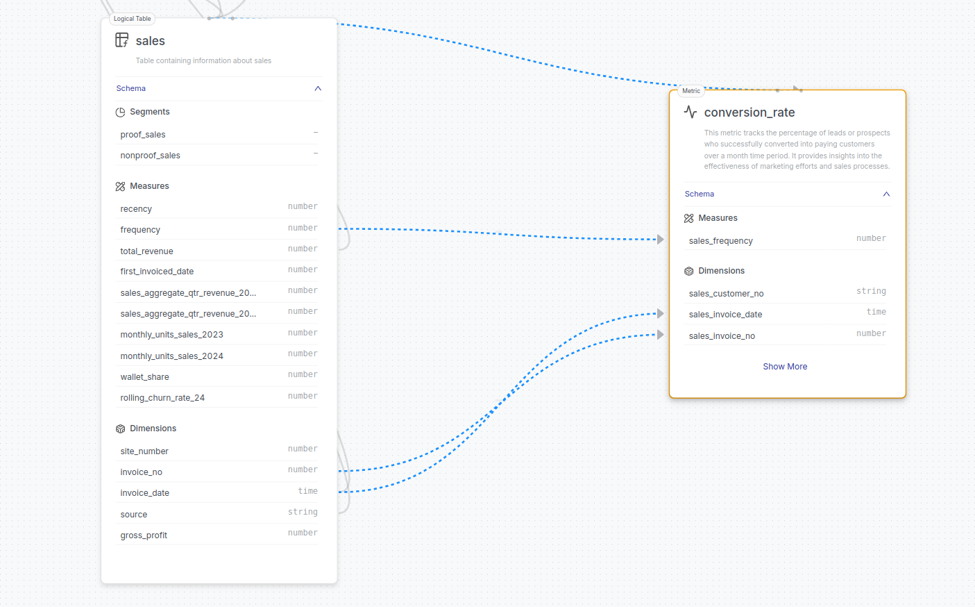
Dashed blue lines visually indicate the relationships between the Sales Table and the conversion_rate metric. The lines highlight which dimensions and measures from the Sales Table are used to calculate the conversion_rate metric.
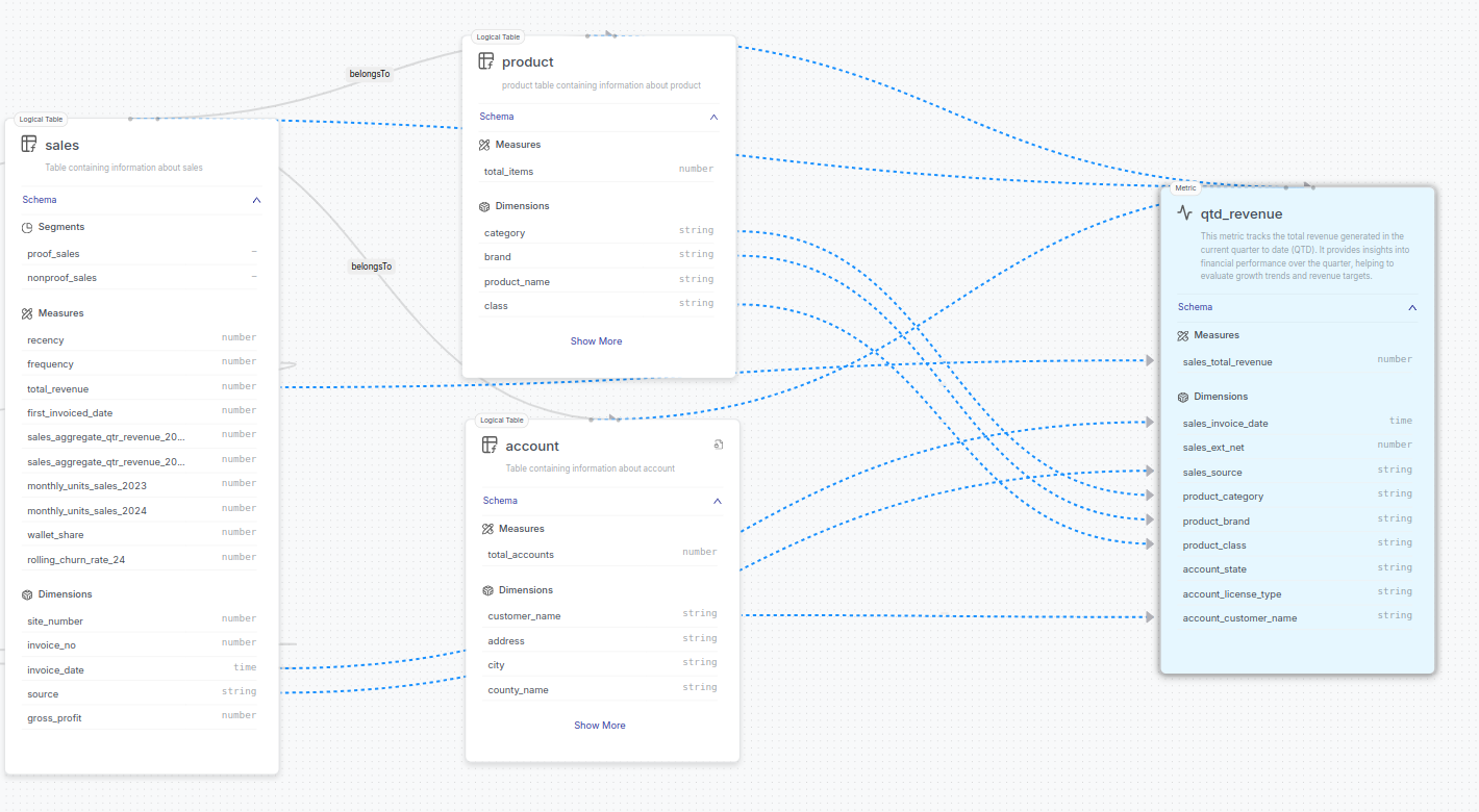
Similarly, QTD Revenue Metrics leverage fields from multiple logical tables— Sales, Product, and Account —to offer a rich, multi-dimensional view of performance. Using join paths in the manifest file ensures that fields are correctly referenced, maintaining clarity and consistency across the data model.
The blue dashed lines in the graph visualization represent the relationships between the logical tables and the metrics, helping users understand how measures and dimensions from different sources contribute to the overall metric. For instance, in the below image, all fields are prefixed with their respective table name (e.g., sales_, product_, account_), showing which fields from different tables contribute to the metric.
Schema
The schema section contains detailed information about the structure of the tables, views, and entities within the data model. Users can view columns, their data types, and relationships, making it easier to understand how data is stored and linked within the product.
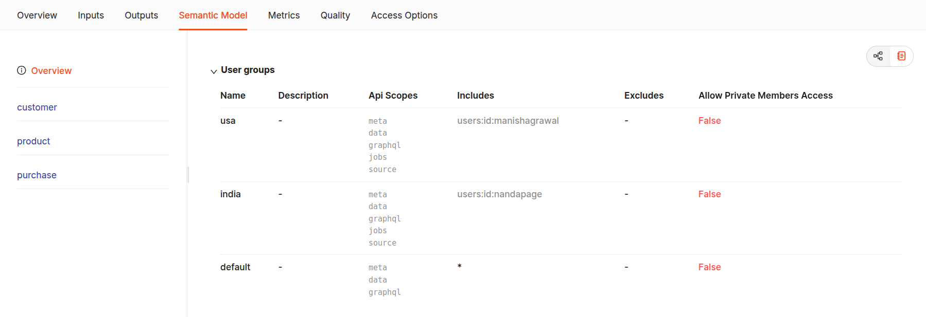
The Overview section gives the details of the Data Model used in the data product, such as the name of the Lens model, the user groups, which detail the access permissions applied to each user group, and the user's name included in it, and the API scopes that are granted. The Security section displays the redacted column name.
In this example, there are three user groups: usa, india and default. Both groups can access all API scopes, including meta, data, graphql, and source.
- The usa group includes a user identified by the tag
users:id:manishagrawal. - The india group includes a user identified by the tag
users:id:nandapage. - The default group includes all members, providing universal access to anyone not explicitly excluded from the model.
Below overview is the list of logical tables and metrics, giving a detailed record when selected. For instance, the following sections are displayed when the account table is selected.
- logical table overview:
- Table name: The logical table name (e.g.,
Account) is displayed, providing context on the explored dataset. - Table type: The type (e.g., Table) and whether it is
public(True/False). - Field overview: The schema section categorizes the table’s fields into Measures, Dimensions, and Segments, showing the total number of each type.
- Table name: The logical table name (e.g.,
- Measures:
- Measures represent quantitative fields that are used in calculations or aggregations.
- Example: The measure
total_accountsin theAccounttable shows the total number of accounts. It is accompanied by information such as its data type (number), aggregation type (count(distinct)), and a brief description ("Total customers").
- Dimensions:
- Dimensions represent qualitative attributes used for categorization or grouping.
- Example: Dimensions in the
Accounttable include attributes like customer_name, address**, city, and state. Each dimension is described by its data type (e.g., string, time), SQL reference, and a brief description explaining its purpose.
- Segments:
- If applicable, segments are listed, representing pre-defined filters within the table for more granular analysis.
- Additional Information:
- Secure: Indicates whether access to certain fields is restricted based on user permissions. For example, here, the email column is secured and redacted.
- Aliases: Provides alternate names for fields if defined.
.png)
.png)
The details of each table can be explored individually. For instance, by selecting the Account table, one can view specific information such as the total number of measures and dimensions and whether the table is public or private. Additionally, it reveals the underlying data type, aggregation method, and the corresponding SQL queries.
.png)
Files
This contains all relevant SQL files, tables, views, and YAML files necessary to define the Lens. Here, users can explore the actual implementation and configuration of the model, making it useful for developers who need to access the code and metadata behind the Data Product.
The image above shows the YAML implementation files for the Lens model of the Data Product across all entities. The Lens artifact can also be accessed in Metis by clicking the Open in Metis button in the top right corner.
.png)
GraphQL tab
The GraphQL tab provides an interface for advanced users and developers to programmatically interact with the data model. It displays the data returned by a GraphQL query alongside the query itself. This feature helps perform complex or customized data extractions that go beyond the standard capabilities of the Studio interface. The interface includes syntax highlighting, autocompletion, automatic documentation, and error highlighting. Users can utilize GraphQL to build both page and static queries interactively.
The GraphQL tab redirects to the following interface:
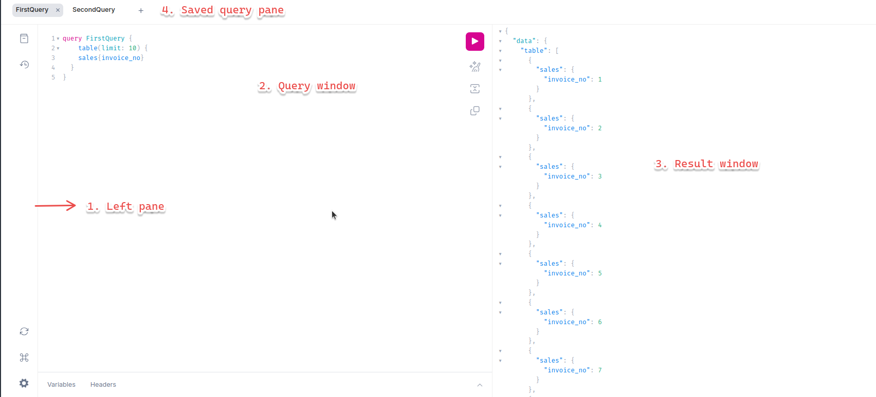
Further, GraphQL is divided into three sections:
- The left sidebar contains buttons for opening plugin panes and changing settings.
- The middle section is used to write queries.
- The right section displays the results of the executed queries.
The left sidebar is further divided into a top and bottom section. The top section provides buttons for accessing the documentation explorer and query history. The bottom section contains buttons to refetch the schema, view keyboard shortcuts, and modify settings.
In the middle section, queries can be written using the following format:
Press Ctrl + Space (or "Shift + Space" as an alternate keyboard shortcut) to open the autocomplete window within the curly braces. This will prompt a query for the data model's logical tables or metrics.
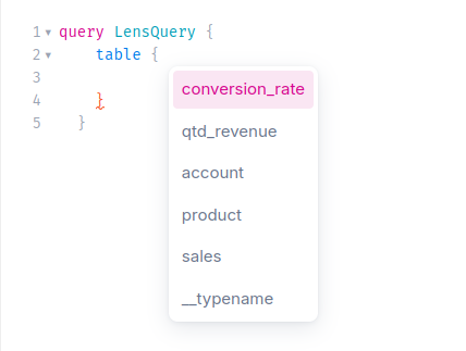
Construct a query like the one below:
Explanation of the query:
- Action type (query): Specifies the type of operation, such as retrieving data.
- Name (LensQuery): Optional name for the query.
- Root field (table): The entry point defined in the Query root type.
- Table name
- Arguments (limit: 10): Parameters to customize the data retrieval.
- Measures and Dimensions(total_revenue, source): Specifies the exact data to fetch.
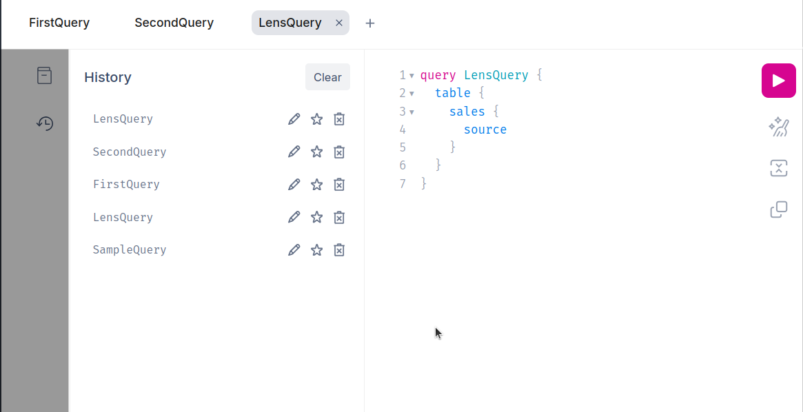
Press the Execute button (which resembles a "Play" icon) or use Ctrl + Enter to run the GraphQL query. The data will be returned in the Result window.
As users submit queries to the model, each query is saved and can be accessed by clicking on the history icon. The saved query will be labeled with the name provided in the query. These saved queries can also be accessed from the "Saved Query" pane at the top of the panels. For example, queries labeled as "FirstQuery" and "SecondQuery" will be stored with these names for easy reference.