Sales Performance Dashboard
Dashboard Overview
Welcome to the Superstore Sales Performance Dashboard, a comprehensive tool designed to provide valuable insights into the superstore sales data. This dashboard is crafted to empower decision-makers by offering a clear and interactive view of sales performance utilizing multiple tabs grouped by category, city, region, and customers.
Data Source Information
Google BigQuery Connection:
- The data for this dashboard is sourced from Google BigQuery, utilizing the dataset from Kaggle. The connection to Google BigQuery is established securely, ensuring a reliable and efficient data retrieval process.
Dataset Details:
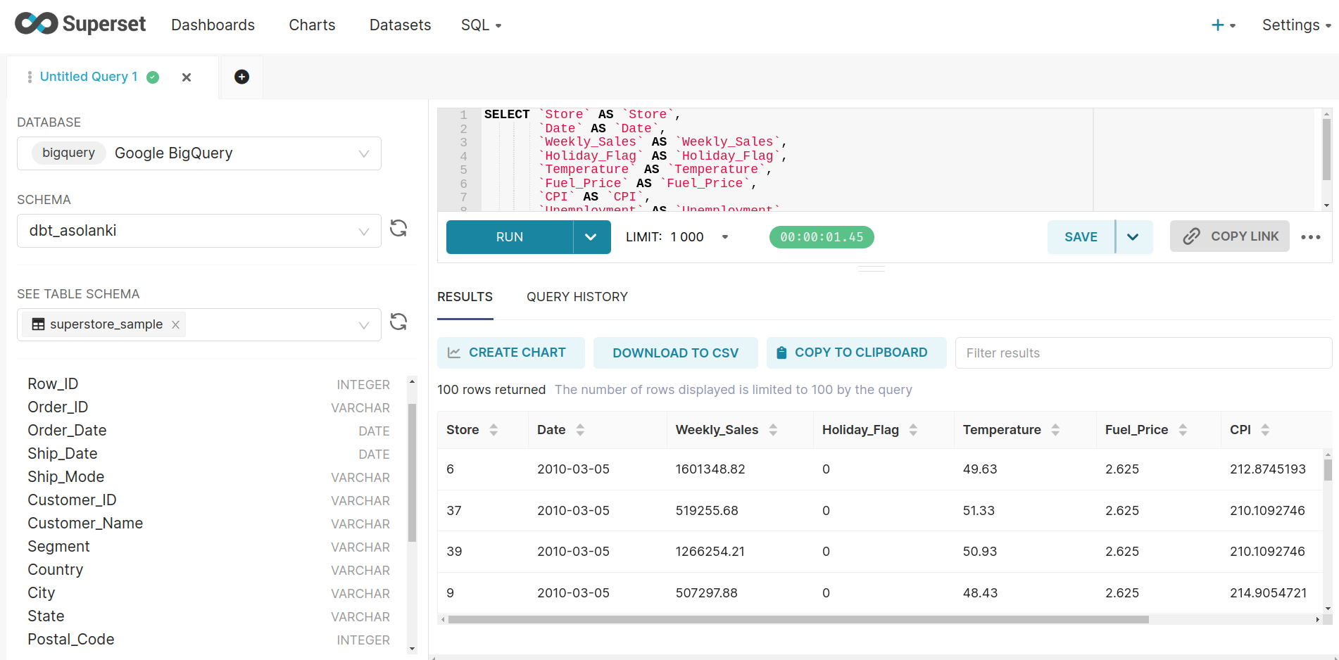
- The primary dataset used for this dashboard is stored in Google BigQuery under the
superstore_sampledataset. The dataset comprises a single table with the following columns:- Row_ID (INTEGER): Unique identifier for each row of data.
- Order_ID (VARCHAR): Unique identifier for each order.
- Order_Date (DATE): Date when the order was placed.
- Ship_Date (DATE): Date when the order was shipped.
- Ship_Mode (VARCHAR): Shipping mode chosen for the order.
- Customer_ID (VARCHAR): Unique identifier for each customer.
- Customer_Name (VARCHAR): Name of the customer.
- Segment (VARCHAR): Market segment to which the customer belongs.
- Country (VARCHAR): Country where the order was placed.
- City (VARCHAR): City where the order was placed.
- State (VARCHAR): State where the order was placed.
- Postal_Code (INTEGER): Postal code associated with the order location.
- Region (VARCHAR): Geographical region of the customer.
- Product_ID (VARCHAR): Unique identifier for each product.
- Category (VARCHAR): Product category.
- Sub_Category (VARCHAR): Sub-category of the product.
- Product_Name (VARCHAR): Name of the product.
- Sales (FLOAT): Total sales amount for the order.
- Quantity (INTEGER): Quantity of products ordered.
- Discount (FLOAT): Discount applied to the order.
- Profit (FLOAT): Profit generated from the order.
Steps for Creating the Dashboard
Step 1: Creating Tabs
- Open Superset and navigate to the Create Dashboard section.
- Create four tabs named:
- "by region"
- "by category"
- "by city"
- "by customer"
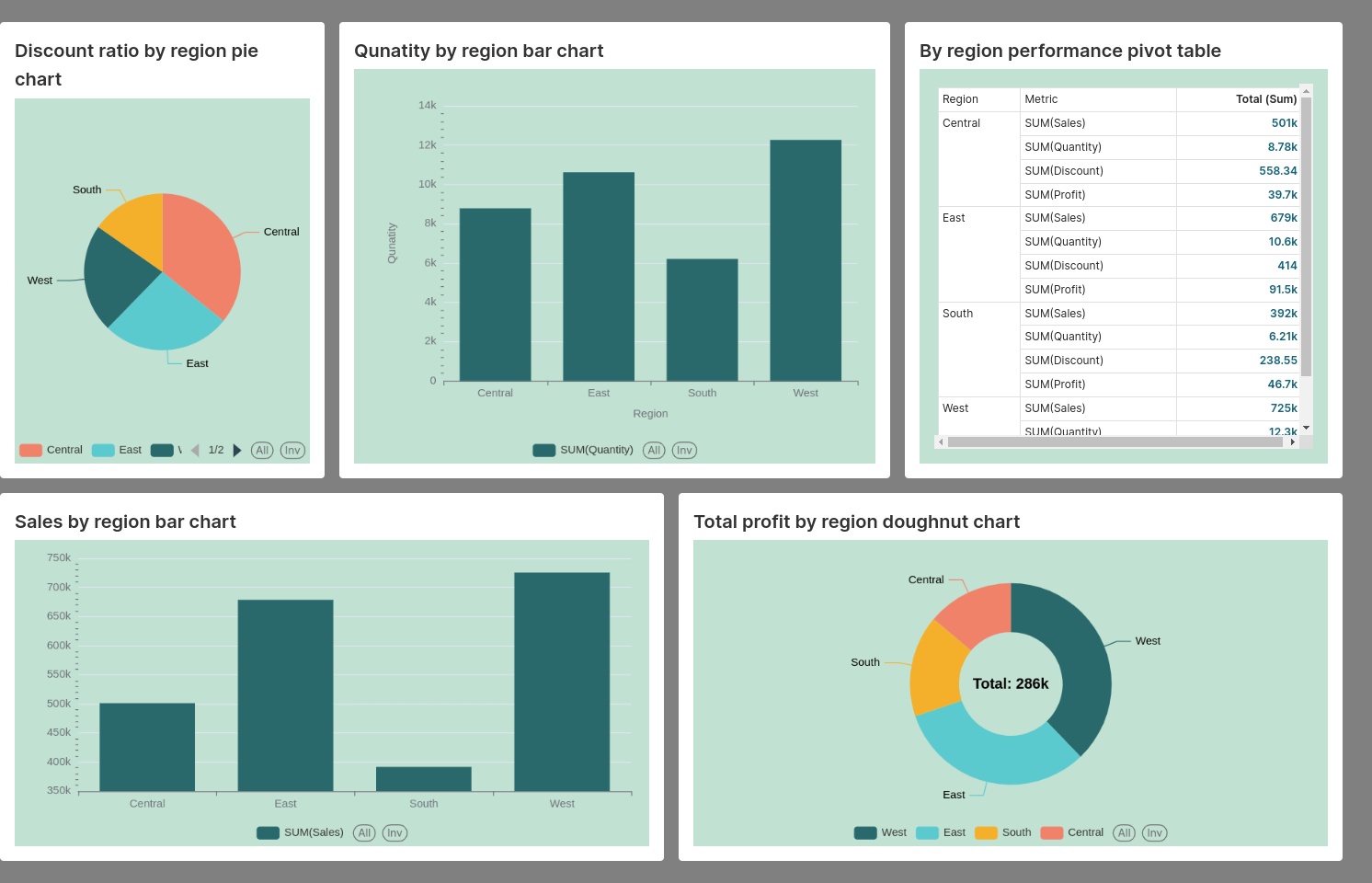
Step 2: "By Region" Tab
Create the following charts for the “by region” tab.
- Discount Ratio by Region Pie Chart:
- Visualize the discount ratio using a pie chart.
- Quantity by Region Bar Chart:
- Create a bar chart to display quantity distribution across regions.
- By Region Performance Pivot Table:
- Utilize a pivot table to showcase performance metrics by region.
- Sales by Region Bar Chart:
- Generate a bar chart to represent sales data across different regions.
- Total Profit by Region Doughnut Chart:
- Create a doughnut chart to illustrate the total profit distribution by region.
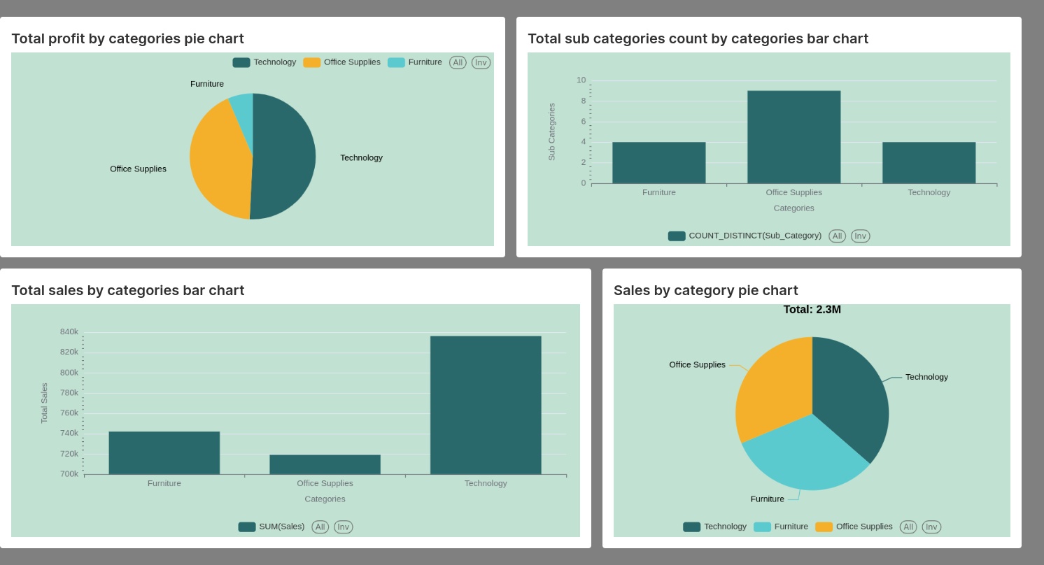
Step 3: "By Category" Tab
Create the following charts for the “by category” tab.
- Total Profit by Categories Pie Chart:
- Design a pie chart to visualize the total profit distribution across categories.
- Total Sub-Categories Count by Categories Bar Chart:
- Represent the count of sub-categories using a bar chart grouped by categories.
- Total Sales by Categories Bar Chart:
- Display total sales data using a bar chart categorized by different product categories.
- Sales by Category Pie Chart:
- Create a pie chart to showcase sales distribution by product categories.
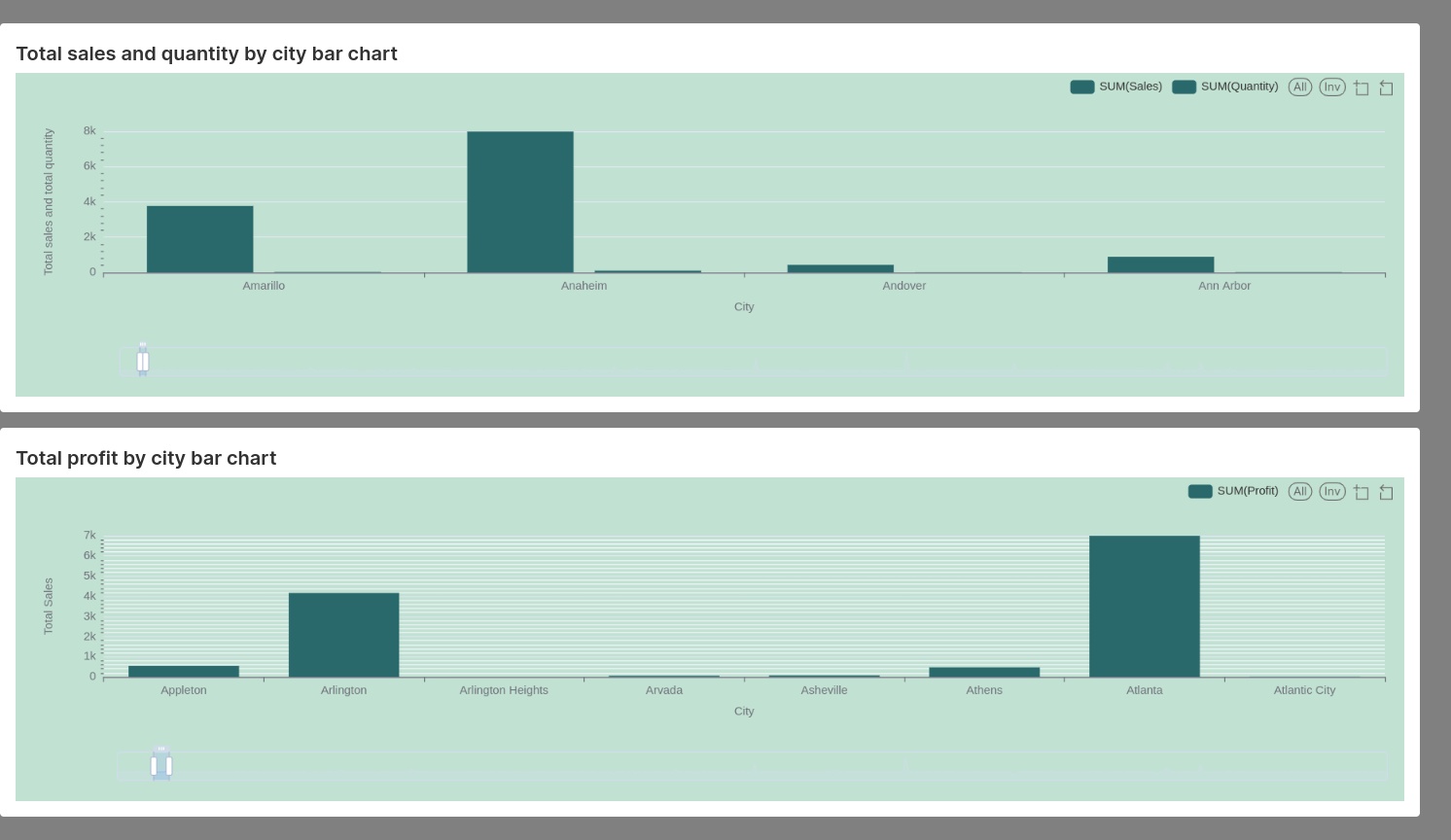
Step 4: "By City" Tab
Create the following charts for the “by city” tab.
- Total Sales and Quantity by City Bar Chart:
- Generate a bar chart to visualize both total sales and quantity distribution by city.
- Total Profit by City Bar Chart:
- Design a bar chart to represent the total profit distribution across different cities.
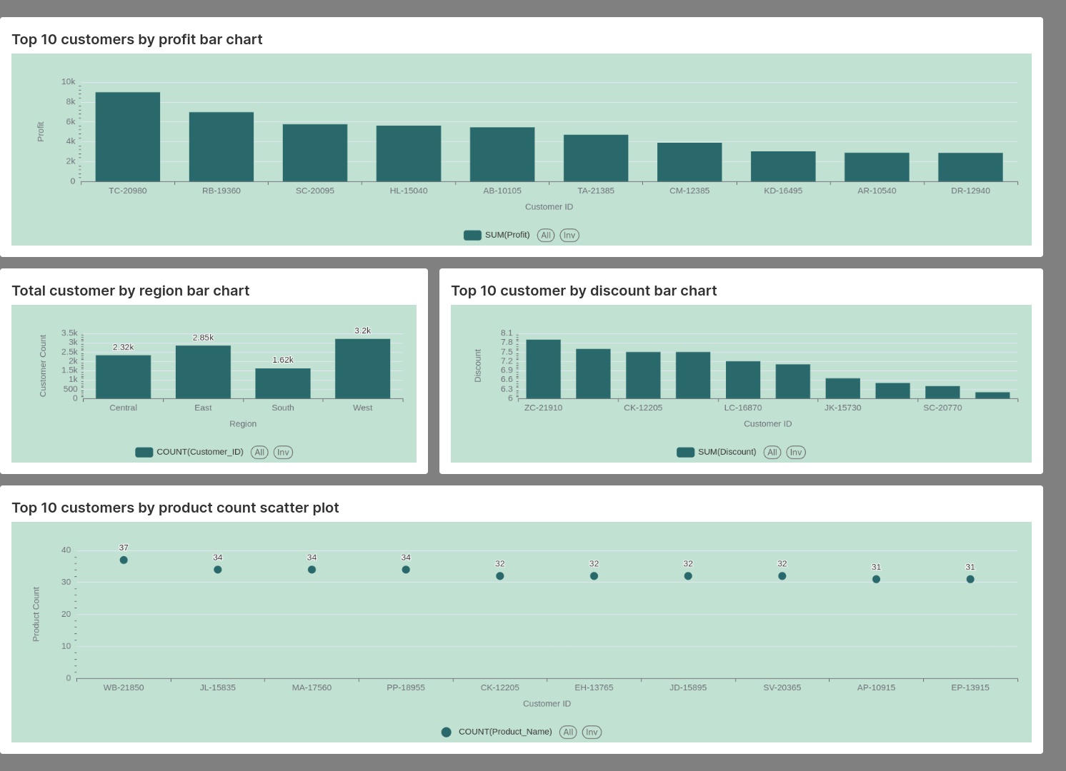
Step 5: "By Customer" Tab
Create the following charts for the “by customer” tab.
- Top 10 Customers by Profit Bar Chart:
- Create a bar chart showcasing the top 10 customers based on profit.
- Total Customers by Region Bar Chart:
- Visualize the total number of customers across different regions using a bar chart.
- Top 10 Customers by Discount Bar Chart:
- Generate a bar chart to display the top 10 customers based on discounts.
- Top 10 Customers by Product Count Scatter Plot:
- Utilize a scatter plot to represent the product count for the top 10 customers.
Step 6: Assembling the Dashboard
- Assemble the charts into their respective tabs to create a comprehensive dashboard.
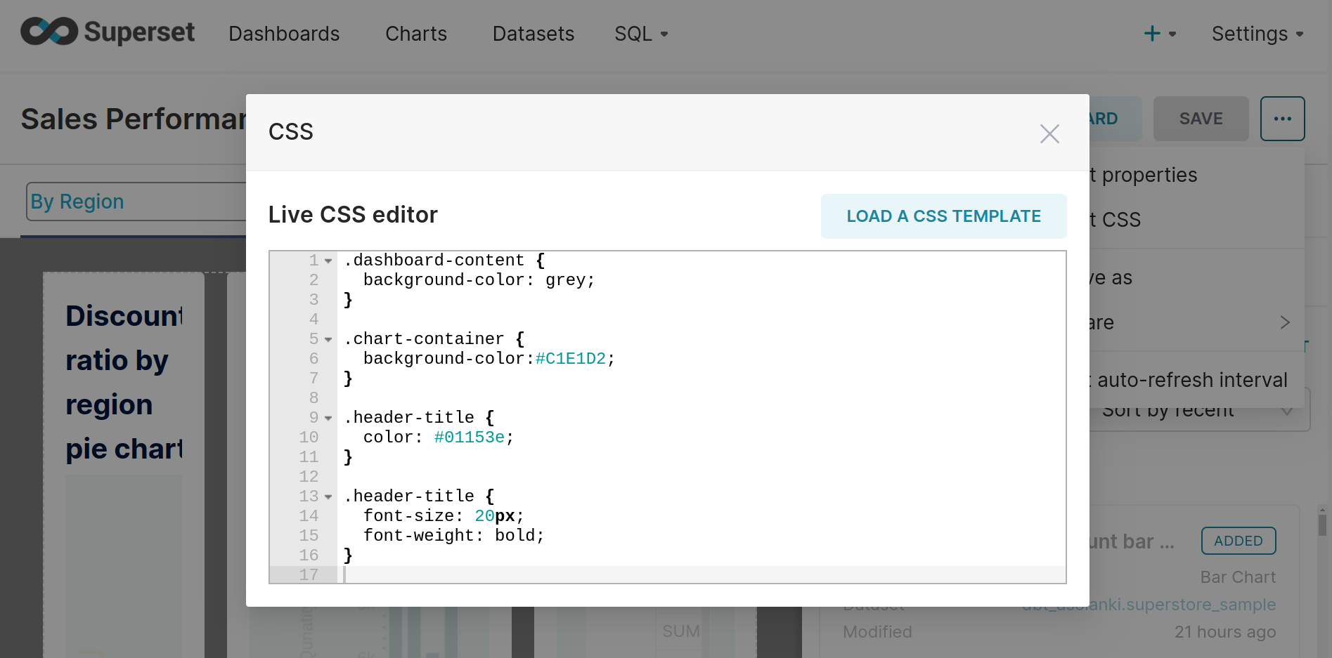
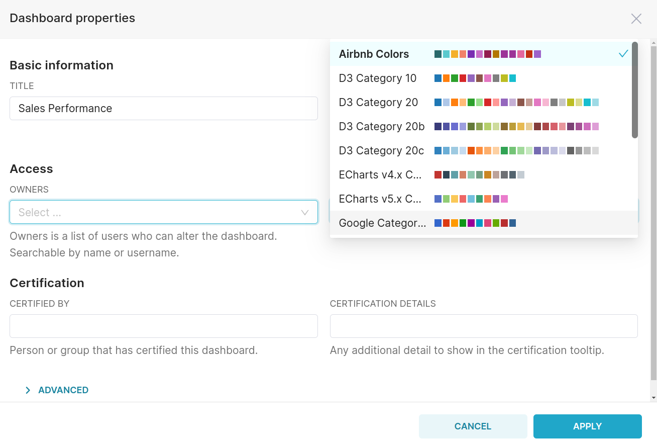
Step 7: Customizing the Dashboard
- Change the default color scheme to the "Airbnb color scheme" for a visually appealing theme.
- Use the CSS editor to customize the dashboard:
- Change the background color of the entire dashboard.
- Adjust the background color of each chart individually.
- Modify the color and size of each chart's title.