Adding Visualizations to Dashboards
This tutorial demonstrates the steps to create and add visualizations charts like Sankey, Sunburst, Treemap, Bar, etc., to an existing/new Dashboard.
When you have explored and gathered all the necessary data with appropriate queries, you can start using Atlas to create visualizations on top of that data.
Export Query
The first step to creating dashboards is to export the query from the workbench to Atlas.
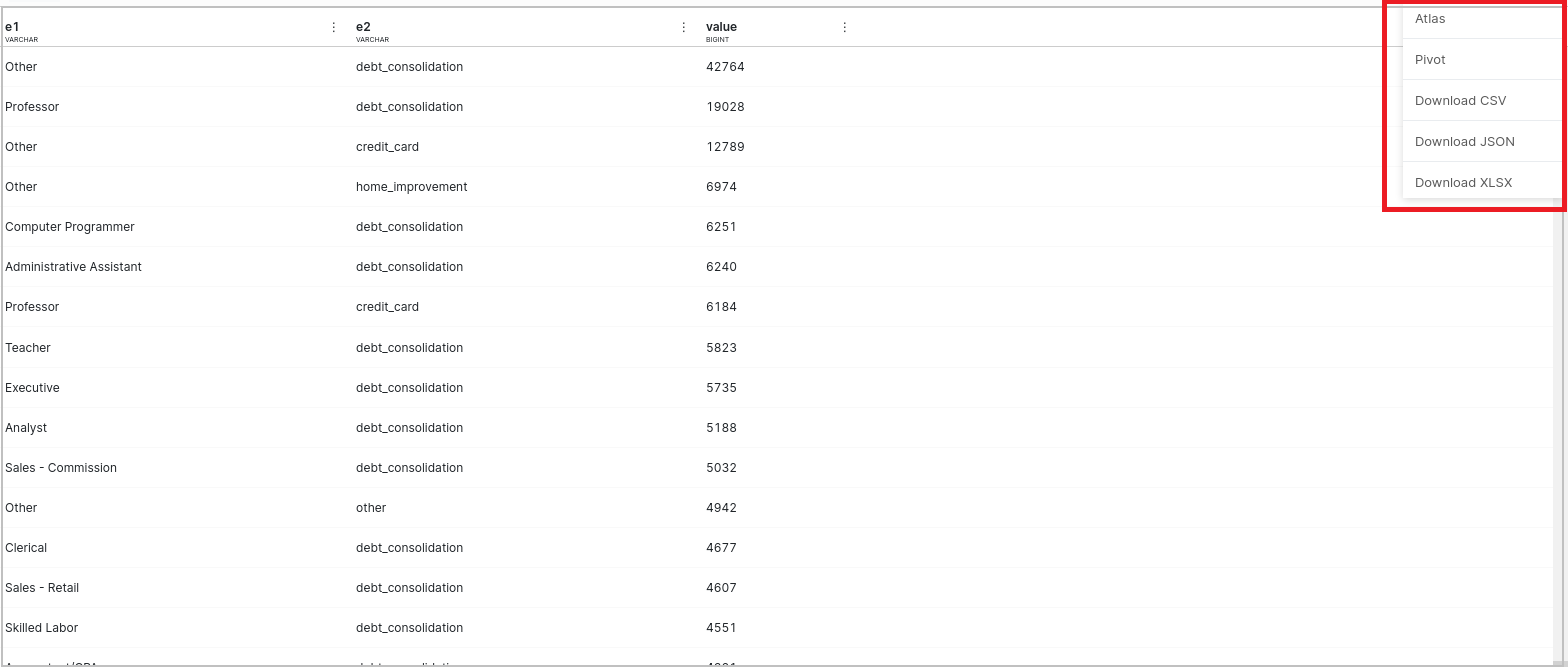
Click on the three dots present just above the output data table. In the pop-up, select the Atlas option. A pop-up box will appear, provide the name for the query and then export it.
Create Visualization
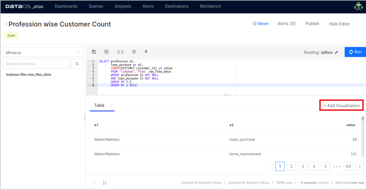
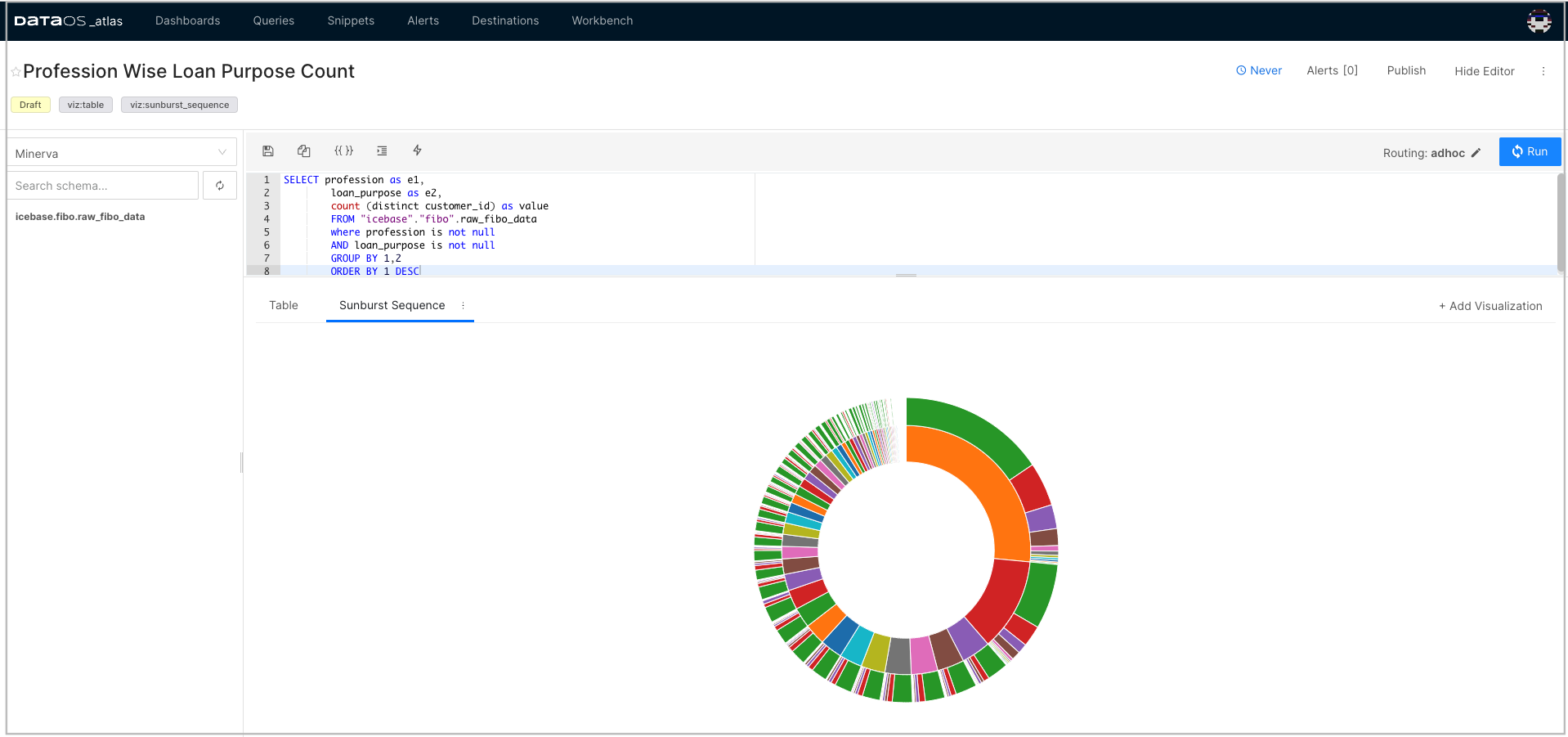
Once you have exported your query, a new tab in your browser will open, as shown below.
You can add a chart using the visualization editor. Click on the ** Visualization** tab.
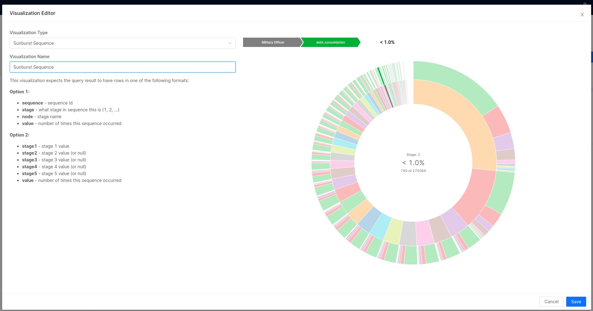
A pop-up appears on the screen. Select the right visualization type for your data from the drop-down and provide its name.
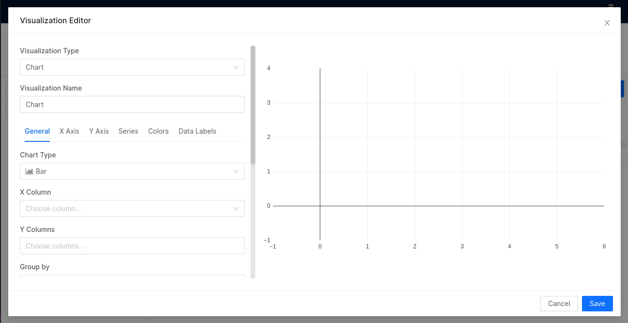
Based on the visualization type, provide additional inputs (if required) for rendering the chart. These inputs will vary according to the selected visualization type. Click on Save.
you can see the created visualization under the Queries tab.
Add Created Visualization to Dashboard
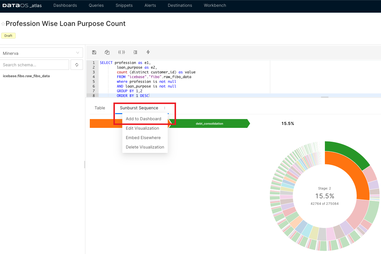
Click on the three dots present next to the chart tab. In the pop-up, click on Add to Dashboard.
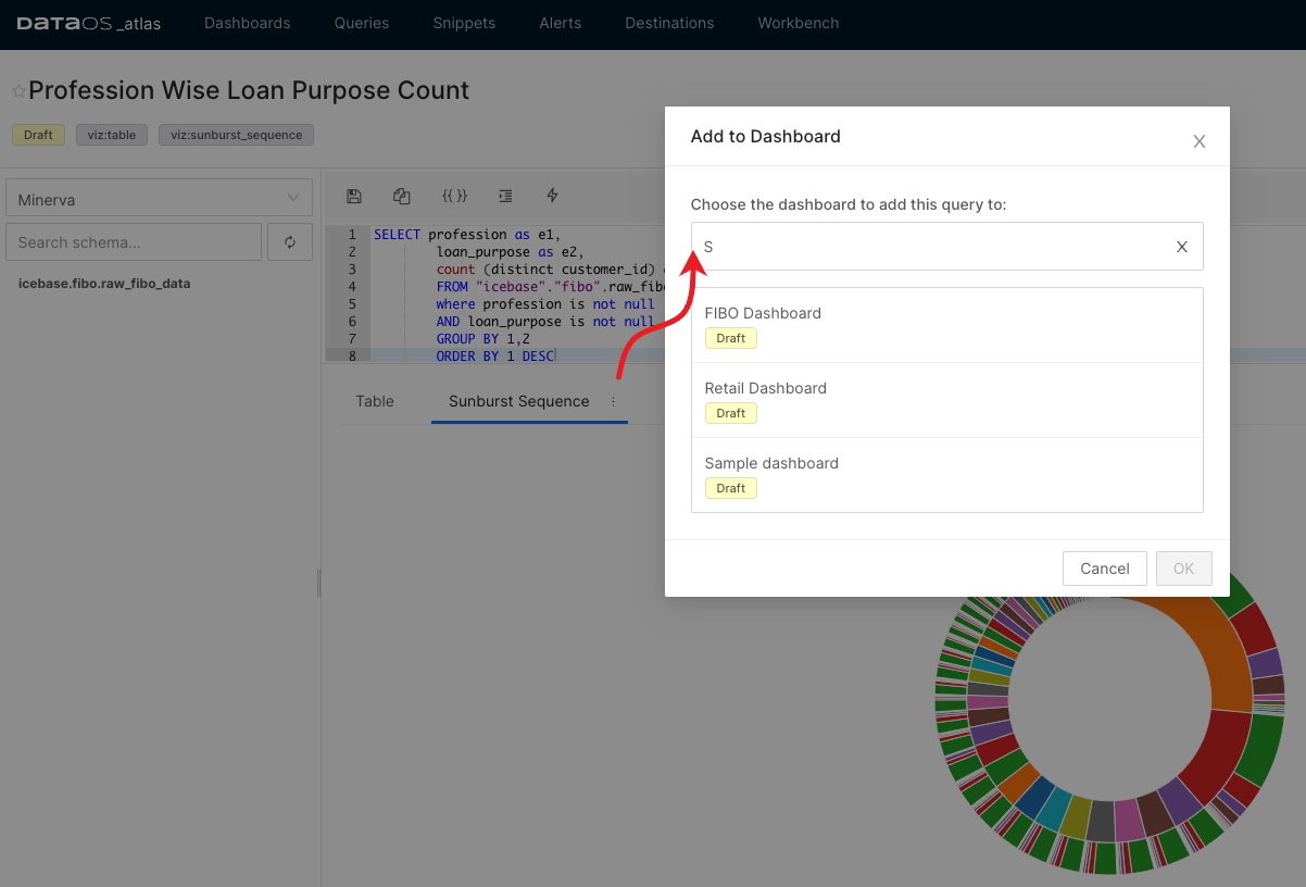
Choose the one from the existing/available dashboards where you wish to add the chart /visualization and then click on Ok.
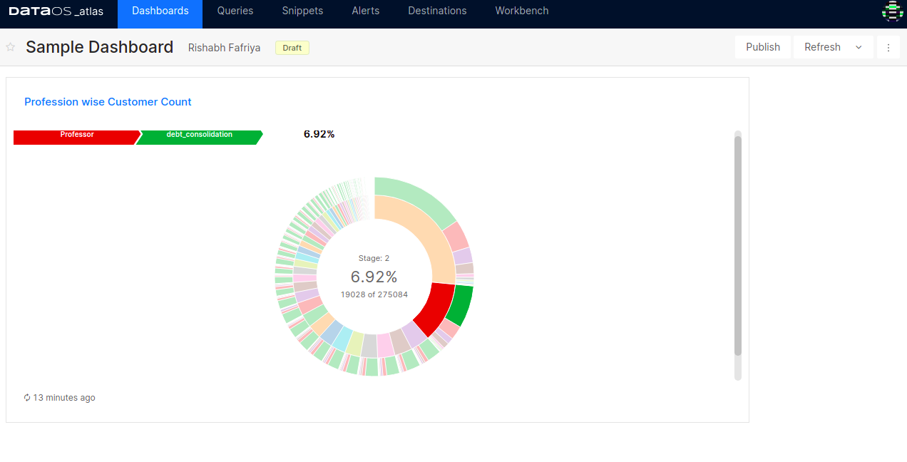
To see the added chart/visualization, go to the Dashboards tab and click on your dashboard.
Adding Visualization to New Dashboard
You can create a new dashboard from the Dashboards tab. Click on the + Add New and give it a name. Then Goto the Queries tab and add your visualization to the newly created dashboard as explained in the previous step.
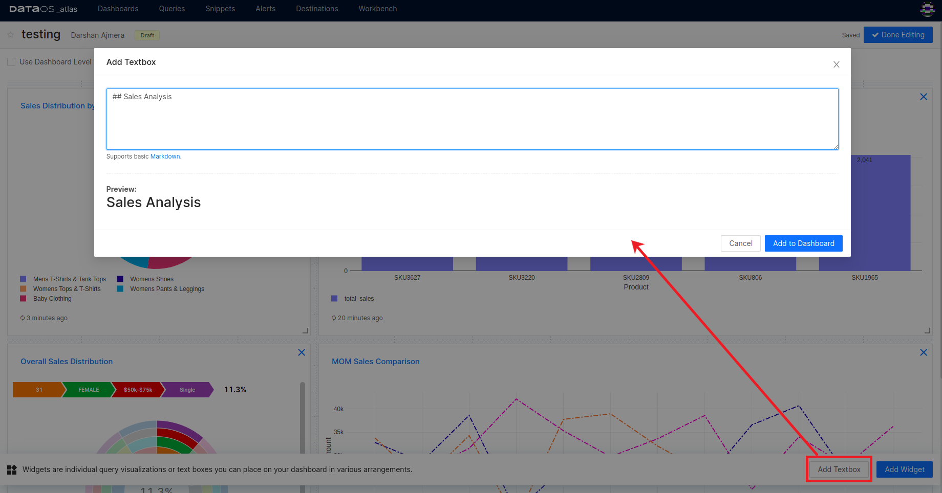
Add Text boxes to Dashboards
Text boxes can be added to your dashboards to provide descriptions or context for your data.
In the Edit mode, click on the Add Textbox button.
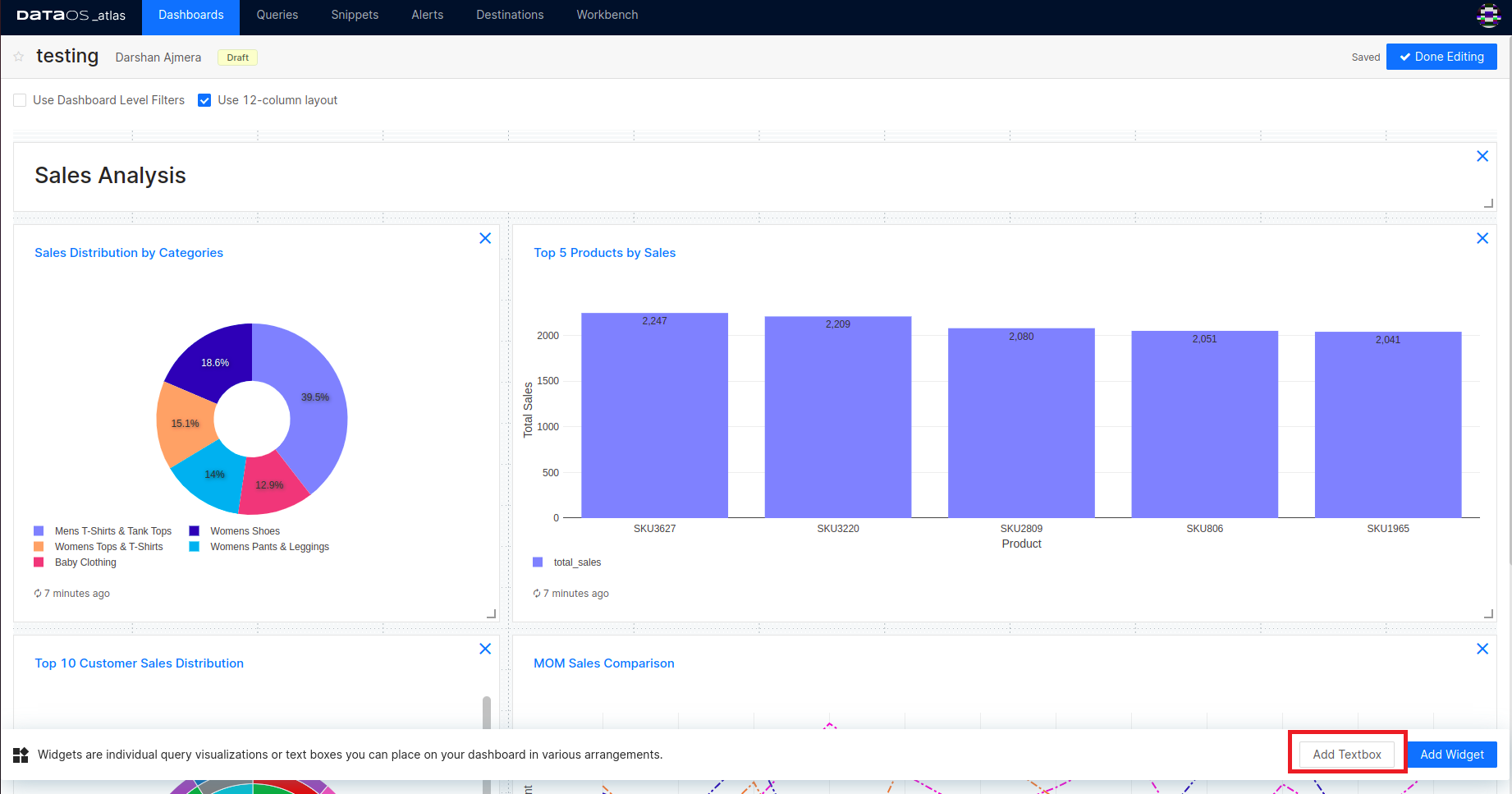
Atlas provides options to style the text boxes in your dashboards using Markdown.