Dashboard Customization
Customize your dashboards to improve the user experience and better align with the look and feel of your organization.
Layout Elements
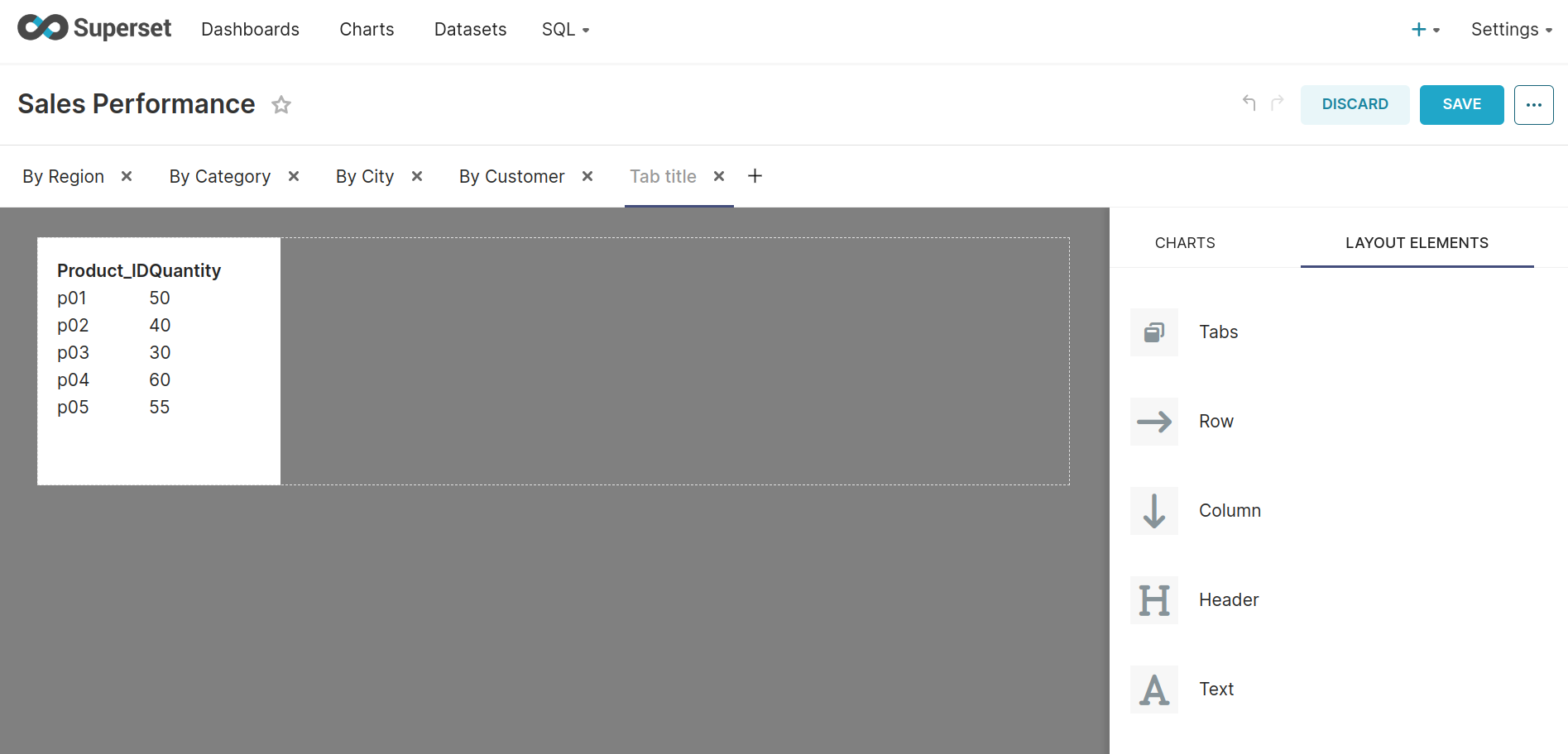
Superset has a variety of layout elements that can be used to organize and segment your content on dashboards. To add one, navigate to the LAYOUT ELEMENTS tab and drag and drop it to your dashboard:
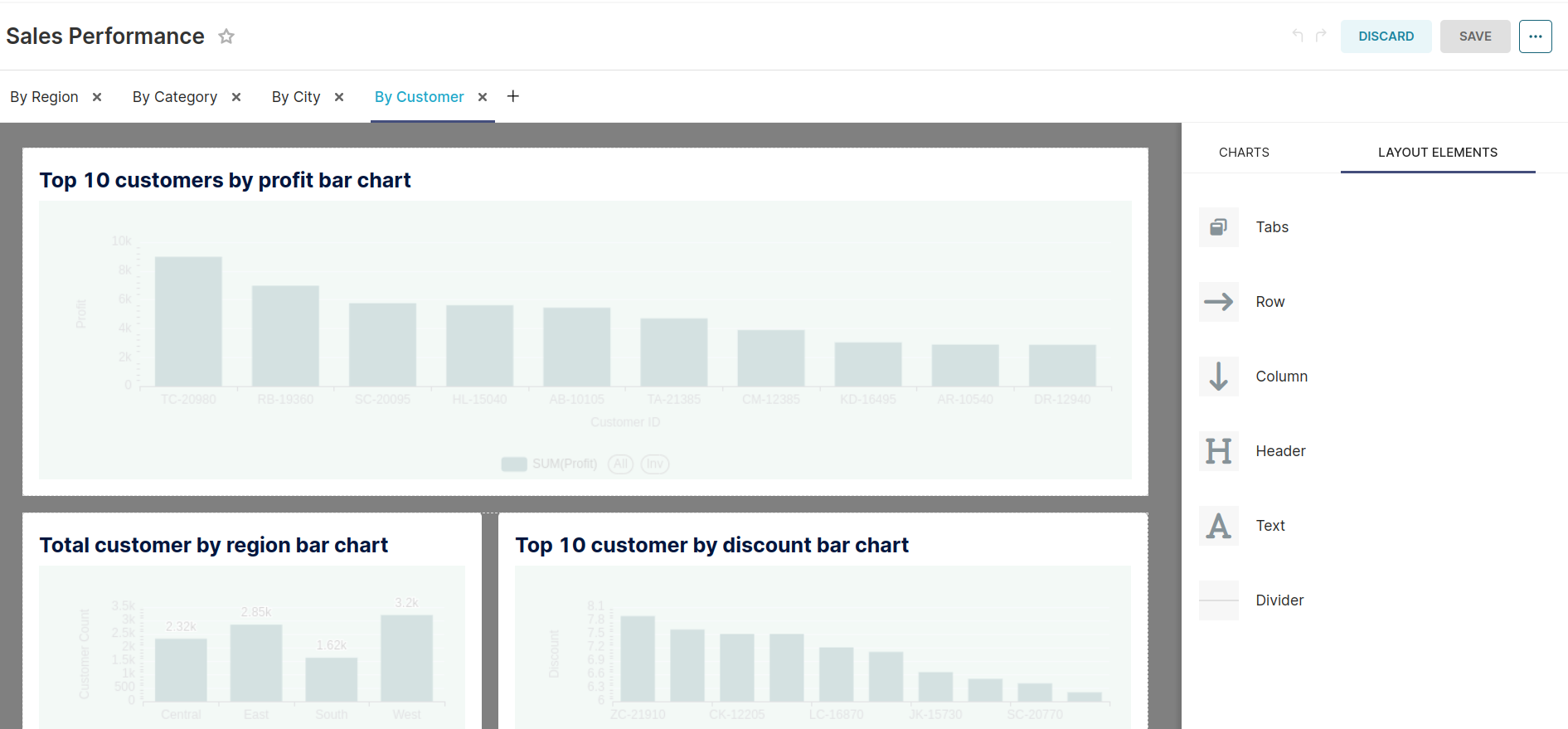
Tabs
Tabs are used to segment your charts into different groups.
Row & Column
Rows and Columns can be added to configure the chart layout further.

Similar to columns, Incorporating column elements into your dashboard requires adequate space allocation. If space becomes limited, consider adjusting the ratios of existing charts to create room.

Header
Header is used to add titles.

Text
Text can be used to add text and advanced features, such as images, markdown, and HTML content.

Divider
Divider is useful to isolate the parts of your dashboard.

Adding Tables to Dashboards
Adding tables to your dashboards, using HTML with the Text element, is also possible. For example:
<table>
  <tr>
    <th>Header 01</th>
    <th>Header 02</th>
  </tr>
  <tr>
    <td>First Row First Column</td>
    <td>First Row Second Column</td>
  </tr>
  <tr>
    <td>Second Row First Column</td>
    <td>Second Row Second Column</td>
  </tr>
</table>
Just paste the above HTML code into the text element by replacing the header titles and other values with respective column names and their actual values.
Color Palettes
As part of the chart creation process, creators specify a color palette. On the dashboard level, it is possible to specify a single categorical color palette that all charts would use on your dashboard - the chart color palette would still be used when viewing the chart directly, or on other dashboards. Today, the sequential color palette is specified at the chart level and can be configured from the "Chart Builder" view of the compatible charts (e.g., World Maps, Heatmap, Country Map, deck.gl Polygon).
To set up a dashboard-level color palette:
- Access your dashboard.
- Click on EDIT DASHBOARD, in the top right corner.
- Click on the three ellipses in the top right corner > Edit properties.
- Choose a palette under the COLOR SCHEME drop-down.
- Save changes.
Superset would use the same color for metrics/dimensions displayed on multiple charts (in the same tab). However, suppose you want to have more control over the columns that are applied to each dimension. In that case, you can manually specify the colors (using hexadecimal or RGBA code) on the dashboard JSON metadata. To do so:
- Access the dashboard.
- Click on EDIT DASHBOARD, in the top right corner.
- Click on the three ellipses (...) > Edit properties.
- Expand the ADVANCED section.
- Under the JSON METADATA inside “color_scheme” write your color scheme name of which colors you want for your labels then under label_colors give the label name and color code of your choice. For example:
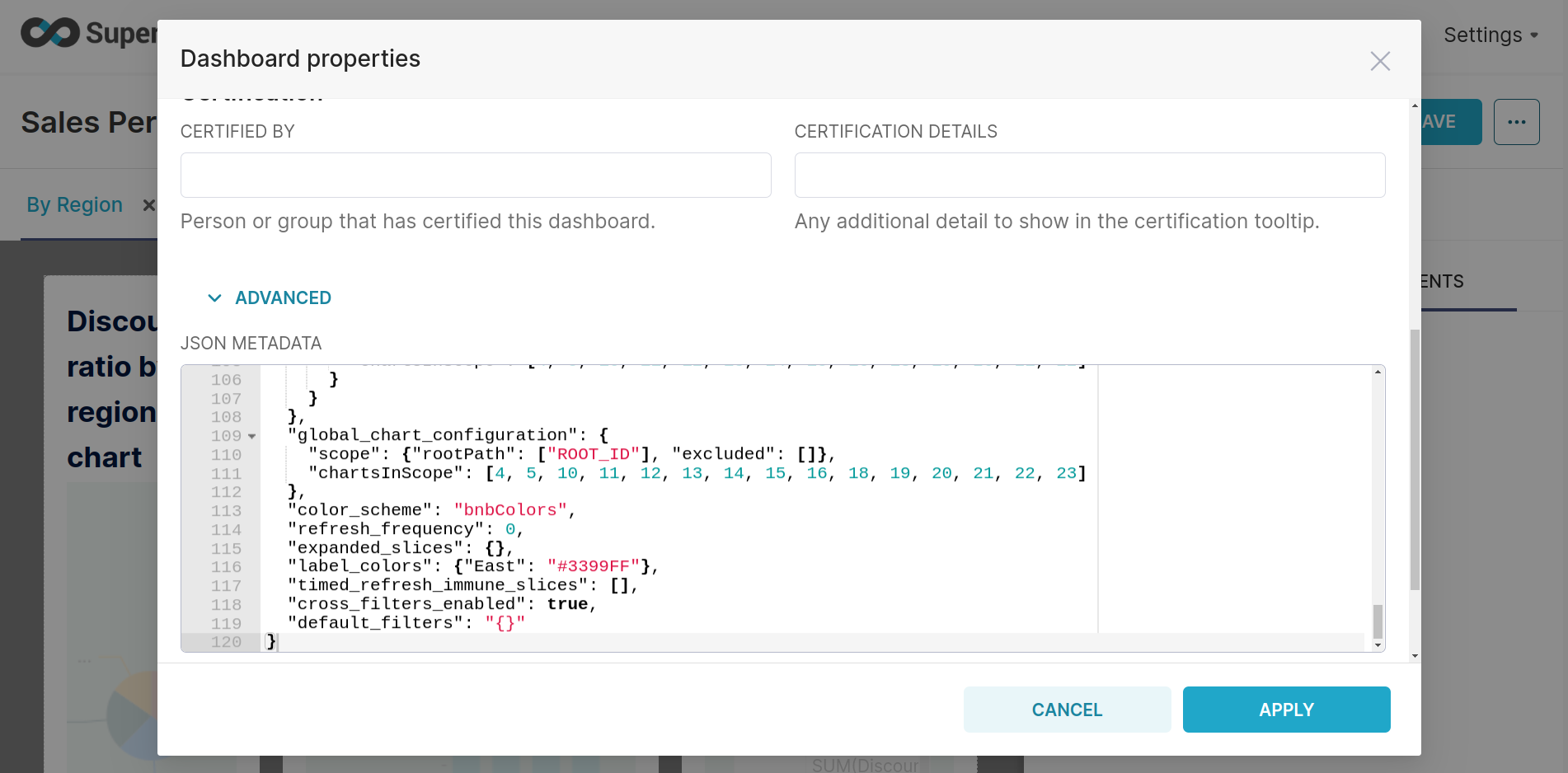
Just change the color_scheme with your desired color_scheme and under the label_colors write your label name along with your desired color code.